Unlock a world of possibilities! Login now and discover the exclusive benefits awaiting you.
- Qlik Community
- :
- All Forums
- :
- QlikView App Dev
- :
- Re: Trendline for a multiple dimension line chart
- Subscribe to RSS Feed
- Mark Topic as New
- Mark Topic as Read
- Float this Topic for Current User
- Bookmark
- Subscribe
- Mute
- Printer Friendly Page
- Mark as New
- Bookmark
- Subscribe
- Mute
- Subscribe to RSS Feed
- Permalink
- Report Inappropriate Content
Trendline for a multiple dimension line chart
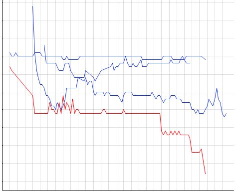
Is there an easy way to create an 'average' trendline for a line chart with 2 dimensions? I have the following, and wish to produce an average of the 4 lines on the same chart, but since I have 2 dimensions, clicking the Average trendline box produces 4 additional trendlines, instead of 1. I'd rather not have to create a transparent chart on top if possible. Thanks
- « Previous Replies
-
- 1
- 2
- Next Replies »
Accepted Solutions
- Mark as New
- Bookmark
- Subscribe
- Mute
- Subscribe to RSS Feed
- Permalink
- Report Inappropriate Content
Pick is deciding which specific dimension value should get assigned which expression. So looking at it from the straight table view might make things easier to understand
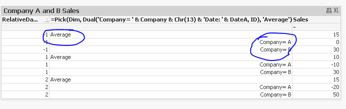
When my dimension is Average, use the Avg(Sales) Expression. and when the dimension is Company = A or Company = B, then use Sum(Sales)
This dimension in itself is created using the pick function.
- Mark as New
- Bookmark
- Subscribe
- Mute
- Subscribe to RSS Feed
- Permalink
- Report Inappropriate Content
Hi,
May be try this..
Instead of Checking Average Trend line for each expression, Create one more Expression , Uncheck the line and Check the Average in the Trend lines Part (this expression only)
and check the value on Data points
- Mark as New
- Bookmark
- Subscribe
- Mute
- Subscribe to RSS Feed
- Permalink
- Report Inappropriate Content
I don't think the trendline is what I'm looking for actually. I essentially need to be able to produce an average at each x axis interval, and connect the dots. Perhaps this is not do-able..?
- Mark as New
- Bookmark
- Subscribe
- Mute
- Subscribe to RSS Feed
- Permalink
- Report Inappropriate Content
May be share a sample with your expectation for us to play around with 
- Mark as New
- Bookmark
- Subscribe
- Mute
- Subscribe to RSS Feed
- Permalink
- Report Inappropriate Content
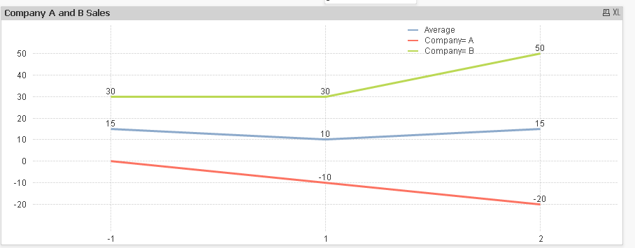
I'm trying to get the sales lines for Companies A and B to populate, as well as the average line for both selections. Thanks for the help
- Mark as New
- Bookmark
- Subscribe
- Mute
- Subscribe to RSS Feed
- Permalink
- Report Inappropriate Content
Something like this?
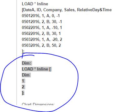
 Script:
Script:
LOAD * Inline
[DateA, ID, Company, Sales, RelativeDay&Time
05012016, 1, A, 0, -1
05012016, 2, B, 30, -1
05022016, 1, A, -10, 1
05022016, 2, B, 30, 1
05032016, 1, A, -20, 2
05032016, 2, B, 50, 2
];
Dim:
LOAD * Inline [
Dim
1
2
];
Chart Dimensions:
RelativeDay&Time
=Pick(Dim, Dual('Company= ' & Company & Chr(13) & 'Date: ' & DateA, ID), 'Average')
Expression
Pick(Dim, Sum(Sales), Avg(Sales))
- Mark as New
- Bookmark
- Subscribe
- Mute
- Subscribe to RSS Feed
- Permalink
- Report Inappropriate Content
Can you explain how the Pick function knows which expression (Sum or Avg) to 'Pick'? I'm trying to replicate for a much larger data set, but am unclear how exactly it's picking an expression to display, as well as how both the sum and average are displayed at the same time
- Mark as New
- Bookmark
- Subscribe
- Mute
- Subscribe to RSS Feed
- Permalink
- Report Inappropriate Content
Pick function works similar to the if statement. Pick would look at the number associated with value of Dim (which in this case is 1 and 2). So When Dim = 1, use Sum(Sales), when it is 2 use Avg(Sales). This works, because I have use Pick(Dim in the dimension also.
=Pick(Dim, Dual('Company= ' & Company & Chr(13) & 'Date: ' & DateA, ID), 'Average')
Here when Dim = 1, use Dual('Company= ' & Company & Chr(13) & 'Date: ' & DateA, ID) as the dimension and when Dim = 2, then use 'Average' (static value) as dimension.
So combining the two, we get
For Dual('Company= ' & Company & Chr(13) & 'Date: ' & DateA, ID) -> use Sum(Sales)
For 'Average' -> Use Avg(Sales)
Does this make sense?
- Mark as New
- Bookmark
- Subscribe
- Mute
- Subscribe to RSS Feed
- Permalink
- Report Inappropriate Content
I understand that, but where/when does DIm get set to 1 or 2?
- Mark as New
- Bookmark
- Subscribe
- Mute
- Subscribe to RSS Feed
- Permalink
- Report Inappropriate Content
In the script
- « Previous Replies
-
- 1
- 2
- Next Replies »