Unlock a world of possibilities! Login now and discover the exclusive benefits awaiting you.
- Qlik Community
- :
- All Forums
- :
- QlikView App Dev
- :
- Re: Two Dimmensions in a Single Graph
- Subscribe to RSS Feed
- Mark Topic as New
- Mark Topic as Read
- Float this Topic for Current User
- Bookmark
- Subscribe
- Mute
- Printer Friendly Page
- Mark as New
- Bookmark
- Subscribe
- Mute
- Subscribe to RSS Feed
- Permalink
- Report Inappropriate Content
Two Dimmensions in a Single Graph
Hello all,
I have the following graph:
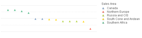
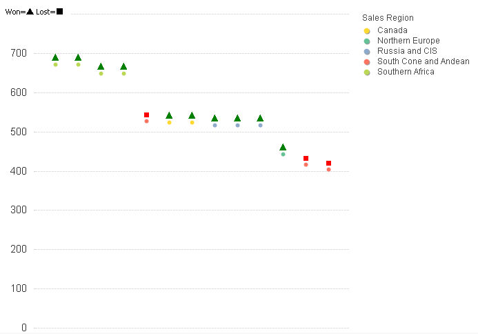
Each point represent a business case.
What I need is, in the same graph, show if each case is either Won or Lost while at the same time seeing which Sales Region it is from, is that posible? Would be better disposicion of the points stay the same.
I thought of doing something like triangles are Won and Squares are Lost, something like this (did this image in Paint):
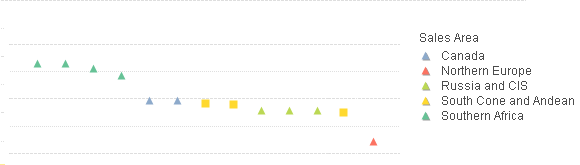
Do you think it's feasible? Or if there's some other way?
I'm attaching some mock info to mirror this in order to see how my data loos like.
Thanks!
- « Previous Replies
-
- 1
- 2
- Next Replies »
- Mark as New
- Bookmark
- Subscribe
- Mute
- Subscribe to RSS Feed
- Permalink
- Report Inappropriate Content
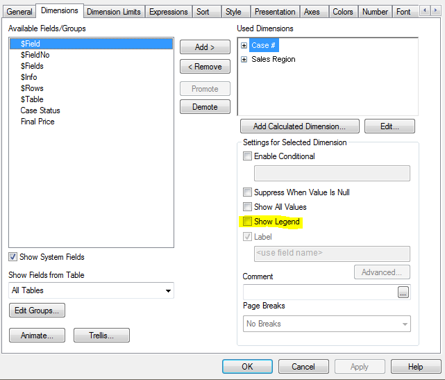
Something like this, the issue is how I add the 2nd dimmension and how do I display its legend.
With only one dimmension I already managed to do.
- Mark as New
- Bookmark
- Subscribe
- Mute
- Subscribe to RSS Feed
- Permalink
- Report Inappropriate Content
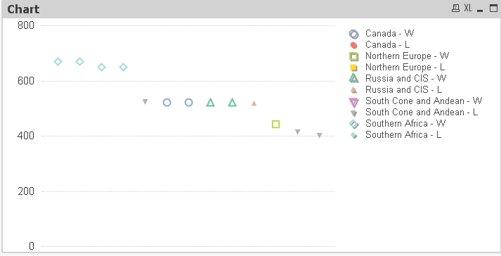
This will probably not work since your data is probably just a subset of a larger set, but it might give you some ideas. I started by creating a new dimension with the Case # with value of the Final Price using Dual. Please see attached.
- Mark as New
- Bookmark
- Subscribe
- Mute
- Subscribe to RSS Feed
- Permalink
- Report Inappropriate Content
Marcelo,
How about something like this?
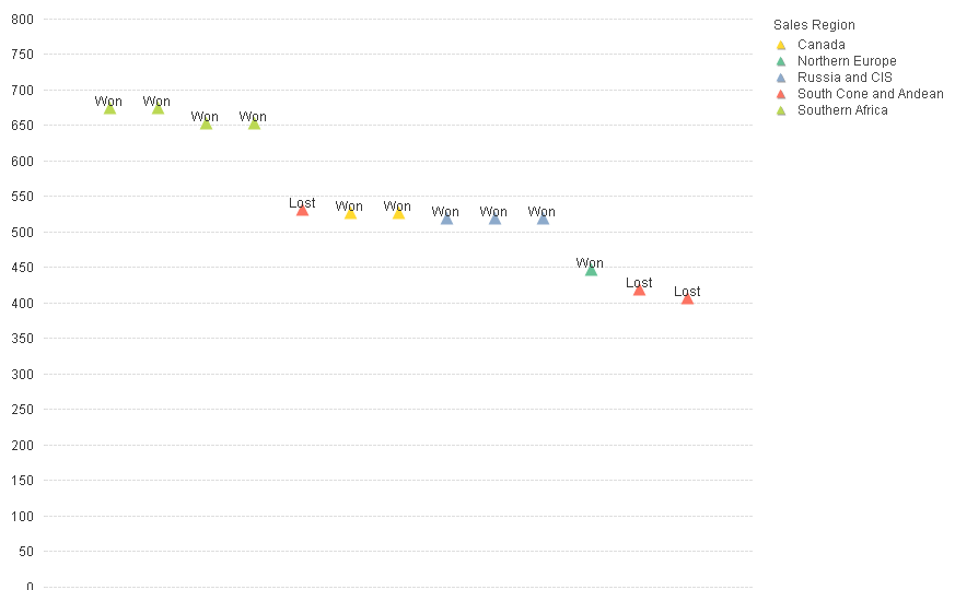
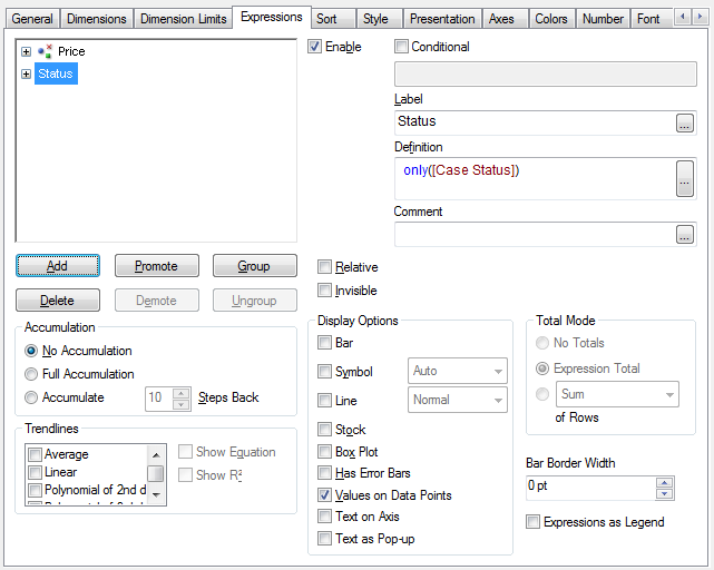
This solution is using Case # and Sales Region as the dimension and sum(Final Price]) as the expression. Then to get the Status in as well, I added an additional expression as only([Case Status]) with Display Option as Value on Data Points.
- Mark as New
- Bookmark
- Subscribe
- Mute
- Subscribe to RSS Feed
- Permalink
- Report Inappropriate Content
This one makes nice !!! But, His intend to show "Square Diagrams" for Lost. If you are the one who did that please share final Version of QVW. He may easy tackle the same 
- Mark as New
- Bookmark
- Subscribe
- Mute
- Subscribe to RSS Feed
- Permalink
- Report Inappropriate Content
One "hacky" way to solve for the square vs triangle is to use ASCII replacements for Won and Lost as seen below (and also in the QVW attached to original reply.).
If he changes the symbol for Region to a dot and changes Won to a triangle and Lost to a Square, you get the below. I also applied red/green color logic as an additional visualization call out and added a Text in Chart key for the additional symbols... but who knows how that will react on an access point deployment.
- Mark as New
- Bookmark
- Subscribe
- Mute
- Subscribe to RSS Feed
- Permalink
- Report Inappropriate Content
Hello Justin,
How do I do that with ASCII? I'm not very familiar with it.
- Mark as New
- Bookmark
- Subscribe
- Mute
- Subscribe to RSS Feed
- Permalink
- Report Inappropriate Content
Hey Marcelo,
In Qlik you can use chr() codes that correspond to specific ASCII characters that aren't on your typical keyboard.
In this case the Triangle is chr(9650) & the Square is chr(9632)
So that expression could be
if(only([Case Status]) = 'Won', chr(9650),
if(only([Case Status]) = 'Lost', chr(9632)
, null()))
- Mark as New
- Bookmark
- Subscribe
- Mute
- Subscribe to RSS Feed
- Permalink
- Report Inappropriate Content
What about the colors (red for lost and green for won)?
Could you give me their codes too so I can add to the script?
Thanks!
- Mark as New
- Bookmark
- Subscribe
- Mute
- Subscribe to RSS Feed
- Permalink
- Report Inappropriate Content
Sure, for the colors just click the + expansion icon on your primary measure expression and add this as the text color expression:
if(only([Case Status]) = 'Won', green(), red())
- « Previous Replies
-
- 1
- 2
- Next Replies »