Unlock a world of possibilities! Login now and discover the exclusive benefits awaiting you.
- Qlik Community
- :
- All Forums
- :
- QlikView App Dev
- :
- Urgent Help Required - Bar Width Problem
- Subscribe to RSS Feed
- Mark Topic as New
- Mark Topic as Read
- Float this Topic for Current User
- Bookmark
- Subscribe
- Mute
- Printer Friendly Page
- Mark as New
- Bookmark
- Subscribe
- Mute
- Subscribe to RSS Feed
- Permalink
- Report Inappropriate Content
Urgent Help Required - Bar Width Problem
Hello,
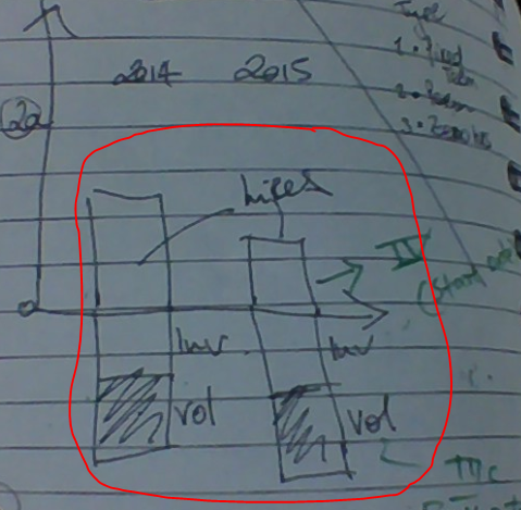
I have two graphs, Please find image..
I want to show same width of second image. And same line..!
- Anil
- « Previous Replies
-
- 1
- 2
- Next Replies »
Accepted Solutions
- Mark as New
- Bookmark
- Subscribe
- Mute
- Subscribe to RSS Feed
- Permalink
- Report Inappropriate Content
I don't know of any other way, but that does not mean that there isn't any other way.
talk is cheap, supply exceeds demand
- Mark as New
- Bookmark
- Subscribe
- Mute
- Subscribe to RSS Feed
- Permalink
- Report Inappropriate Content
Please post a small qlikview document that demonstrates the problem.
talk is cheap, supply exceeds demand
- Mark as New
- Bookmark
- Subscribe
- Mute
- Subscribe to RSS Feed
- Permalink
- Report Inappropriate Content
Gysbert,
Thanks for attempting.
PFA.
I have two graphs. In that, second graph i want to increase my graph width same as first graph...
- Mark as New
- Bookmark
- Subscribe
- Mute
- Subscribe to RSS Feed
- Permalink
- Report Inappropriate Content
May be 'Uncheck' the 'Show Legend' in the Dimension Tab
- Mark as New
- Bookmark
- Subscribe
- Mute
- Subscribe to RSS Feed
- Permalink
- Report Inappropriate Content
But,
I want like below..
- Mark as New
- Bookmark
- Subscribe
- Mute
- Subscribe to RSS Feed
- Permalink
- Report Inappropriate Content
Use F year as dimension in both charts.
In both charts use the same Bar Distance and Cluster Settings
In the bottom chart use these expressions:
- if([F Year]=2014,-Count([Name of Leaver]),0)
- if([F Year]=2014,-Count(Type),0)
On the Presentation tab of the bottom chart uncheck the option Suppress Zero-Values
Press the Shift and Ctrl keys down at the same time. You should see red outlines around the chart parts. Move the legend from the right to the top or to the bottom of the chart.
talk is cheap, supply exceeds demand
- Mark as New
- Bookmark
- Subscribe
- Mute
- Subscribe to RSS Feed
- Permalink
- Report Inappropriate Content
Helpful,
Updated :
Can you please look the qvw and Excel
I take two graphs here. So, Client want to show single graph only. If i want to move one graph client want to move whole graph. But, here i am facing problem like if i move one graph the graphs are going out...
1) Hires graph 2) Leaver graph.
For reference (Hires Graph):
Graph 1 (Dimensions are Start Date (iv Recruiting data) and Expression is count(candidate {iv Recruiting data})
For reference (Leaver Graph):
Graph 2 (Dimensions are Drill Down {ExitDate, BU/Department, Job Level, Job Title - From HR HC Leavers (named), Expression is Count(Name of Leaver) } )
So i want to create one graph with these two graphs...
------------------------------
Client don't want to create any buttons here. When ever we click on second graph she want to hide first graph only. And then she want to show the second graph replace to first graph
Please help me....
- Mark as New
- Bookmark
- Subscribe
- Mute
- Subscribe to RSS Feed
- Permalink
- Report Inappropriate Content
Updated : is anyone trying my issue?
- Mark as New
- Bookmark
- Subscribe
- Mute
- Subscribe to RSS Feed
- Permalink
- Report Inappropriate Content
Hello,
Finally, I got the issue..
So i have one more problem here.
Is there any way to remove the 0 on Y-Axis of the below graph. For ref -251 Value is the graph. If not possible, Tell me so that i can close this issue with the correct answer of GYSBERT
Please help me, I want to close this thread ASAP..
- Mark as New
- Bookmark
- Subscribe
- Mute
- Subscribe to RSS Feed
- Permalink
- Report Inappropriate Content
I'm not sure what you want. Try setting the Axis Color and the Font color of the Expression axis to white (or 100% transparent). And on the Expressions tab click on the + in front of the expression, select Text Color and enter =Black() as Definition.
talk is cheap, supply exceeds demand
- « Previous Replies
-
- 1
- 2
- Next Replies »