Unlock a world of possibilities! Login now and discover the exclusive benefits awaiting you.
- Qlik Community
- :
- All Forums
- :
- QlikView App Dev
- :
- Urgent - Help required to create a Progress Chart
- Subscribe to RSS Feed
- Mark Topic as New
- Mark Topic as Read
- Float this Topic for Current User
- Bookmark
- Subscribe
- Mute
- Printer Friendly Page
- Mark as New
- Bookmark
- Subscribe
- Mute
- Subscribe to RSS Feed
- Permalink
- Report Inappropriate Content
Urgent - Help required to create a Progress Chart
Hello Team,
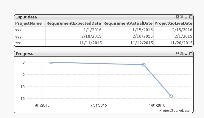
I have the following columns already loaded in qvw. I want to create a Progress chart (over the time period) to show the progress.
Table:
ProjectName RequirementExpectedDate RequirementActualDate ProjectGoLiveDate
xxx 1/1/2016 1/15/2016 2/15/2016
yyy 2/10/2015 2/10/2015 2/1/2015
zzz 11/11/2015 11/12/2015 11/20/2015
Now my requirement is to show how the difference of RequirementExpectedDate and RequirementActualDate has progressed over the period (ProjectGoLiveDate).
X-Axis should show the date difference (in numbers) in Percentage.
Y -Axis should show the GoLiveMonths
Can you all please guide me.
Thanks
- Tags:
- new_to_qlikview
- Mark as New
- Bookmark
- Subscribe
- Mute
- Subscribe to RSS Feed
- Permalink
- Report Inappropriate Content
Maybe you should first fix your dates. Project xxx has a ProjectGoLiveDate of 2/15/2016 and project zzz has a PrjectGoLiveDate of 29/11/2015. You can't have it both ways (you can, but it's better to fix what is wrong)
Peter
- Mark as New
- Bookmark
- Subscribe
- Mute
- Subscribe to RSS Feed
- Permalink
- Report Inappropriate Content
Hi Peter,
That was a typo. I have fixed it. Can you guide here.
Thanks in advance!!!
- Mark as New
- Bookmark
- Subscribe
- Mute
- Subscribe to RSS Feed
- Permalink
- Report Inappropriate Content
Based on your minimal details, this is what I came up with. Is this what you want?
Best,
Peter
- Mark as New
- Bookmark
- Subscribe
- Mute
- Subscribe to RSS Feed
- Permalink
- Report Inappropriate Content
Can we have x-axis in Percentage please.
The differnce should be Actual minus Expected, so always positive or zero. (not negative)
Also, can we apply NetWorkDays function.. instead of avg, so that we get only the working dayscount excluding weekends.
Thanks
- Mark as New
- Bookmark
- Subscribe
- Mute
- Subscribe to RSS Feed
- Permalink
- Report Inappropriate Content
can you elaborate your requirement..
X-Axis (numbers in %) --> what % you want to showcase?
Y-Axis (GoLiveMonths) --> how you are calculating this