Unlock a world of possibilities! Login now and discover the exclusive benefits awaiting you.
- Qlik Community
- :
- All Forums
- :
- QlikView App Dev
- :
- Re: Urgent - Need help in creating Grouped Bar Cha...
- Subscribe to RSS Feed
- Mark Topic as New
- Mark Topic as Read
- Float this Topic for Current User
- Bookmark
- Subscribe
- Mute
- Printer Friendly Page
- Mark as New
- Bookmark
- Subscribe
- Mute
- Subscribe to RSS Feed
- Permalink
- Report Inappropriate Content
Urgent - Need help in creating Grouped Bar Chart
Hi Team,
I have a requirement where I need to show some bar graphs grouped by some conditions.
The data i have is:
| Division | ProjectName | ApplicableforTracking | GoLiveDate |
| A | xx | Yes | 2/2/216 |
| A | yy | No | 2/15/2016 |
| C | zz | Yes | 03/12/2016 |
| B | xx | Yes | 2/2/216 |
| A | yy | No | 2/15/2016 |
| B | zz | Yes | 03/12/2016 |
| C | xx | Yes | 03/12/2016 |
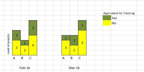
And below is the graph i am looking for. (sample only, no link with data and graph)
Thanks in advance!!!
Accepted Solutions
- Mark as New
- Bookmark
- Subscribe
- Mute
- Subscribe to RSS Feed
- Permalink
- Report Inappropriate Content
- Mark as New
- Bookmark
- Subscribe
- Mute
- Subscribe to RSS Feed
- Permalink
- Report Inappropriate Content
Take first dimension as Division , second dimension as Apllicable for tracking and measure as Count(Project Name)
Thanks
Kiran Kumar
- Mark as New
- Bookmark
- Subscribe
- Mute
- Subscribe to RSS Feed
- Permalink
- Report Inappropriate Content
Hello,
How to get the x-axis dimension then? Based on GoLive Month? Feb-16, March-16 etc
- Mark as New
- Bookmark
- Subscribe
- Mute
- Subscribe to RSS Feed
- Permalink
- Report Inappropriate Content
See attached example.
talk is cheap, supply exceeds demand
- Mark as New
- Bookmark
- Subscribe
- Mute
- Subscribe to RSS Feed
- Permalink
- Report Inappropriate Content
Hi,
Please find attached?
Kiran Kumar
- Mark as New
- Bookmark
- Subscribe
- Mute
- Subscribe to RSS Feed
- Permalink
- Report Inappropriate Content
1.add Monthname(GoLiveDate) as dimension 1
2.add Division as dimension 2
add two expression like below
count({<[ApplicableforTracking]={Yes}>}Divison)
count({<[ApplicableforTracking]={No}>}Divison)
and go to presentation tab and check the stacked bar chart option
- Mark as New
- Bookmark
- Subscribe
- Mute
- Subscribe to RSS Feed
- Permalink
- Report Inappropriate Content
Hi Satyantan,
I hope u need to take 3 Dimensions Month,Division and Tracking
exp like :Count(project Name)
- Mark as New
- Bookmark
- Subscribe
- Mute
- Subscribe to RSS Feed
- Permalink
- Report Inappropriate Content
Find attachment.
- Mark as New
- Bookmark
- Subscribe
- Mute
- Subscribe to RSS Feed
- Permalink
- Report Inappropriate Content
Hi Sayanta,
Try applying Trellis available in the Dimension tab.
make sure u have placed dimension in correct order.
BR,
SK