Unlock a world of possibilities! Login now and discover the exclusive benefits awaiting you.
- Qlik Community
- :
- All Forums
- :
- QlikView App Dev
- :
- Visually Highlighting different items
- Subscribe to RSS Feed
- Mark Topic as New
- Mark Topic as Read
- Float this Topic for Current User
- Bookmark
- Subscribe
- Mute
- Printer Friendly Page
- Mark as New
- Bookmark
- Subscribe
- Mute
- Subscribe to RSS Feed
- Permalink
- Report Inappropriate Content
Visually Highlighting different items
Is there a way to format a table (or a table chart object) so that different values are visually seperated from what is above and below them?for example if I had a table with A, A, A, A, B, B, C, C, C (as say the dimension), The A items would be Blue, B would be red, C would be Blue etc etc. The logic is if(x <> x-1) then change colour. It would need to work even if should the table get filtered to show say, A, A, B, B. etc. It would really help readability.
- Mark as New
- Bookmark
- Subscribe
- Mute
- Subscribe to RSS Feed
- Permalink
- Report Inappropriate Content
Maybe I'm missing something, highlighting the values in a alternating scheme with two colors seems not so easy as I though it would be. While I can check for a change in the value using if(above(Item)<>Item,...) I would need to track a color change index to get an alternating color. Still thinking about that.
If you just want to highlight the fields consistently by value, I think can use something like
=pick(FieldIndex('Item',Item),blue(), green(),yellow(),lightblue(),lightgreen(),lightyellow())
One color per possible value of Item.
You can also try to use only two colors here, but the FieldIndex is depending on load order, so if your sort order in your chart is different, you won't succeed with that.
Ah, I think I need to explain that you need to use above expression e.g. as background color attribute expression for your dimension (go to dimension tab, open the attributes by clicking on the plus sign, edit the background color expression).
Hope this helps,
Stefan
- Mark as New
- Bookmark
- Subscribe
- Mute
- Subscribe to RSS Feed
- Permalink
- Report Inappropriate Content
I played with this for hours today and couldn't get it to work either. There are many ways of assigning a dedicated colour to a dimension value (I'd favour using ApplyMap() in the script for the RGB values I think), but the alternate colour thing just proved too hard!
Jason
- Mark as New
- Bookmark
- Subscribe
- Mute
- Subscribe to RSS Feed
- Permalink
- Report Inappropriate Content
Jason Michaelides wrote:
I'd favour using ApplyMap() in the script for the RGB values I think
Right, that's probably the better way to do.
- Mark as New
- Bookmark
- Subscribe
- Mute
- Subscribe to RSS Feed
- Permalink
- Report Inappropriate Content
This one certainly gets filed under 'harder than it should be' but I think I've got a solution of sorts which is hopefully attached. Crucially it maintains the 'banding' regardless of selections:
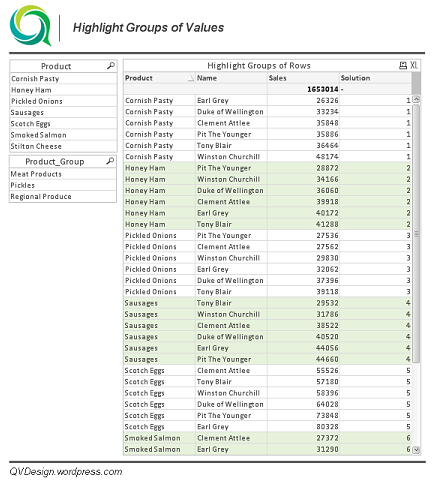
The main problem is that the fieldindex() function doesn't follow selections so the bandings can group together when elections are made, this solution uses a variable with a concat() of the dimension to band and a check as to whether the match() value is even() thus mainitaing the alternation.
I guess you could use the $Field to allow users to select which dimension they want to group across.
Hope that solves it; it's a bit cowboy but seems to work and wouldn't be too onerous if you only need it on one or two tables.
All the best,
Matt - Visual Analytics Ltd
Qlikview Design Blog: http://QVDesign.wordpress.com
- Mark as New
- Bookmark
- Subscribe
- Mute
- Subscribe to RSS Feed
- Permalink
- Report Inappropriate Content
Matt - that is genius! Now if only you could get the highlighted field to change automatically based on the first sorted dimension/expression... 🙂
- Mark as New
- Bookmark
- Subscribe
- Mute
- Subscribe to RSS Feed
- Permalink
- Report Inappropriate Content
Very nice idea Matt!
I feel bad about being critical here, only found another issue with using dimension limits, e.g. the usual suspect TopX display (test with largest 3). Any idea about that?
Regards,
Stefan
- Mark as New
- Bookmark
- Subscribe
- Mute
- Subscribe to RSS Feed
- Permalink
- Report Inappropriate Content
Hi alphie,
If you are working with pivot table, go for visual cues.
Take chart properties -> visual cues .
There you can change either the text color or the background color according to the expression you give.
Regards
Maria
- Mark as New
- Bookmark
- Subscribe
- Mute
- Subscribe to RSS Feed
- Permalink
- Report Inappropriate Content
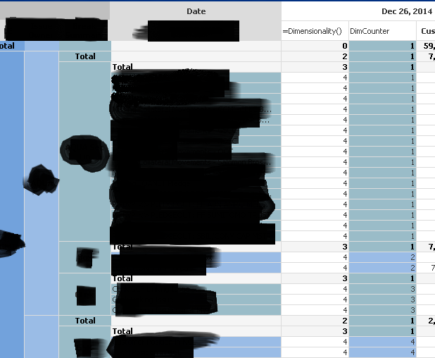
If I got it correctly - you want to alternate between groups of rows based on the dimension order by any sort.
I've done it using the rowno() function, since it returns the row number for the grouped lines in the dimension.
Here is the solution:
1. Add a hidden expression (lets call it DimCounter):
if(isnull(Above(total [AnyDimension]))=-1,1,if(RowNo()=1,above(total DimCounter)+1,Above(DimCounter)))
what this function does is simple: as long as you are in the "same" group, the value of DimCounter will be the same. when the group changes, it's adding 1 to the counter. the first "if" is for the first row in the table.
2. in the dimensions, edit the background color:
=if(Even(DimCounter),RGB(R1,G1,B1),RGB(R2,G2,B2))
and that's it.
- Mark as New
- Bookmark
- Subscribe
- Mute
- Subscribe to RSS Feed
- Permalink
- Report Inappropriate Content
Hi Doron,
Thanks for great solution!
I'm trying to implement it, but having some issues. Could you please share your knowledge on how to make a hidden expression and how to add a color based on DimCounter to a dimension? I have 3 dimensions on the left from data columns and while your solution works on the dimension next to the data, it does not on the second and third next to data dimensions and renders same color for even and odd rows; i guess due to different dimensionalities created by total rows.
Thanks,
Igor