Unlock a world of possibilities! Login now and discover the exclusive benefits awaiting you.
- Qlik Community
- :
- All Forums
- :
- QlikView App Dev
- :
- % in gauge chart
- Subscribe to RSS Feed
- Mark Topic as New
- Mark Topic as Read
- Float this Topic for Current User
- Bookmark
- Subscribe
- Mute
- Printer Friendly Page
- Mark as New
- Bookmark
- Subscribe
- Mute
- Subscribe to RSS Feed
- Permalink
- Report Inappropriate Content
% in gauge chart
Hi Everybody,
i have dimension as sales office and metric as Revenue, how ever I need to create a gauge chart for that?
how i need to display sales ofc wise revenue amount % in gauge chart?
I hope anybody can help me
Thanks & Regards
Anjani
- Tags:
- new_to_qlikview
- « Previous Replies
-
- 1
- 2
- Next Replies »
- Mark as New
- Bookmark
- Subscribe
- Mute
- Subscribe to RSS Feed
- Permalink
- Report Inappropriate Content
hi,
can u post sample data source
- Mark as New
- Bookmark
- Subscribe
- Mute
- Subscribe to RSS Feed
- Permalink
- Report Inappropriate Content
first of all do you really need gauge chart in your scenario ...i think you can use pie chart or bar chart
gauge chart dose not use dimension ... only expression you need to provide..
Thanks
BKC
- Mark as New
- Bookmark
- Subscribe
- Mute
- Subscribe to RSS Feed
- Permalink
- Report Inappropriate Content
Use TOOLS (menu) and select Quick Chart Wizard (menu choice on drop-down menu).
Then select NEXT and select GAUGE CHART .... it will guide you through it....
- Mark as New
- Bookmark
- Subscribe
- Mute
- Subscribe to RSS Feed
- Permalink
- Report Inappropriate Content
your reply is fine, however my requirement is I need to show them into gauge chart only
- Mark as New
- Bookmark
- Subscribe
- Mute
- Subscribe to RSS Feed
- Permalink
- Report Inappropriate Content
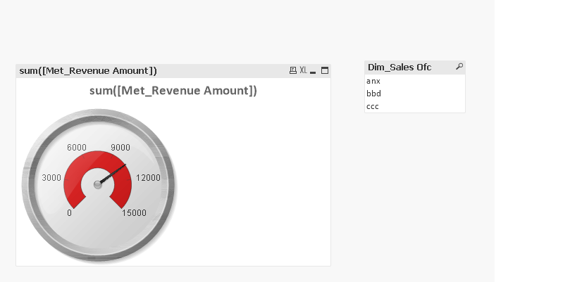
for ex:
Dim_Sales Ofc
anx
bbd
ccc
Met_Revenue Amount
2500
3500
4500
I need to show the %(percentage) of Revenue Amount for Sales ofc by using gauge chart ,
- Mark as New
- Bookmark
- Subscribe
- Mute
- Subscribe to RSS Feed
- Permalink
- Report Inappropriate Content
are u sure u need gauge chart. because gauge chart dont need dimensions
- Mark as New
- Bookmark
- Subscribe
- Mute
- Subscribe to RSS Feed
- Permalink
- Report Inappropriate Content
then you can use sum(Revenue)/sum(Total Revenue) in your expression and give then a list box (sales office filter)
so that they can select the sales office which they want to see the revenue.
Thanks
BKC
- Mark as New
- Bookmark
- Subscribe
- Mute
- Subscribe to RSS Feed
- Permalink
- Report Inappropriate Content
like this?
- Mark as New
- Bookmark
- Subscribe
- Mute
- Subscribe to RSS Feed
- Permalink
- Report Inappropriate Content
hi , thanks for your reply
I show them like this , but its not giving correct %
top(max(aggr(sum([Total Margin])/sum(TOTAL [Total Margin]),[Inventory.Sales Office Number])))
- « Previous Replies
-
- 1
- 2
- Next Replies »