Unlock a world of possibilities! Login now and discover the exclusive benefits awaiting you.
- Qlik Community
- :
- All Forums
- :
- QlikView App Dev
- :
- in pie chart values are over riding on to another ...
Options
- Subscribe to RSS Feed
- Mark Topic as New
- Mark Topic as Read
- Float this Topic for Current User
- Bookmark
- Subscribe
- Mute
- Printer Friendly Page
Turn on suggestions
Auto-suggest helps you quickly narrow down your search results by suggesting possible matches as you type.
Showing results for
Creator II
2019-03-30
01:36 AM
- Mark as New
- Bookmark
- Subscribe
- Mute
- Subscribe to RSS Feed
- Permalink
- Report Inappropriate Content
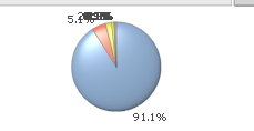
in pie chart values are over riding on to another values
hi ,
how to change the settings for the values on data points to display each and every values for the pie chart.
290 Views
3 Replies
MVP
2019-03-30
04:18 AM
- Mark as New
- Bookmark
- Subscribe
- Mute
- Subscribe to RSS Feed
- Permalink
- Report Inappropriate Content
Try to explore the different properties of the pie chart. Maybe you could put the values in a legend.
https://help.qlik.com/en-US/qlikview/November2018/Subsystems/Client/Content/QV_QlikView/Pie_Chart.ht...
However you should also consider if pie chart is the best visualization for your data? Is it easy to compare the size of the slices by the eye?
Maybe a bar or mekko chart could do the job better? Or maybe just an simple straight table?
Vegar
Qlik Community MVP
Qlik Community MVP
279 Views
MVP
2019-03-30
04:25 AM
- Mark as New
- Bookmark
- Subscribe
- Mute
- Subscribe to RSS Feed
- Permalink
- Report Inappropriate Content
There are a lot of anti pie chart evangelists and you'll find good help in finding alternative visualisations by reading some of their arguments.
Example read: https://medium.com/@KristinHenry/in-defense-of-pie-charts-and-why-you-shouldnt-use-them-df2e8ccb5f76
Example read: https://medium.com/@KristinHenry/in-defense-of-pie-charts-and-why-you-shouldnt-use-them-df2e8ccb5f76
Vegar
Qlik Community MVP
Qlik Community MVP
276 Views
Contributor III
2019-03-31
08:25 AM
- Mark as New
- Bookmark
- Subscribe
- Mute
- Subscribe to RSS Feed
- Permalink
- Report Inappropriate Content
Try something like this.
Suppose your Dimension is Region and your expression ist Spending:
1) in the expression tab Replace the expression sum(Spending) by
Dual(
Region & '-' &
Num(sum(Spending ), '#,##0') &
Repeat(chr(13)&chr(10), rank(Sum(Spending ))-6),
sum(Spending )
)
Select the Values on Data Points option.
On the Sort tab, select the Y-Value option with Descending direction.
258 Views
