Unlock a world of possibilities! Login now and discover the exclusive benefits awaiting you.
- Qlik Community
- :
- All Forums
- :
- QlikView App Dev
- :
- Re: line chart with missing data point
- Subscribe to RSS Feed
- Mark Topic as New
- Mark Topic as Read
- Float this Topic for Current User
- Bookmark
- Subscribe
- Mute
- Printer Friendly Page
- Mark as New
- Bookmark
- Subscribe
- Mute
- Subscribe to RSS Feed
- Permalink
- Report Inappropriate Content
line chart with missing data point
Hi!
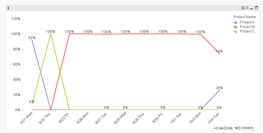
If you look at the attached file, you will see the line chart.
please take a closer look at the line that is running across relatively horizontally across the chart. the apricot color.
the thing about this line is that it has only three data points
two at the beginning of all dates and one at the very last date on the chart.
what this causes is even though the mid date range does not have any data for the apricot line, because it has data points at the beginning and at the end, the line goes across the chart. I want the line to go down to zero when the data point does not exist.
Please advise!!
Thank you in advance!
David
- « Previous Replies
-
- 1
- 2
- Next Replies »
Accepted Solutions
- Mark as New
- Bookmark
- Subscribe
- Mute
- Subscribe to RSS Feed
- Permalink
- Report Inappropriate Content
May be some manipulation in the script:
Table:
LOAD Date as TimeStamp,
Date(Floor(Date)) as Date,
Name,
[Project Name],
Count,
Hours
FROM
[https://community.qlik.com/thread/235224]
(html, codepage is 1252, embedded labels, table is @1);
TempTable:
Left Keep (Table)
LOAD Date(Min + IterNo() - 1) as Date
While Min + IterNo() - 1 <= Max;
LOAD Min(Date) as Min,
Max(Date) as Max
Resident Table;
Left Join (TempTable)
LOAD [Project Name]
Resident Table;
- Mark as New
- Bookmark
- Subscribe
- Mute
- Subscribe to RSS Feed
- Permalink
- Report Inappropriate Content
What is the expression that you are using for that line? Can you share it?
- Mark as New
- Bookmark
- Subscribe
- Mute
- Subscribe to RSS Feed
- Permalink
- Report Inappropriate Content
Sum( {<[Project Name] = {'Project1'}>} [Hours]) / Sum([Hours])
Hi Sunny!
above is the expression that I am using.
and I am also using master calendar so if I get all the data in table chart, the dates that does not have any data still shows up with all the other column simply - - - - .
let me know if you need any other info.!
- Mark as New
- Bookmark
- Subscribe
- Mute
- Subscribe to RSS Feed
- Permalink
- Report Inappropriate Content
Hey David -
Can you see if this works:
Sum({<[Project Name] = {'Project1'}>} [Hours]) / Sum([Hours]) + Avg({1} 0)
If this doesn't, would you be able to share a sample to look at?
- Mark as New
- Bookmark
- Subscribe
- Mute
- Subscribe to RSS Feed
- Permalink
- Report Inappropriate Content
Just for my curiosity, try this as well:
Sum({<[Project Name] = {'Project1'}>} [Hours]) / Sum([Hours]) + Avg(TOTAL {1} 0)
- Mark as New
- Bookmark
- Subscribe
- Mute
- Subscribe to RSS Feed
- Permalink
- Report Inappropriate Content
Hi Sunny
I tried both but nothing happened.
| Date | Name | Project Name | Count | Hours |
| 9/21/2016 7:12 | Amy | Project A | 92 | 7 |
| 9/21/2016 7:43 | Tanya | Project C | 8 | 1.5 |
| 9/22/2016 7:50 | Tanya | Project C | 6 | 1 |
| 9/23/2016 7:24 | Amy | Project B | 1224 | 3 |
| 9/26/2016 7:21 | Amy | Project B | 2136 | 7 |
| 9/23/2016 7:23 | Hannah | Project B | 406 | 1.5 |
| 9/26/2016 7:28 | Hannah | Project B | 2198 | 6 |
| 9/26/2016 7:59 | Tanya | Project B | 1000 | 2.5 |
| 9/27/2016 7:09 | Amy | Project B | 2454 | 6.5 |
| 9/27/2016 7:40 | Hannah | Project B | 2720 | 6 |
| 9/27/2016 7:53 | Tanya | Project B | 435 | 1 |
| 9/27/2016 7:54 | Tanya | Project C | 4 | 1 |
| 9/29/2016 6:55 | Amy | Project B | 2936 | 6.5 |
| 9/28/2016 7:07 | Ihm | Project B | 3087 | 8 |
| 9/28/2016 7:27 | David | Project B | 2782 | 8 |
| 9/28/2016 7:10 | Patrick | Project B | 3031 | 8 |
| 9/28/2016 7:50 | Hannah | Project B | 2504 | 6 |
| 9/28/2016 7:56 | Tanya | Project C | 7 | 1.5 |
| 9/28/2016 7:57 | Tanya | Project B | 1034 | 3 |
| 9/29/2016 7:24 | Ihm | Project B | 2836 | 6.5 |
| 9/29/2016 7:25 | Amy | Project B | 2498 | 6 |
| 9/29/2016 7:38 | David | Project B | 2785 | 7 |
| 9/29/2016 7:41 | Patrick | Project B | 3025 | 7 |
| 9/29/2016 7:48 | Hannah | Project B | 2104 | 5 |
| 9/29/2016 7:34 | Tolga | Project B | 1400 | 5 |
| 10/1/2016 6:49 | Patrick | Project B | 3043 | 8 |
| 9/30/2016 7:03 | Amy | Project B | 2756 | 7.5 |
| 9/30/2016 7:18 | Ihm | Project B | 3158 | 8 |
| 9/30/2016 7:37 | Tolga | Project B | 1001 | 4 |
| 9/30/2016 7:31 | David | Project B | 3034 | 8 |
| 9/30/2016 7:47 | Tanya | Project C | 2 | 0.5 |
| 9/30/2016 7:47 | Tanya | Project B | 1400 | 4.5 |
| 10/3/2016 7:33 | Patrick | Project B | 3050 | 8 |
| 10/3/2016 7:35 | Ihm | Project B | 3044 | 8 |
| 10/3/2016 7:46 | Tanya | Project C | 11 | 2 |
| 10/4/2016 7:32 | Hannah | Project B | 1741 | 4 |
| 10/4/2016 7:49 | Tanya | Project C | 1 | 0.5 |
| 10/4/2016 7:50 | Ihm | Project A | 300 | 8 |
| 10/4/2016 7:46 | Patrick | Project A | 310 | 6 |
Okay. let's say this is an example.
as you can see Project A has big chunk of time in between.
This is the original chart. this chart has more data than what i have provided, but above provided data will be enough for you to chart this out. the apricot color straight line is the line for project A. and as you can see since it only has data at the end of the dates line becomes straight.
Hope the dataset helps you explain this problem 
- Mark as New
- Bookmark
- Subscribe
- Mute
- Subscribe to RSS Feed
- Permalink
- Report Inappropriate Content
May be some manipulation in the script:
Table:
LOAD Date as TimeStamp,
Date(Floor(Date)) as Date,
Name,
[Project Name],
Count,
Hours
FROM
[https://community.qlik.com/thread/235224]
(html, codepage is 1252, embedded labels, table is @1);
TempTable:
Left Keep (Table)
LOAD Date(Min + IterNo() - 1) as Date
While Min + IterNo() - 1 <= Max;
LOAD Min(Date) as Min,
Max(Date) as Max
Resident Table;
Left Join (TempTable)
LOAD [Project Name]
Resident Table;
- Mark as New
- Bookmark
- Subscribe
- Mute
- Subscribe to RSS Feed
- Permalink
- Report Inappropriate Content
Hi Sunny,
I have made changes according to what you have given me but unfortunately nothing change 
but I really really want to understand what you were trying to do here.
could you explain what this is doing?
1. why did you add
LOAD Date as TimeStamp,
2. and all the codes that are in the last half...
I really want to make it work like it is working on your side.
Thanks in advance
David
- Mark as New
- Bookmark
- Subscribe
- Mute
- Subscribe to RSS Feed
- Permalink
- Report Inappropriate Content
esp. left keep / resident / IterNo.
- Mark as New
- Bookmark
- Subscribe
- Mute
- Subscribe to RSS Feed
- Permalink
- Report Inappropriate Content
1) Since date included time, I wanted to create a field which was truly just date
Date as TimeStamp,
Date(Floor(Date)) as Date,
2) All the part in red is to create a table which would include all possible combination of dates and Project Names. The problem with your original data is that not all Project Names have all the dates, right? And they are not just nulls, they are completely missing. So by the means of the code in red above, I recreated a table which included all possible combinations of Project Names and dates.
Does that make sense?
- « Previous Replies
-
- 1
- 2
- Next Replies »