Unlock a world of possibilities! Login now and discover the exclusive benefits awaiting you.
- Qlik Community
- :
- All Forums
- :
- QlikView App Dev
- :
- mini charts uses in qlikview
- Subscribe to RSS Feed
- Mark Topic as New
- Mark Topic as Read
- Float this Topic for Current User
- Bookmark
- Subscribe
- Mute
- Printer Friendly Page
- Mark as New
- Bookmark
- Subscribe
- Mute
- Subscribe to RSS Feed
- Permalink
- Report Inappropriate Content
mini charts uses in qlikview
Hi all,
I know that we have Mini charts options in list box and straight table but I want to know
what is the use of mini charts and how and where can we use the same ..
Thanks,
Venkat.
- Mark as New
- Bookmark
- Subscribe
- Mute
- Subscribe to RSS Feed
- Permalink
- Report Inappropriate Content
Hi,
Check this file, Go to Spark lines tab
Regards
ASHFAQ
- Mark as New
- Bookmark
- Subscribe
- Mute
- Subscribe to RSS Feed
- Permalink
- Report Inappropriate Content
- Mark as New
- Bookmark
- Subscribe
- Mute
- Subscribe to RSS Feed
- Permalink
- Report Inappropriate Content
If it answered,
then close this thread by selecting appropriate email.
Regards
ASHFAQ
- Mark as New
- Bookmark
- Subscribe
- Mute
- Subscribe to RSS Feed
- Permalink
- Report Inappropriate Content
Hi Venkat,
Please find the below attachment. Might be it should useful to you clarify something.......
Regards,
Habib Shaik.
Mini charts are the trend chart or bar chart in cell of a table over a period. It becomes more helpful when in one column we are showing the present value and in the next cell historical trend of that value. It will help the end user to quickly understand the trend. In excel 2010, this feature has been introduced as Sparklines chart. In Qlikview, this can be used in straight table only.
Steps for Mini chart:
Objective: Represent regional monthly sales trend.
Step 1: Create a straight table with region as dimension and sum(sale) as expression.
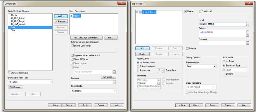
Step 2: Select expression and in display options tab select “Mini Chart”. Post that select mini chart setting, under mini chart setting, under dimension option select dimension for trend (Here select Month for Monthly trend) and we can select different mode of mini chart like sparkline, bars etc. then apply and OK.
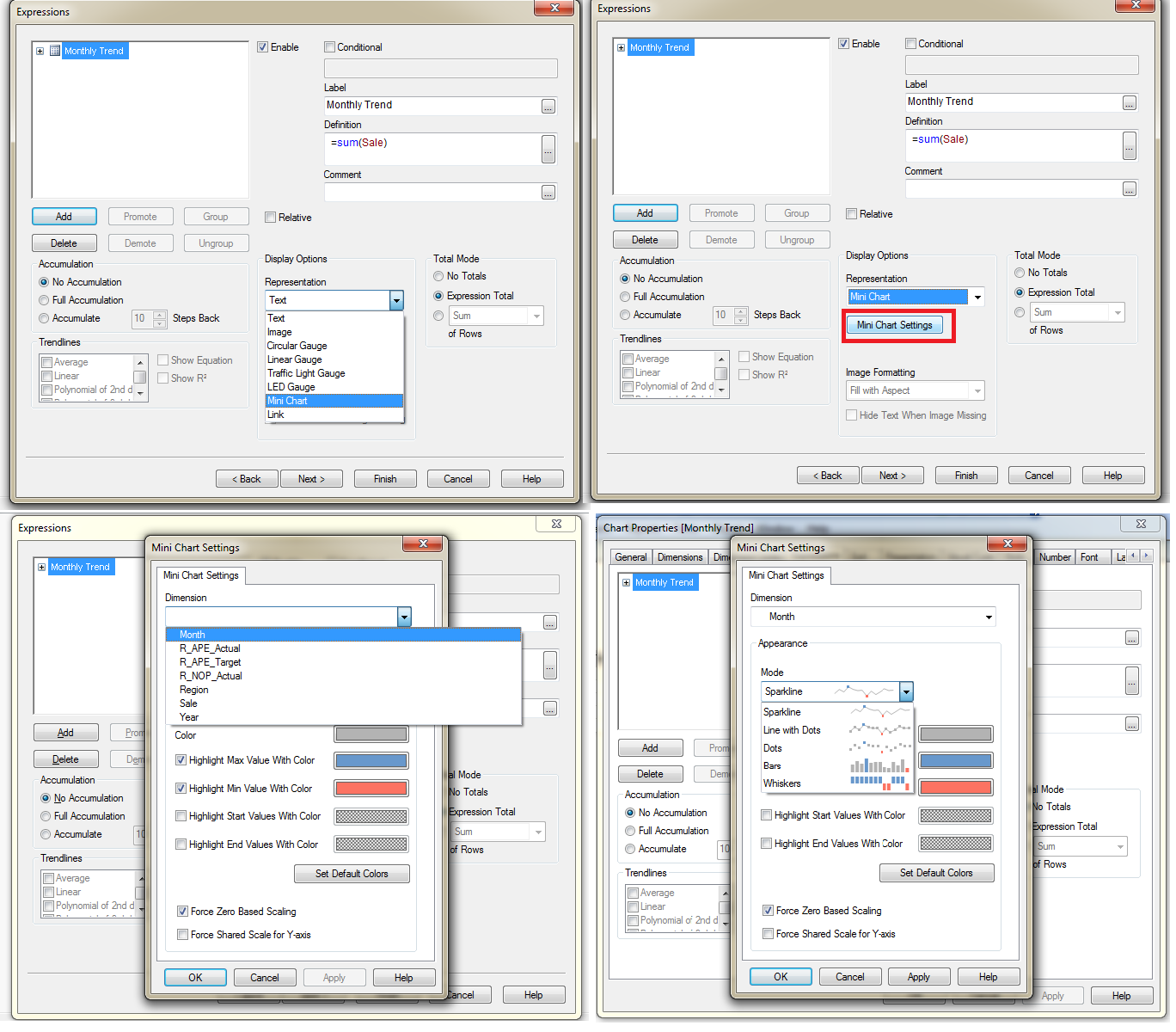
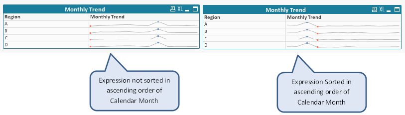
Finally we have mini chart with regional Monthly trend but here monthly trend is not in ascending order of calender month. To execute same we need to sort the expression value in sort tab.
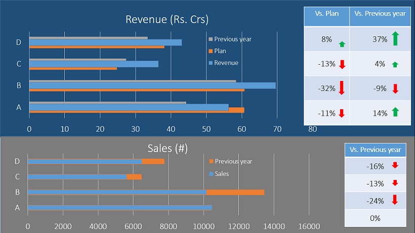
While we have improved the initial report a lot, it is still job half done! A good BI professional will spend more time thinking on following aspects of this report:
- How can I make this more visually appealing?
- How would this look on a mobile device?
- Can we simplify this or do we need all this information?
The end result of all this thinking should reflect in your application. Following is one such example of representing the same information in visually impressive manner: