Unlock a world of possibilities! Login now and discover the exclusive benefits awaiting you.
- Qlik Community
- :
- All Forums
- :
- QlikView App Dev
- :
- Re: segment reflection according to data in gauge ...
- Subscribe to RSS Feed
- Mark Topic as New
- Mark Topic as Read
- Float this Topic for Current User
- Bookmark
- Subscribe
- Mute
- Printer Friendly Page
- Mark as New
- Bookmark
- Subscribe
- Mute
- Subscribe to RSS Feed
- Permalink
- Report Inappropriate Content
segment reflection according to data in gauge chart
Hi,
I am new in qlikview, i want to make a gauge chart as doughnut chart because i want to show my values in % and reflect them in gauge chart as dark and light color which is automatically according to value.
For Example for 25% only 1/4th part of chart are fill with color & for 50% 1/2 chart is filled with different color but iam not able to do thisin single chart and also segment value is fixed it can not change when output is 50 % segment is fixed to 1/4.
for more clarification i attached a screenshot .
Accepted Solutions
- Mark as New
- Bookmark
- Subscribe
- Mute
- Subscribe to RSS Feed
- Permalink
- Report Inappropriate Content
Hi,
I know the basic classification using segment option but i do'nt want to devide on the basis of lower bound value i want my final output on the basis of calculation of % which is not fix.
i tried this using some other articles also for example :-
- Mark as New
- Bookmark
- Subscribe
- Mute
- Subscribe to RSS Feed
- Permalink
- Report Inappropriate Content
Hi Deeksha,
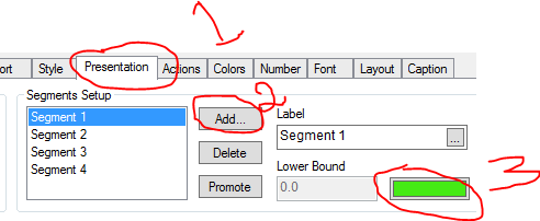
We can able to change colors for each segment color
Go to Presentation Tab--> Segments Setup(Add)-->you can add fixed number of segments how many you want.
then select the segment which you want to change the color by clicking on Color (on Right hand side).
- Mark as New
- Bookmark
- Subscribe
- Mute
- Subscribe to RSS Feed
- Permalink
- Report Inappropriate Content
Hi,
I know the basic classification using segment option but i do'nt want to devide on the basis of lower bound value i want my final output on the basis of calculation of % which is not fix.
i tried this using some other articles also for example :-
