Unlock a world of possibilities! Login now and discover the exclusive benefits awaiting you.
- Qlik Community
- :
- All Forums
- :
- QlikView App Dev
- :
- what kind of chart ?? representation to use ?
- Subscribe to RSS Feed
- Mark Topic as New
- Mark Topic as Read
- Float this Topic for Current User
- Bookmark
- Subscribe
- Mute
- Printer Friendly Page
- Mark as New
- Bookmark
- Subscribe
- Mute
- Subscribe to RSS Feed
- Permalink
- Report Inappropriate Content
what kind of chart ?? representation to use ?
hello there,
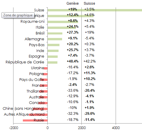
i need to recreate that kind of chart in Qlikview...any idea how ?
i have the formula for pourcentage information and the "green bar" is the value.
i do not know how to do a nice representation in qlikvew ?
please help
JP
- Mark as New
- Bookmark
- Subscribe
- Mute
- Subscribe to RSS Feed
- Permalink
- Report Inappropriate Content
One option would be to create a straight table using your calcualtions for the percent as your expressions. and get the 2 columns with the numeric data. You can then create 2 more expressions that are exactly the same but on the Expressions tab change the Display Option field from text to one of the gauge types

- Mark as New
- Bookmark
- Subscribe
- Mute
- Subscribe to RSS Feed
- Permalink
- Report Inappropriate Content
Hi,
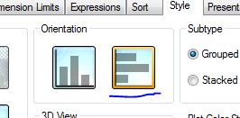
This one isn't a simple one. The closest I think you could get would be to used a bar chart. Under the style tab change the orientation to the side
As I mentioned in your other post, If you used the background colour to get the bar colours.
The hard part really would be the values to the right, you could over lay a straight table, but this could be problematic.
Another other would be either the show value option.
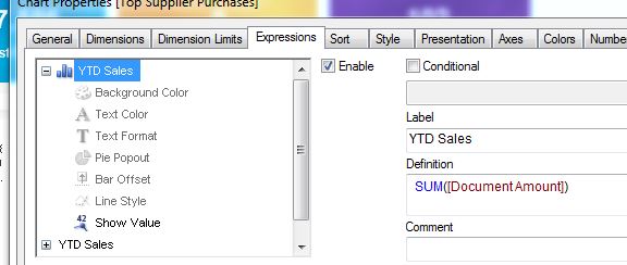
The add another expression, then in the display options untick bar and tick text on axis, but again it will be less than perfect.
Sorry I couldn't help more
Mark
- Mark as New
- Bookmark
- Subscribe
- Mute
- Subscribe to RSS Feed
- Permalink
- Report Inappropriate Content
Hi,
See the below post (it is interesting example)
Graphic to display market share.
Hope that gives you some ideas.