Unlock a world of possibilities! Login now and discover the exclusive benefits awaiting you.
- Qlik Community
- :
- Discover
- :
- Blogs
- :
- Product
- :
- Product Innovation
- :
- New Features in Qlik Sense Cloud - Segment Colors ...
- Subscribe to RSS Feed
- Mark as New
- Mark as Read
- Bookmark
- Subscribe
- Printer Friendly Page
- Report Inappropriate Content
We are pleased to share with you 2 new features available immediately in Qlik Sense Cloud:
- Segment Colors for Master Measures
- New Density Map Layer
To learn more about these new features and see them in action, check out this brief video:
Segment Colors and Density Map Layer
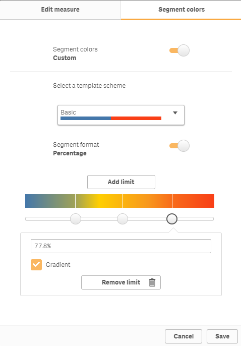
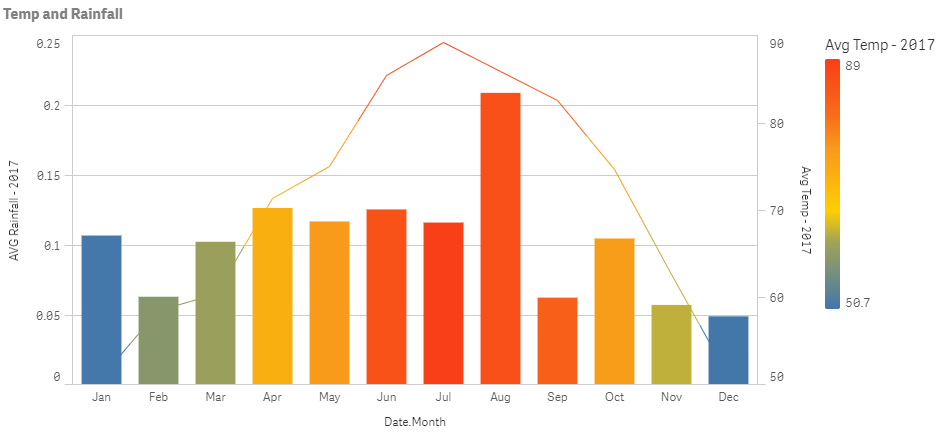
Segment Colors - for Master Measures
This new feature allows you to create and customize your own color segments for your measures that are defined within the Master Items library. You can define your individual segments along with its corresponding color and set a range for each by either using fixed values or percentages. Since the scheme is defined in the master measure, it is created one and then respected by every chart object and is consistent throughout in the app.
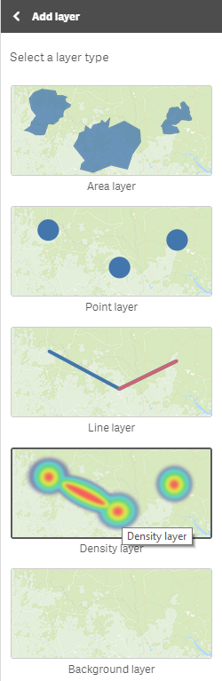
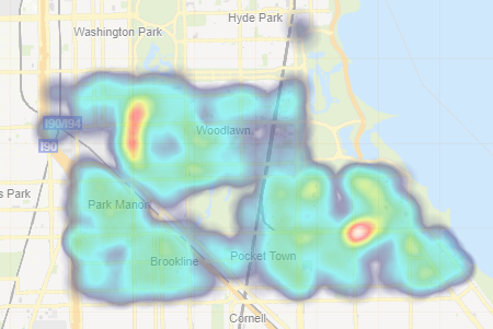
New Density Map Layer
This is a new layer available with our default map object that comes with Qlik Sense. This layer is best used with very "dense" location data, allowing you to summarized large amounts of data where your points are considered very close in proximity to one another. Depending on the number of points in a particular location the density map will reveal shapes and patterns with various colors and intensities. Indicating "dense" areas or hot spots within your data. This type of map draws your intention immediately to areas of concern or progress allowing you to make informed decisions quickly and easily.
Try them out now http://qlik.com/cloud
Can't see the video? YouTube blocked by your organization or region? No problem. Download the .mp4 to watch on your computer or mobile device.
You must be a registered user to add a comment. If you've already registered, sign in. Otherwise, register and sign in.