hic
Former Employee
Former Employee

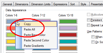
It is not uncommon that users want specific products or customers to be displayed in specific colors. The most obvious way to do this is to change the colors in the chart properties. This is in fact quite easy if you use the copy and paste functions found when you right-click a color button. Just copy one button and paste on another, and you have moved the color.


Copy and Paste.png


This way you can assign which color is to be used for the different values of the field. However, a prerequisite for this to work is that the order of the field values doesn’t change.


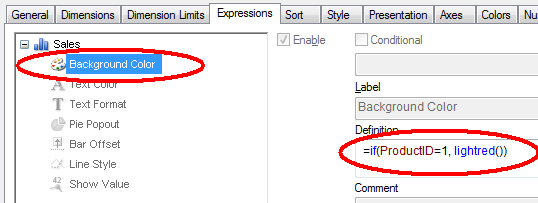
A more robust way is to use color functions. Usually, you want to set the color of a bar, line or bubble and this is done by using the “Background Color” on the Expression tab:


Color expression.png


By the way – don’t use Visual cues. This feature is old and not very versatile. Use color functions as described here instead.


In the picture above, both the product ID and the color are hard-coded in the expression. However, if you want to define colors for many products, the if-function will not be manageable. Then it is better to store this information in a table – either in the database or in an Excel sheet or as an inline statement in a scriptlet that is included in the script. Hence,


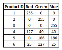
  1. Create your color definition table and store it in an appropriate place. The Red, Green and Blue columns hold the different color components and define the color uniquely.

    Color table.png
  2. Load the color definitions into a mapping table:
       ProductColors:
       Mapping Load ProductID, Rgb(Red,Green,Blue) as ProductColor From ProductColors

  3. Use this mapping table when loading the products table, creating a new field for the product color:
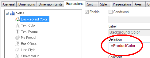
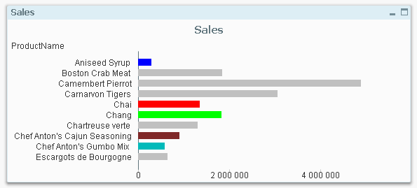
       Applymap('ProductColors', ProductID , LightGray()) as ProductColor
    The third parameter, here lightgray(), defines which color the unlisted products should get. If you instead use null(), the unlisted products will be multicolored according to the color settings in the chart properties.

  4. Finally, use this field as product color in the charts:

    Color expression2.png


This way it is easy to define which color specific products, customers, or other dimensions should get.


Which colors to use? Oh, that is a completely different topic:


HIC


Bar chart.png

34 Comments
hic
Former Employee
Former Employee

In all charts... and in pivot tables and straight tables (as background color).

HIC

0 Likes
4,354 Views
AbhijitBansode
Specialist
Specialist

Henric Cronström ,

Is there any way to apply diffrent colors on one bar.

eg: a bar showing % utlisation. if utilisation <=70% then green() , if utilisation > 70% and <=90% then Amber() else Red().


Additionaly, this is not a stacked bar , so colors based of value  of dimesion will not work here.

please suggest any idea.

0 Likes
4,354 Views
hic
Former Employee
Former Employee

If you use the following as formula for the background color, it should work:

     If(<Utilization> <= 0.7, LightGreen(),

     If(<Utilization> <= 0.9, Yellow(), LightRed() ))

The <Utilization> need to be replaced with the correct formula, e.g. Sum(UsedHours)/Sum(PossibleHours), or with a label referring to an expression.

HIC


0 Likes
4,354 Views
AbhijitBansode
Specialist
Specialist

Hi Henric, Thanks for quick response.

I think, I've not mentioned my problem statement clearly.

Above expression will change the color of whole Bar, depending upon value of expression. I don't want to do that. Instead, if value of expession id 82%, then till 70% bar color should be Green, then till 82% it should be Amber.

Another exapmle, if value of expression is 92%, till 70% , bar color should be Green(), then till 90% it should be Amber and for remaining 2 % it should be Red.

Please refer below image :

BarColor.JPG


Thanks,

Abhijit

0 Likes
4,354 Views
hic
Former Employee
Former Employee

Not possible in a bar chart. But you can do something very similar if you instead use a pivot table and choose a Linear Gauge as representation for the expression.

HIC

4,340 Views
Not applicable

couldn't you do that with three expressions and a stacked bar chart?

the first expression would be:

if(expr>.70;.70;expr)

the second would be:

if(expr>..92;.92-.7;expr-.7)

..

0 Likes
4,340 Views
AbhijitBansode
Specialist
Specialist


Thanks for the idea. I will try it out with Pivot table.

Mathias Vanden Auweele, I can't not use stacked graph here due to some other limitations.

0 Likes
4,340 Views
Not applicable

Hi, this is the expression in my line chart:

Sum({<MonthID>}Volumes)/Sum({<MonthID>}) Total <Year> (Volumes))

The colours work if I select other dimensions, but as soon as I select MonthID, the colours change to be just random and don't map properly.

Any ideas as to why this would happen would be great? 

p.s. I need to have max(MonthID) selected for the figures to be correct.

0 Likes
4,340 Views
hic
Former Employee
Former Employee

I am not sure I understand what the expression should do... The Set Analysis expressions - i.e. the {<Month>} inside your Sum() function - are incomplete. There needs to be an equal sign also. Secondly, you don't tell us what your color expression is.

I suggest you open a discussion thread with your app attached. Then it will be a lot easier to figure out what's wrong.

HIC

0 Likes
4,340 Views
Not applicable

Hi,

The Set Analysis expression for color is =ProductColor as I followed your example. The actual expression calculates volume percentages. Everything works until the field max(MonthID) is selected.

0 Likes
4,340 Views