sna
Partner - Contributor III

If I say the word “Dashboard”, most readers probably think of a software tool that gives an overview of enterprise health, rather than of a control panel in front of the driver in a vehicle.  One is in a computer, and the other is in a car, but they should play the same role; it should alert you when something is wrong.  So where do we start when creating a dashboard for business users?

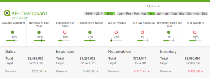
I follow a D-A-R concept:  dashboard-analysis-report.  The first QlikView tab, the dashboard, tells users what is good or bad. It’s the “what” sheet.  The next batch of tabs is for analysis and has graphs and tables which tell users “how” or “why” things are good or bad.  The last part, the report sheet, has more detailed information such as invoice details, order details, employees’ shifts and so on where users can identify the exact action item to act on.  So when creating a dashboard, it’s important to highlight the “what” in it.

The first step is to identify the key metrics.  The fewer the better.  Don’t place 50 KPI’s to try to characterize the entire company in a dashboard, but rather the major ones that matter the most.  Pick metrics that change every day if the dashboard is to be utilized daily.

Secondly, make sure all KPI’s have a comparison.  Human beings are trained to compare everything 24/7.  If your sales figure is 3 million dollars, then so what?  Is it better than yesterday’s number?  You need to place a comparison number to indicate whether it is better or worse.

Next, don’t use the color green when something is good.  If you have 4 KPI’s (key performance indicators) and two of them are green and the other two are red, then people take it as 50% good, not 50% bad.  You want users to focus on the ‘bad’ part so they can act on it.  Only color-code what is bad, that is, red.

Compare with a dashboard in a car.  It does not alert you when something is doing well, but it is designed to alert you on the bad things.  Think about the fuel light. It’s not lit in green when your car has enough fuel. Instead it alerts you when fuel is critically low.  Then it comes on in red and you notice it right away.  It grabs your attention and personally I even get nervous when I see it. 

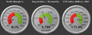
Think about a usage of gauges. A big number with a small red color indicator will do a better job to alert users than a round gauge with both green and red in it.

Gauges.png

Bottom line: When designing a dashboard, make sure to keep it as simple as possible. When a user looks at it for 10 seconds and looks away, she or he should remember what was bad.  Otherwise, it is not playing its fundamental role and is just pretty to look at.

executive dashboard2.png

Executive Dashboard on demo.qlik.com.

Here is a technical brief on this topic.

5 Comments
Anonymous
Not applicable

Love that executive dashboard.  A minimal, yet effective representation. I am a fan of your team's work.

2,967 Views
Or
MVP
MVP

That's a clean-looking dashboard, though perhaps a little short on some information I'd personally want (such as trends using sparklines). Much better than many of the typical offerings out there. One big minus - QlikView does not natively support bullet charts, which would be perfect for this sort of layout. With the current layout, it's hard to get a perspective of whether a certain KPI is particularly good or bad, and the matter is made worse by the lack of scales on the graphs, which means that we have absolutely no idea what we're looking at past the actual number displayed and the red light indicator.

As a matter of personal preference, I could also do without the green indicators for things that are going well. A simple red = bad, no color = good would work equally well and provide less distraction to the eye (as well as being more friendly on the color-blind, who I think would see your indicators as a brown empty circle and a brown full circle). This is doubly confusing in the case of this dashboard because of the stylistic choice to use green bars for the graphs, even when the actual KPI is red. I would've skipped the green indicators entirely, or at least switch the color of the graph bars to black or blue to avoid confusion.

2,967 Views
Not applicable

The idea of not using 'green' for good actually - on the face of it - makes a lot of sense. Certainly when followed with the example of a car, one can see why one might have no colour for good and a colour for bad. That said, in the example screenshots presented with the article, both had green for good, and red for bad thus ignoring this application building principle.

0 Likes
2,967 Views
sna
Partner - Contributor III

Good observation everyone on the executive dashboard snapshot. 

Some of you commented that it has green indicators at the top of the dashboard.  I would say, in this case, we used the top part as a scorecard; thus we have green, red and yellow (not shown).  However, if you look at the numbers in the middle section, 'good' numbers are not in green but only the 'bad' ones in red.  So hopefully you agree that it works well.

In terms of lacking the suppotive information for some indicators, I agree.  Though, most of the numbers can be made sense from the given numbers below.  The reason we did not place supportive information for each indicator is because we wanted to keep the dashboard simple.  As you can see, not all the supportive information has to be on the dashboard but only for the *key* metrics. 

Everyone has their personal preference of how a dashboard can be.  I appreciate your feedback, and please continue to do so.  We may incorporate your ideas on our next demos on demo.qlik.com!

2,967 Views
Or
MVP
MVP

A couple of responses -

1) I still hold to my preference - green as "Everything is OK" tends to be redundant. I've taken the libery of simply removing the green circles from the dashboard image - you're welcome to see if you think it looks better, the same, or worse this way. I personally think the red circles now attract more attention than they did before, which is the way it should be.

Dashboard.png

2) I think the gauges in the top part of the graph are somewhere between borderline useless and completely useless as they currently stand. Look at the "Expenses vs. Target" gauge and tell me what information you can derive from it, other than "We're doing OK" (which we already knew because there's no red or yellow dot). What does the intersecting line indicate (I assume 100% of target but it's hard to say for sure)? Is the scale left-to-right or right-to-left (there seems to be a mix of both in this dashboard)? What value range would result in a yellow indicator / red indicator? How close are we to these values and/or to the target?

3) I completely agree that many aspects of dashboard design - including the colors used - are subject to personal preference. I do feel, however, that some of the design decisions here are objectively inappropriate, and that the existing literature (such as Stephen Few's "Information Dashboard Design" or any of Edward Tufte's relevant work) would support the same conclusion.

Just to clarify - I like QlikView, and I think the recent sample dashboards have been trending in the right direction (sparklines, red highlighting, single-color gauge indicators rather than car-dashboard-style gauges, generally clean look-and-feel, less wasted ink). I just feel that there's still some way to go before these can be looked at as an example of truly good dashboard design (starting with the inclusion of the long-missing bullet chart).

2,967 Views