Unlock a world of possibilities! Login now and discover the exclusive benefits awaiting you.
- Qlik Community
- :
- Discover
- :
- Blogs
- :
- Product
- :
- Design
- :
- Dislike gauge charts? You may want to give them a ...
- Subscribe to RSS Feed
- Mark as New
- Mark as Read
- Bookmark
- Subscribe
- Printer Friendly Page
- Report Inappropriate Content
Gauge charts were used widely in dashboards and analytical apps a few years ago, and they still are, but when was the last time you saw a nice looking dashboard using one of those old fashion speedometers?
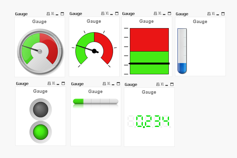
If you are an experienced QlikView user/dev, you may be familiar with Gauge charts styles as shown in the picture below. Today I would like you to explore with me how QlikView can help you to turn a boring gauge into something different.
Let´s start with a simple question, what do the following charts have in common?
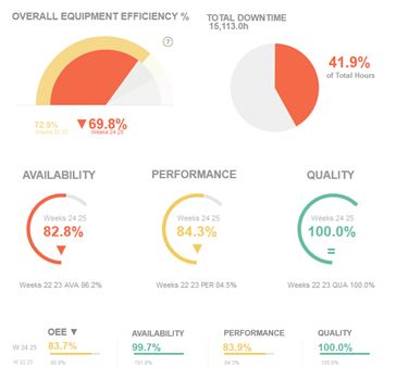
Besides the fact that all of them share the same color palette and style, and even if you haven’t notice it at a first sight, what all have in common is the chart type we picked when we created the charts. We chose a Gauge chart. Actually, all this charts are components of the new demo app called !OEE Analysis. This app is a redesign of an existing app that was created as a demonstration for the manufacturing industry.
The nature of manufacturing, coupled with the industries’ natural inclination to mimic its physical environment, drives developers to extensively use gauges and/or speedometers on dashboards. This rationale is based on the implementation of images that are familiar to engineers and people with experience using industrial machinery.
Since we started to work in the former app redesign, we had one clear goal. We wanted to keep that gauge essence in the new app, but we also needed to modernize the look of the old speedometers. To do so, we spent some time exploring different alternatives until we found how to turn them into a new set of ‘flat’ style gauges.
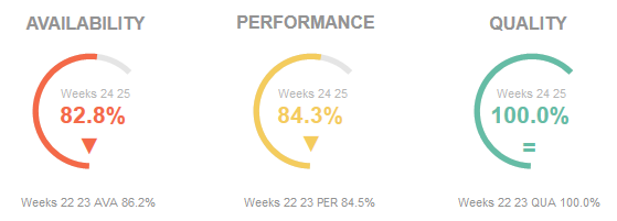
All of the new gauge styles, as in the picture above, are representing just one metric at a time (gauges don’t work well with more than one measure anyway). In addiction we are using color to emphasize the current state for each KPI so the user doesn’t really need to look for needle position to understand the data but she/he only need to identify the color code. If a color code catches the user’s attention, then she/he can spend more time looking at the details. We incorporated adjacent text objects making the whole chart much more interesting and data complete.
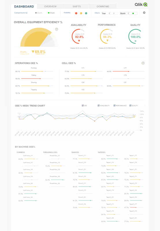
The result is a much cleaner data centric app which we managed to keep the gauge spirit on it.
Gauge charts have gained a bad reputation as data visualization objects, sometimes because they give user too little information, at times it’s all about a weak implementation, and most of times it’s because they were designed as a real-life object rather than a data centric object. After seeing the new styles we came up with, you may want to reconsider your position and give gauge charts a second chance, won’t you?
Enjoy Qliking!
AMZ
You must be a registered user to add a comment. If you've already registered, sign in. Otherwise, register and sign in.