Unlock a world of possibilities! Login now and discover the exclusive benefits awaiting you.
- Subscribe to RSS Feed
- Mark as New
- Mark as Read
- Bookmark
- Subscribe
- Printer Friendly Page
- Report Inappropriate Content
A few days ago I stumbled upon one of those little tricks that we all love. Roland Vecera came up with a nice solution to bring minicharts to Qlik Sense. It can help us to increase app data density and make our Qlik Sense tables sexy and informative again. Don't forget to add this to your bookmarks!
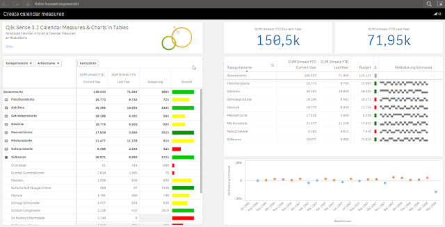
In Roland's blog post you will find instructions about how to build a linear gauge, a traffic light gauge, and even whiskers minicharts (right table in the image above),
I particularly like the linear gauge, with this technique we can now simulate small bars that goes along with each one of the table dimension items. The expression used to create the linear gauge 'bar chart' is actually reusable and very simple, looks like this:
repeat('█', rangemax(rangemin( ceil(((column(1)/column(2))-1)*10),10),1) )
The expression will paint a variable number of solid blocks █ based on a given calculation that is evaluated by row. By now you should have a nice grey bar from 1 to 10 blocks.
Next (optional) step is to apply color to it. You could add color based on any criteria you want, in the chosen example Roland is using color in the same way as he use size, both display Growth.
The text color expression looks like this in the example:
if(expression>2, argb(255,0,150,0),
if(expression>1, argb(255,0,200,0),
if(expression>0.5, yellow(),lightred())))
Where expression will be the same expression as in Growth column (Steigerung).
You can read more about minichars in tables trick at QlikView + Qlik Sense Blog von Heldendaten: Qlik Sense Calendar Measures & "Minicharts" in Tabellen
Hope you like it.
AMZ
PS: For those of you who can't read German and/or use Google translator, please check out this community doc Creating Mini Chart in Qlik Sense tables (it also contains some hacks to make this trick even more complete)
You must be a registered user to add a comment. If you've already registered, sign in. Otherwise, register and sign in.