Unlock a world of possibilities! Login now and discover the exclusive benefits awaiting you.
- Subscribe to RSS Feed
- Mark as New
- Mark as Read
- Bookmark
- Subscribe
- Printer Friendly Page
- Report Inappropriate Content
Stacked bar charts are perfect to represent the contribution of particular elements to the total, the classic example is Sales by Year and by Quarter.
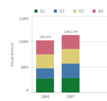
Just by observing the chart a few seconds we can conclude that Actual Amount was higher in 2007 than 2006, and it seems clear that Q2 rise in 2007 contributed significantly to the 2007 total increase in Actual Amount.
To create a simple stacked bar chart like the one in our example we've needed 2 dimensions (Year and Quarter) and one measure. Alternatively, we could recreate the chart using one single dimension "Year" and 4 expressions one per each one of the quarters. The procedure to customize the colors will depend of what type of chart you have, bi-dimensional chart or multi-expression chart, let’s start with bi-dimensional chart coloring.
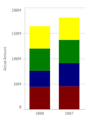
Bi-dimensional stacked bar chart
This is the simplest case, you just need to target each one of the segments (Quarters in our example) by name, you could just use an if statement to target them, something like:
if(Quarter='Q1',red(),if(Quarter='Q2',blue(), if(Quarter='Q3', green(), yellow())))
Alternatively, you could use conditional functions for a more elegant approach:
pick(match(Quarter,'Q1','Q2','Q3','Q4'),red(),blue(),green(),yellow())
Multi-expression stacked bar chart
In this scenario our data table contains one column per quarter as in the image below but we still want to represent them in one stacked chart using custom colors.
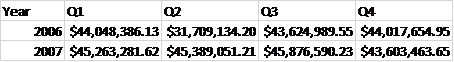
We could get a stacked bar chart using one single dimension "Year", and 4 expressions Q1,Q2, Q3 and Q4. The problem comes when trying to color the segments, at this point we can’t target specific segments anymore because each one of our segments is made of an expression.
To solve this situation, we need to work-around our chart to make it again bi-dimensional. In order to do that we’ll add a new table to our data model. Our table will contain the name of the segments for our chart, I called it [segment names] in my example.

Once the data has been loaded then it’s time to create our chart. The dimensions will be “Year” and the recently created “measure”. To complete our chart, we’ll need to add a simple if statement (or the more elegant pick&match combo) in our measure expression, similar to this one:
if(measure='Q1', sum(Q1),
if(measure='Q2', sum(Q2),
if(measure='Q3', sum(Q3),
if(measure='Q4', sum(Q4)))))
Now that our chart is standard bi-dimensional bar chart, all we need to do is to apply custom colors as described earlier in this post. So again we could use the good old if statement or pick&match to end up having customized segment colors in our stacked bar chart.
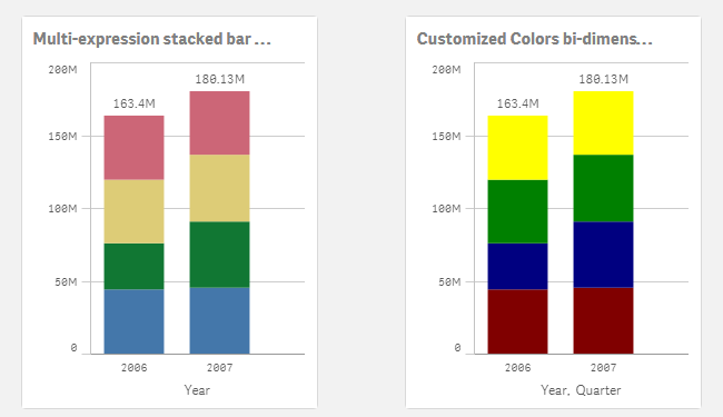
I'm attaching an example app so you can check how it's done.
I want to give credits to all the contributors to How to use custom colours in a stacked bar chart, please check that community thread if you have questions or just to learn more about custom colors in stacked bar charts.
AMZ
- « Previous
-
- 1
- 2
- Next »
You must be a registered user to add a comment. If you've already registered, sign in. Otherwise, register and sign in.