Announcements
Qlik Connect 2024! Seize endless possibilities! LEARN MORE
Not applicable

There are some common misconceptions that surround the field of Visual Design. One of them is that visual design is just the act of making something look pretty or to make something pop. However, Visual Design is more than that.

While making something looks aesthetically pleasing is one of the important parts of Visual Design, it goes beyond that to effectively communicate to people what the product or the application is all about. Visual Design if not done well cannot help the user to answer basic questions like – What is this? How do I use it? Why should I care?

These are some crucial questions that a design needs to answer in order for it to be user friendly and seamless.

For instance, Figure 1 below shows information about Silicon Yogurt stores in the United States of America and a comparison between other brands. The information below is visually appealing but the problem is that I don’t get the story.

Figure 1

i1.png

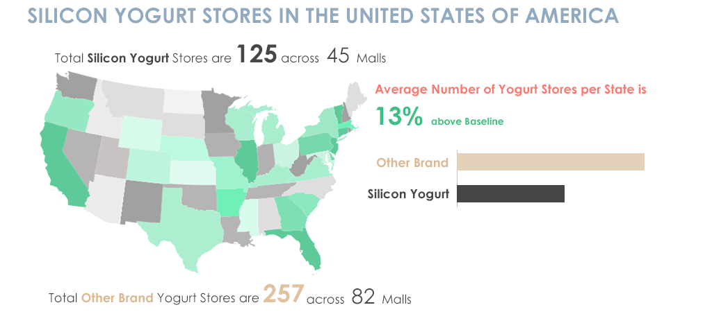
In Figure 1, the first set of information tells me about the total number of Silicon Yogurt stores and across how many malls, then my eyes go down to the average number of yogurt stores per state which is a high level information then a comparison is made between other brands and Silicon brand which again is something that talks about the detailed statistics and then it gives me information about other brands. All this information is delivered in bits and pieces and it is hard for someone to understand the point of this material as it is not organized in a proper high-level to low-level sequence.

Whereas in Figure 2 below, all elements of the visual design are the same but the information is organized is in a way that tells a story and the info graphic makes more sense.

Figure 2

i2.png

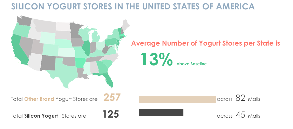
The Title introduces the topic, the map and piece of information goes hand in hand by giving a high level summary of Yogurt stores per State. Once a high level summary is given, my eyes then go to the details and a comparison is made side by side which is useful to understand instantly?

The difference between Figure 1 and 2 was only about content organization which made a huge difference in creating a story to the article, something which is an important part of visual design.

This is just one part but there are a number of other things that need to be thought about along with the look and feel of something.

  • Organizing information in an effective way
  • Looking at the design problem holistically so that everything works in conjunction with each other
  • Balancing the look and feel such that no element in the design pops up unless intentional
  • Choosing the right colors, fonts and other UI elements

These are some considerations that need to be taken care of while working on the visual design of something. And then of course there is making everything look neat and pretty.

7 Comments
Anonymous
Not applicable

Hi

I cannot derive anything meaningful from the map with the different coloured States with different shades.

Can anybody explain its meaning to me ?

Best Regards,     Bill

933 Views
Anonymous
Not applicable

Hello Apeksha:

"Pretty" doesn't mean good.

I think BI is full of "misconceptions".

Grettings.

CB.

0 Likes
933 Views
Anonymous
Not applicable

If I was forced to guess I would assume the darker the green the more Silicon Yogurt stores there are in that state vs the baseline.

0 Likes
933 Views
Or
MVP
MVP

While I completely agree with the concept you've presented here, I can't say I like your example. Look at all the monitor real-estate you've spent just to present three numbers - you haven't even given them a scale so we can tell if they're good or bad. You've also made made it hard to figure out which of the two numbers (total and number of malls) is important, and it isn't clear whether the bar graph is displaying the figure on its left or the one on its right.

I would:

1) Put the 13% value on a bullet chart or (yuck) a gauge.

2) Remove the bar chart entirely - you're comparing two figures, making it unnecessary to have a chart. People can generally eyeball the difference between two numbers - it's three or more we struggle with.

3) I have no idea why the number of malls is significant - are we looking at its ratio to the number of stores? Or is it significant on its own? If the former, display the ratio rather than the actual number. If the latter, simply displaying the textual information as in the first image, but right below each other and below the 13% number, would be best.

4) I would not use a reddish color for the "Average number.." header. Use a neutral color like blue or gray, not one that draws unnecessary attention (red suggests something needs attention).

5) If the geo-analysis is relevant here (I assume it is, or it wouldn't be displayed), make it significantly larger by allocating a much smaller portion of the monitor to the three (or five) numbers displayed in text/graphs.

I actually think the top version of the image is better than the bottom one, so while I agree that pretty isn't a goal, I don't think the example illustrates good design practices.

933 Views
Not applicable

Hi APEK

I alway like this kind of article because i know that this can help user tell the story using the data. i know which is not easy.  by the way well done for try it out. and i think you should take those feedback positively. and redo the article , since orsh ( he must be in consumer business, and he know what user are looking ) give some many constructive feedback , it is possible for you to follow his approach and create a new figure 3 , so that all of us can learn from this interesting post. or you can provide the QV doc to orsh , and he can help us to redo and make it an impressive figure.

0 Likes
933 Views
Not applicable

Great example thx, but design is also about different type of people, who prefer to process input in different ways! 

0 Likes
933 Views
Not applicable

Thank you all for your feedback. I think the example that I presented here is not explanatory enough since it is not a dashboard or an application but just an info graphic poster that I made up for the sake of elaborating the point that even with all the same UI elements, the composition is what makes a difference. But I guess, the reference point is missing. Using correct chart type is a separate discussion topic altogether.

781 Views