Unlock a world of possibilities! Login now and discover the exclusive benefits awaiting you.
- Subscribe to RSS Feed
- Mark as New
- Mark as Read
- Bookmark
- Subscribe
- Printer Friendly Page
- Report Inappropriate Content
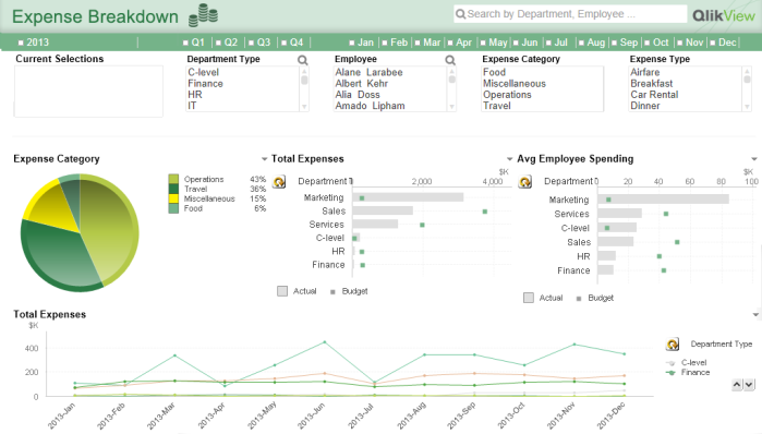
I have received a few emails from QlikView developers asking what the best practice is for placing list boxes. There are two arguments that you may think of right away.
In information design, left-side, top-left to be precise, is always used for the most important information. It is because as a human-nature that’s the space people pay attention to first. So why should I waste the space for placing the navigation pane there? I should place it on the right.
Another argument is that people are used to use left navigation because most of the web sites have menus on the left. Think about a shopping web site. All departments, categories, genders, sizes… whatever you think of usually on the left hand side. So why should I go against human’s habit and place it on the right-side? People will get confused.
I can buy both arguments. But then how about placing it at the top? I have seen QlikView applications that have navigation pane at the top. Is this the best of all? Let’s think about this in QlikView usability, with an elimination method.
Right-pane |  |
Top-pane |  |
That being said, I personally think that having the left-side pane works the best in QlikView applications, and here are the benefits.
Left-pane
|  |
Lastly, you may wonder why I have the timeline list box at the top. This is my 11-year QlikView habit. I believe it is the best to keep the timeline list boxes separated from other selection categories.
If you cannot give up the top-pane option or wish to have many list boxes on user’s figure tip, then you can use a trick. Here is an example. When you click on the ‘filter’ button, then there is a drop panel with list boxes. I recommend you using this in dashboard where you need lots of real-estate for important information. Or also you can use this together with the left-pane navigation. In this case, create list boxes for the most frequently used fields on the left for easy navigation (accessibility), and you can create the hidden panel for additional list boxes.
Now it is up to you what method you will use in your QlikView application. Will you go with a top, left, right or hidden pane?
You can also download the technical paper on this topic here.
- « Previous
-
- 1
- 2
- Next »
You must be a registered user to add a comment. If you've already registered, sign in. Otherwise, register and sign in.