Unlock a world of possibilities! Login now and discover the exclusive benefits awaiting you.
- Subscribe to RSS Feed
- Mark as New
- Mark as Read
- Bookmark
- Subscribe
- Printer Friendly Page
- Report Inappropriate Content
QlikView Standard Visualization objects have much more to offer than standard out of the box settings. This is why data centric apps developers love QlikView so much, because you can dig into every object properties expanding their usage case scenarios.
This is the case of the line chart; probably one of the oldest visualization methods available. It´s a pretty simple and straightforward way to represent data - often used to visualize a trend in data over intervals of time.
In-Chart Legend
This is a simple space saver trick; it will help you to replace QlikView standard legend with a customized in-chart legend.
Look at the chart below. It represent sales in two countries US and UK. As you can see, we don't have too much space to plot the chart and the legend. QlikView will automatically adjust the chart area to the real state in the object. In this case that will make my chart area to be really small.
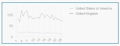
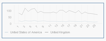
One approach could be to move the legend to the bottom. This will make my chart area much bigger, specially true for long label scenarios. On the other side, by reducing the Y axis the lines look much flatter, and in some situations that could mean that some users wont perceive small variations in the chart.
Remember: To move or/and size chart components as legends, text in charts, and chart area, press the Shift and Ctrl keys and keep them depressed while a chart is active. You will enter the chart layout edit mode.
In edit mode, thin red rectangles will appear around those components of the chart that can be sized or moved. Use the mouse drag and drop technique to move things around.
What can we do to get the best of both worlds?
Another alternative could be something like the chart below, where legends appear right next to the each line.
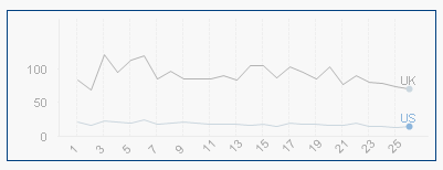
To tune a line chart to look like the image above, you will need to follow the next steps:
- Create a standard line chart as in the picture.
- Use one expression per line, we cannot use this method when the lines are created based on dimensions.
- Use Dual()
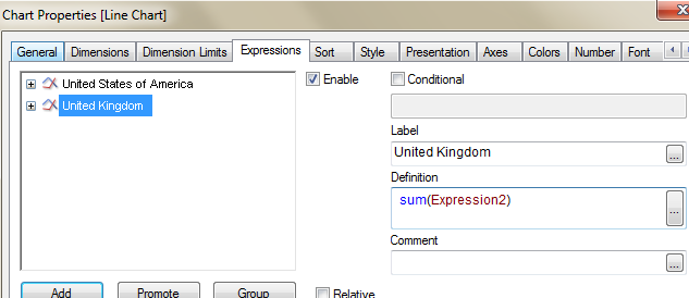
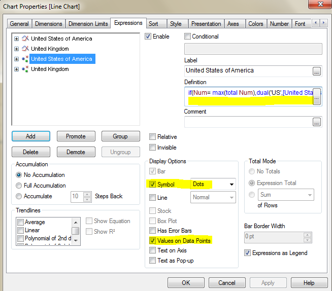
Duplicate each expression and set the definition to
if(Num= max(totalNum),dual('US',[United States of America]))
Where, Num is the dimension name,'US' will be the text displayed in the chart and [United States of America] is the number I calculated with my first expression. - To finish, remember to check Symbol and Values on Data Points for the expression.
Pros:
- This method will allow you to create mini sparkline using standard line charts.
- The most obvious advantage will be to get more space for your chart area.
- Due to in context information, in-Chart legend style will allow users to quickly consume the chart. Users doesn't need to apart their eyes from the chart to read the legend.
Cons:
- Lack of dynamism: you have to create one expression per line displayed, rather than letting QlikView to include new elements as they came to the data model.
- In situations where multiple lines have to be displayed this method may create confusion by overlapping the legends labels.
- Hard-coding expression is required.
I will post a second part on this topic with another trick soon, stay tuned!
Enjoy Qliking!
AMZ
PS: if you have tricks you want to share with our Community left us a comment 
You must be a registered user to add a comment. If you've already registered, sign in. Otherwise, register and sign in.