Unlock a world of possibilities! Login now and discover the exclusive benefits awaiting you.
- Subscribe to RSS Feed
- Mark as New
- Mark as Read
- Bookmark
- Subscribe
- Printer Friendly Page
- Report Inappropriate Content
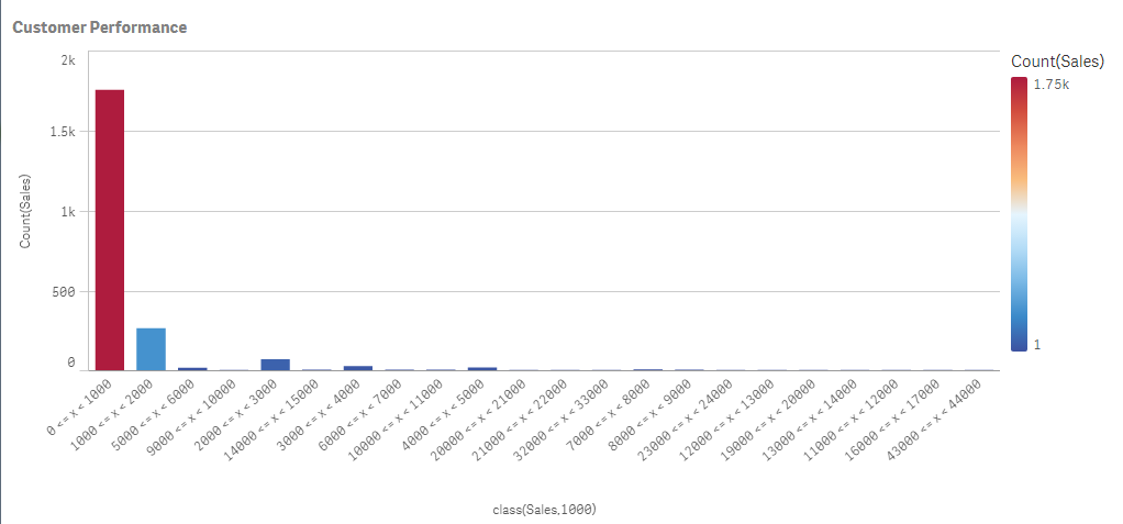
Late last week I was working with a Qlik Sense client who wanted to classify a certain range of numeric data. Basically they described it as putting certain values into their own respective "buckets" defined by high and low values. Now when I hear "range of data" along with "classify" and "buckets" or even "grouping of data" I think of a histogram.
For the most part we know that a histogram is really nothing more than a bar chart that shows the distribution of numeric data. For example, say you want to know who your strongest customers are and you want to see how many and which customer orders have sales that fall in between a certain monetary range. We can make a bar chart act like a histogram by simply defining the bar chart’s dimension using the Class() function. Simply stated, Class() can be used to classify or group, a measure into bins defined with upper and lower limits.
The Class() function takes in a few arguments. The first argument is the actual "measure field name" you would like to count and the second argument is the interval you would like to bin by. For example, let’s see how many customers have sales that fall within 0 and $1000. In my bar chart I define my dimension as class(Sales,1000), and for my measure I count the number of sales transaction using Count(Sales). In the final result you can see most of my sales consist of transactions that fell between 0 and $1000.
To see this in action watch this 60 second video on the topic.

Dimension - class(Sales,1000)
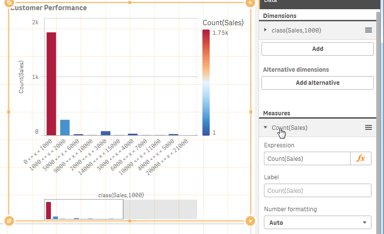
Measure - count(Sales)
 Final Result
For more chart functions like Class() be sure to visit our online help.
See the Qlik Sense sample provided in this post.
If using Qlik Sense Desktop please copy .qvf file to your C:\Users\<user profile>\Documents\Qlik\Sense\Apps and refresh Qlik Sense Desktop with F5. If using Qlik Sense Enterprise Server please import .qvf into your apps using the QMC - Qlik Management Console.
Regards,
Michael Tarallo (@mtarallo) | Twitter
Senior Product Marketing Manager
Qlik
You must be a registered user to add a comment. If you've already registered, sign in. Otherwise, register and sign in.