Announcements
Qlik Connect 2024! Seize endless possibilities! LEARN MORE
Jennell_McIntire
Employee
Employee

What is a histogram?  A histogram is a chart that allows you to visualize the distribution of data over a continuous interval or certain period.  It is made up of bars like a bar chart but instead of displaying actual counts against a dimension, a histogram displays the frequency at each interval or bin allowing you to see where the values are concentrated and where there are gaps or odd values.  A histogram is also different from a bar chart in that it does not need measures.  Only a single numeric dimension is needed to create a histogram.  Once the dimension is added to the Qlik Sense histogram chart, the frequency is automatically calculated.


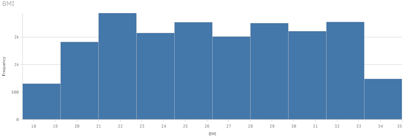
Let’s look at an example, in the histogram below, the dimension BMI (body mass index) is used to view the frequency.  After BMI was added to the chart, Qlik Sense automatically created the BMI bins based on the frequency distribution.  This chart shows that BMI is concentrated in the range 21 <= x < 22.75 (21 to 22.75, but not including 22.75).

histogram.png

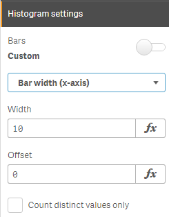
The Qlik Sense histogram chart has some properties that can be used to customize the histogram.  There is the ability to set the number of bars to a maximum number or set the width of the bars if you would like the bars to be even intervals.  Qlik Sense Help has an example of a histogram using even intervals to show temperature.

num of bars.png               bar width.png


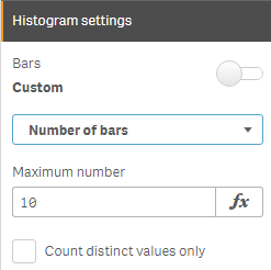
In the histogram above, the number of bars is set to 10.  When the bars are set to Auto, Sturges’ formula is used to determine the bins and this may change based on selections.


A histogram chart is ideal for a large amount of data when you need a quick visualization of frequency.  It is easy to create since only one dimension is required.  The key to remember is that the dimension field must be numeric.  Try it out with your numeric dimensions in your next Qlik Sense app.  If you are using QlikView, you may be interested in Henric Cronström’s blog Recipe for a Histogram on how to create a histogram in QlikView.  Also, check out Arturo Munoz’s blogs on the Distribution Plot chart and the Box Plot chart.  You may also find these helpful in your next Qlik Sense app.


Thanks,

Jennell

13 Comments
Lech_Miszkiewicz
Partner Ambassador/MVP

Hi

thanks for the post and histogram usage explanation.

I like the fact that Qlik is adding extra charts to out of the box object pallet. It makes it easier to build visualisation quicker.

What i do not understand though is why histogram is not in line with look and feel of the rest of the charts?

I am bringing this up, cause recently i had to use bar chart instead of histogram  in order to be able to use color by measure functionality and keep similar formatting across all charts on the sheet. The gaps between bars are also differnet in comparison to other charts (or rather there are no gaps) which makes this chart looking bit odd among others.

When i looked at what is getting selected when you actualy apply selection on histogram chart - it is essentialy using a qlik "class function" applied on the field you use when creating histogram - therefore i am scratching my head even more asking myself why is it so different in terms of look and properties from bar chart or combo chart.

any insights would be appreciated!

thank you and regards

Lech

0 Likes
2,661 Views
Michael_Tarallo
Employee
Employee

Hi Lech - thanks for your comment - please keep in mind this is the first iteration of this chart type - and with all chart types there are always improvements being made - our continuous release cycle brings features and improvements every 10 weeks to the platform across all editions of Qlik Sense.

That being said - however to address your question - this is a different type of chart - histograms technically aggregate and bin data to show frequencies - the count of values within a range - since it aggregates data it technically cannot calculate any color - in short - it is doing what a histogram does well. If you can find an instance of a histogram colored by measure - (Sales i.e.) - I will send to our viz gurus so they can look at it - but I am not sure you will find any. Let us know. Perhaps post the pic of the chart you created with the bar and I'll send it along for comparison. Thanks!

0 Likes
2,661 Views
Lech_Miszkiewicz
Partner Ambassador/MVP

Hi Michael,

I understand that technically histogram is different than any other chart but to your question regarding measure in it - it is as simple as count(of the lines) where the class belongs to.

Therefore your measure is simply frequency or count of the field you use when creating histogram. Obviously in histogram chart you do not create a measure as chart is doing that for you, but high of the bar is still your measure.

I should say - that i understand that you cannot color by any measure other than count(of the field) - my point was more down to availability to use the color palette from the image below to color bars based on their heights

So have a look at examples brought up by Jennel: Recipe for a Histogram

This example shows a workaround on how to build histogram from bar chart - and that is the way i am building histograms for clients to stay consistent with look and feel of the other charts. When i looked close at how Qlik Sense histogram chart works - it is using exactly the same methodology. That being said - some bars are higher, and some are shorter - therefore i do not see a problem why we could not color bars using the same color palette as in bar charts (ranging from blue to dark orange/brown) depending on each bar heights?

kind regards

Lech

qliksense.PNG

2,661 Views
dberkesacn
Partner - Creator III

I do the same, if you use continuous scale (Appearance / X - axis / Continuous off (custom) / Use continuous scale = true)  it looks like a Histogram and you can use Bar or Combo chart functionality for example color by expression.histogram.jpg

2,661 Views
Michael_Tarallo
Employee
Employee

Hi Lech (and Daniel - thanks for your post and visualizations) - this is exactly the information I need to see. Let me post this to plu‌ and see what he can chime in on. Thanks again guys - very valuable info.

2,661 Views
dberkesacn
Partner - Creator III

Hi Michael, is there any platform where we can suggest features which later could be evaluated during Sense future development.  Value label for stacked bar chart, where you could see each stack value and custom tooltip information would be also really good asset. Thanks, Daniel

0 Likes
2,661 Views
Michael_Tarallo
Employee
Employee

Hi Daniel - so this has come up a few times - we have an internal process we call Ideation and the Qlik rep is supposed to be your liaison for a specific request. Basically you provide your input to your local qlik rep and they should forward it on. We used to keep an ideas section in the forums, but it got out of control real fast. Let me know if you have any other questions.

0 Likes
2,303 Views
Lech_Miszkiewicz
Partner Ambassador/MVP

on top of i said above, i think the option "color by expression" would be also handy in histogram allowing us to set custom colors, based for example on tresholds

thanks

Lech

0 Likes
2,303 Views
Patrik_Lundblad
Employee
Employee

Thanks for the feedback all!

We are working on more functionalities for our new charts as well as our old ones. For example in February you will have the option to color the distribution plot by dimension. So feedback like this is good for us to know what to do next.

Thanks,

Patrik.

0 Likes
2,303 Views
Lech_Miszkiewicz
Partner Ambassador/MVP

Hi,

One of the basic functionalities currently unavailable in charts is colour each individual measure by expression. Current "by expression" solution colours all measures using the same expression which makes use of - for example - combo chart very difficult.

Imagine that you show sales as bars, budget as marks (lines) in combo chart and if sales is smaller than budget you want to colour BARS only red and Green if sales is greater than budget.

current solution where you assign colour to measure in master objects does not allow to put expressions or variable in colour code.

it would be great to see this coming to Qlik Sense

thanks and regards

Lech

2,303 Views