Unlock a world of possibilities! Login now and discover the exclusive benefits awaiting you.
- Qlik Community
- :
- Discover
- :
- Blogs
- :
- Product
- :
- Design
- :
- Rank Function
- Subscribe to RSS Feed
- Mark as New
- Mark as Read
- Bookmark
- Subscribe
- Printer Friendly Page
- Report Inappropriate Content
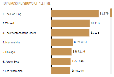
Over the years, I have seen the Rank function used in various expressions. Recently, I was working on a Broadway Shows project where we wanted to show the rank in a bar chart before the label adding a numeric indicator of how a show ranked. You can see what I am referring to in the bar charts used in the Broadway app. The bar chart below is an example of one of the charts. We added the rank before the show name on the y-axis label.
In this blog, I will discuss how the Rank arguments can be used to change how the rank is presented. To do so, I will use a simplified data set to illustrate how the rank can be displayed. Let’s start by defining the Rank function. The Rank function is a chart function and is defined in Qlik Sense Help as:
“Rank() evaluates the rows of the chart in the expression, and for each row, displays the relative position of the value of the dimension evaluated in the expression. When evaluating the expression, the function compares the result with the result of the other rows containing the current column segment and returns the ranking of the current row within the segment.
For charts other than tables, the current column segment is defined as it appears in the chart's straight table equivalent.
Syntax:
Rank([TOTAL] expr[, mode[, fmt]])”
Originally, I used the Rank function without any arguments. This will rank the products by their sales and display it before the product label.

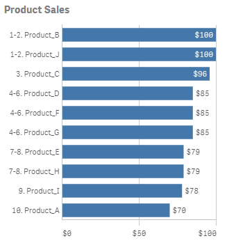
By default, with no arguments for mode and fmt, the Rank function will show the lowest and highest value displayed like a range as seen in the chart above. But what if you want to show a single number for the rank where Product_B and Product_J would show 1 as the rank for both projects since they both tied for first place. This can be accomplished by using the mode and fmt arguments. Mode can take values 0 – 4 and controls which rank is shown for each row for example show the lowest rank, the average rank or the highest rank. The fmt argument takes values 0 – 2 and controls how and where the rank is displayed. You can find the detailed description for each setting in Qlik Sense Help.
For the Broadway app, I set the mode to 4 and the fmt to 1. If I do this with this data set, I will get a chart like this:


The mode argument is 4. This will show the lowest rank on the first row, then increment by one for each row. The fmt argument is 1 and this will show the low value on all rows. When there is a tie, only the lowest rank will be displayed on the respective rows.
There are not always ties when using the Rank function but when there are, the Rank function provides options for how to handle the display of the rank. This was something I never had a need for until now but I found it to be very valuable so I thought I would share what I have learned. The next time you use the Rank function, try out the various arguments to find the display that works best for your app.
Thanks,
Jennell
You must be a registered user to add a comment. If you've already registered, sign in. Otherwise, register and sign in.