Unlock a world of possibilities! Login now and discover the exclusive benefits awaiting you.
- Subscribe to RSS Feed
- Mark as New
- Mark as Read
- Bookmark
- Subscribe
- Printer Friendly Page
- Report Inappropriate Content
When you want to look at the distribution of a measurement, a histogram is one possibility. However, if you want to show the distribution split over several dimensional values, a Box Plot may be a better choice.
You may, for instance, want to evaluate the quality of units produced in different machines, or delivered by different suppliers. Then, a Box Plot is an excellent choice to display the characteristic that you want to examine:
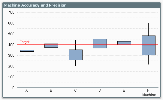
The graph clearly shows you the performance of the different machines compared to target: Machine A has the precision, but not the accuracy. Machine F has the accuracy, but not the precision.
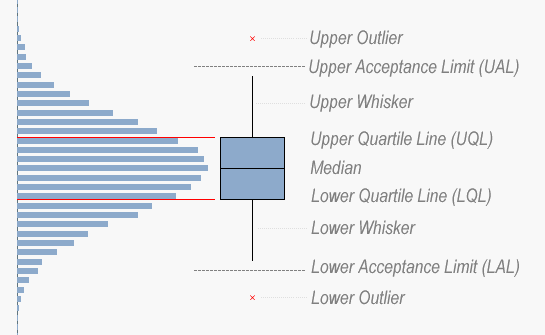
The Box Plot provides an intuitive graphical representation of several properties of the data set. The box itself represents the main group of measurements, with a center line representing the middle of the data. Usually the median and the upper and lower quartile levels are used to define the box, but it is also possible to use the average plus/minus one standard deviation.
The whiskers are used to show the spread of the data, e.g. the largest and smallest measurements can be used. Usually, however, the definition is slightly more intricate. Below I will use the definition used in six sigma implementations.
There, the whiskers are often used to depict the largest and smallest values within an acceptable range, whereas values outside this range are outliers.
The concept of the Inter Quartile Range (IQR) – the difference between the upper and lower quartile level – is used to calculate the acceptance range. Hence:
- Inter Quartile Range (IQR) = Upper Quartile Line (UQL) – Lower Quartile Line (LQL)
- Upper Acceptance Limit (UAL) = UQL + 1.5 * IQR
- Lower Acceptance Limit (LAL) = LQL - 1.5 * IQR
The picture below summarizes the box plot.
And here is how you implement this in QlikView…
- Go to the Tools menu and choose “Box Plot Wizard”.
- On the “Step 1 - Define data” page, you choose your dimension. In my example, this was Machine, but it could be Supplier or Batch or something similar.
- Use the same dimension once more in the “Aggregator” control.
- Use the average of your measurement in the “Expression” control – Avg(Measurement).
- Click “Next”.
- On the “Step 2 - Presentation” page, you should choose “Median mode”.
- Check “Include Whiskers” and “Use Outliers”.
- Click “Finish”.
QlikView has now created a Box Plot with general expressions that almost always display a meaningful result, and allows for an intermediate aggregator. However, the expressions are not what we want for a six sigma box plot, so we need to change them to the following: (Below, the dimension is called Dim, and the measurement is called Val.)
- Box Plot Middle: Median(Val)
- Box Plot Bottom: Fractile(Val,0.25)
- Box Plot Top: Fractile(Val,0.75)
The whiskers and the outliers all need a nested aggregation – each value needs to be compared to the acceptance levels for the group – so they all contain an Aggr() function that calculates the relevant acceptance limit:
- Box Plot Lower Whisker:
Min(If(Val>= Aggr(2.5*Fractile(total <Dim> Val,0.25) -1.5*Fractile(total <Dim> Val,0.75), Dim, Val), Val)) - Box Plot Upper Whisker:
Max(If(Val<= Aggr(2.5*Fractile(total <Dim> Val,0.75) -1.5*Fractile(total <Dim> Val,0.25), Dim, Val), Val)) - Lower Outlier:
Min(If(Val< Aggr(2.5*Fractile(total <Dim> Val,0.25) -1.5*Fractile(total <Dim> Val,0.75), Dim, Val), Val)) - Upper Outlier:
Max(If(Val> Aggr(2.5*Fractile(total <Dim> Val,0.75) -1.5*Fractile(total <Dim> Val,0.25), Dim, Val), Val))
And with this, I leave you to create your own box plots.
Further reading related to data classification:
You must be a registered user to add a comment. If you've already registered, sign in. Otherwise, register and sign in.