hic
Former Employee
Former Employee

“Which products contribute to the first 80% of our turnover?”

This type of question is common in all types of business intelligence. I say “type of question” since it appears in many different forms: Sometimes it concerns products, but it can just as well concern customers, suppliers or sales people. It can really be any dimension. Further, here the question was about turnover, but it can just as well be number of support cases, or number of defect deliveries, etc. It can in principle be any additive measure.


It is called Pareto analysis. Sometimes also known as 80/20 analysis or ABC analysis.


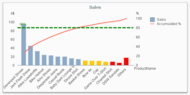
The logic is that you first sort the products according to size, then accumulate the numbers, and finally calculate the accumulated measure as a percentage of the total. The products contributing to the first 80% are your best products; your “A” products. The next 10% are your “B” products, and the last 10% are your “C” products.
 

Pareto chart.png


And here’s how you do it in QlikView:


  1. Create a pivot table and choose your dimension and your basic measure. In my example, I use Product and Sum(Sales).

  2. Sort the chart descending by using the measure Sum(Sales) as sort expression. It is not enough just to check “Sort by Y-value”.

  3. Add a second expression to calculate the accumulated sales value:
         RangeSum(Above(Sum(Sales), 0, RowNo()))
    Call this expression Accumulated Sales. The Above() function will return an array of values – all above values in the chart – and the RangeSum() function will sum these numbers.

  4. Create a third expression from the previous one; one that calculates the accumulated sales in percent:
         RangeSum(Above(Sum(Sales), 0, RowNo())) / Sum(total Sales)
    Format it as a percentage and call it Inclusive Percentage.

  5. Create a fourth expression from the previous one; one that calculates the accumulated sales in percent, but this time excluding the current row:
          RangeSum(Above(Sum(Sales), 1, RowNo())) / Sum(total Sales)
    Format it as a percentage and call it Exclusive Percentage.

  6. Create a fifth expression for the ABC classification:
          If([Exclusive Percentage] <= 0.8, 'A', If([Exclusive Percentage] <= 0.9, 'B', 'C'))
    Call this expression Pareto Class. The reason why the Exclusive Percentage is used, is that the classification should be determined by the lower bound of a product’s segment, not the upper.

  7. Create a conditional background color, e.g.
          If([Pareto Class] = 'C', LightRed(), If([Pareto Class] = 'B', Yellow()))


You should now have a table similar to the following. In it you can clearly see the classification of different products.
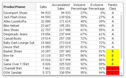
 

Table.png


In this table, there are five different expressions that you can use for Pareto analysis. The graph in the beginning of this post uses Sales and Inclusive Percentage for the bars and the line, respectively; and Pareto Class for the coloring of the bars.


Further, you may want to combine the Pareto Class and the Exclusive Percentage into one expression:


     Pareto Class =
         If(RangeSum(Above(Sum(Sales),1,RowNo())) / Sum(total Sales) <= 0.8, 'A',
         If(RangeSum(Above(Sum(Sales),1,RowNo())) / Sum(total Sales) <= 0.9, 'B', 'C'))


Good luck in creating your Pareto chart.


HIC


Further reading related to this topic:

Recipe for an ABC Analysis

Recipe for a Pareto Analysis – Revisited

128 Comments
Not applicable

Hi,

I seem to be having an issue with my Percentages.  My Total and Accumulated columns are fine however the Inclusive and Exclusive percentages look way out.....  :

My Inclusive Percentage expression is :

RangeSum(Above(sum({ <[Indicator Number] = {313}>} Number), 0, RowNo())) / sum( { <[Indicator Number] = {313}>} [Line Total])

My Exclusive Percentage expression is :

RangeSum(Above(sum({ <[Indicator Number] = {313}>} Number), 1, RowNo())) /  sum( { <[Indicator Number] = {313}>} [Line Total])

Any help appreciated.

Tom

0 Likes
800 Views
Not applicable

Hi hic

As usual it was another informative article from you. I have a question, maybe i haven't really understood the concept correctly and will appreciate some insights from someone of your calibre.

When we talk of the Pareto Analysis or to say 80:20 rule we are trying to derive something like 20% of the Customers generate 80%(or maybe 75 - 90%) Sales. In the example above and most of the examples ive seen shows which Customers account for 80% of the Sales but it never takes into account the percentage those Customers account for ie it shows the 80% side of the concept but takes for granted the 20% part of the concept. Is this how this is supposed to be or am i missing something. Though it is likely to be the latter, i would appreciate your feedback/explanation on this.

Warm Regards

0 Likes
800 Views
hic
Former Employee
Former Employee

To say that "20% of the Customers generate 80% of the Sales" is just a rule of thumb. In other words - a gross over-simplification. But it could also be a hypothesis that you want to test.

The above analysis gives you a tool to test this hypothesis. The method really answers the question "Which customers contribute to the first 80% of the sales?" The answer is different in different data sets. In your data, it could be 10% of the customers. Or it could be 40%. In any case, it is a tool that will help you understand your own data and help you prioritize your customers.

HIC

800 Views
JoaquinLazaro
Partner - Specialist II

Hi hic

I've just created a Pareto chart following this instructions, it works fine without problems; thanks for sharing it.

I have Product as dimension, sum(sales) as bar-expression and ABC as curved line expression

Now I would like to ask you a little variant, how can I paint n Pareto Curves one for each company ?

Thanks,

Joaquín

0 Likes
800 Views
hic
Former Employee
Former Employee

You can't.

The Product sort order is different for different companies, so it wouldn't make sense to show several companies in a pareto chart.

HIC

835 Views
Not applicable

Thank you for your email.

Currently I am not able to respond to your email. I will be back in the office on Wednesday the 11th ofFebruary.

With Kind regards, Mit freundlichen Grüßen, Met vriendelijke groet,

COEN RISPENS

Business Intelligence

c.rispens@essenzahome.nl <mailto:m.bree@essenzahome.nl>

Industrieweg Noord 12

3958 VT Amerongen

The Netherlands

Info@essenzahome.nl <mailto:Info@essenzahome.nl>

ESSENZAHOME.NL

0 Likes
835 Views
JoaquinLazaro
Partner - Specialist II
0 Likes
835 Views
ebrambilla
Contributor III
Contributor III

Hello Mr. hic,

I need to build a more complex Pareto Analysis.

Let's say I already built 2 pareto charts, the first related to Previous Year and the second related to Current Year. I want to analyze now class status changes to build a new report listing all class changes occurred in the form: <Previous Year Class->Current Year Class>  i.e. A->A, A->B, B->A, etc.

For example:

CUSTOMERPREVIOUSCURRENT
CHANGE
Customer 01ABA->B
Customer 02BCB->C
Customer 03BAB->A

The only idea I have is to export the two pareto charts in .qvd format, and then re-import them again, building at script level a single new table.

But this requires macro development.

Could you suggest a different solution to this problem?

Thank you!

Emilio.

0 Likes
835 Views
hic
Former Employee
Former Employee

It sounds as if you don't need a dynamic classification, i.e. you don't want the classification to change with your selections. If so, you could use the above logic, but in the script instead of in a chart. And then you could do it for Customers and per year.

Do you have some sample data? This could make a good blog post...

HIC

835 Views
sohailansari201
Creator
Creator

Very Nice!

HIC, do you have other examples that explains different kind of Analysis/Charts like this one? As a BI Developer, I always strive to choose the best visual for the available data.

Thank you,

0 Likes
835 Views