hic
Former Employee
Former Employee

“Which products contribute to the first 80% of our turnover?”

This type of question is common in all types of business intelligence. I say “type of question” since it appears in many different forms: Sometimes it concerns products, but it can just as well concern customers, suppliers or sales people. It can really be any dimension. Further, here the question was about turnover, but it can just as well be number of support cases, or number of defect deliveries, etc. It can in principle be any additive measure.


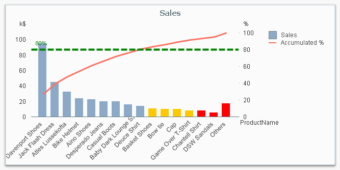
It is called Pareto analysis. Sometimes also known as 80/20 analysis or ABC analysis.


The logic is that you first sort the products according to size, then accumulate the numbers, and finally calculate the accumulated measure as a percentage of the total. The products contributing to the first 80% are your best products; your “A” products. The next 10% are your “B” products, and the last 10% are your “C” products.


Pareto chart.png


And here’s how you do it in QlikView:


  1. Create a pivot table and choose your dimension and your basic measure. In my example, I use Product and Sum(Sales).

  2. Sort the chart descending by using the measure Sum(Sales) as sort expression. It is not enough just to check “Sort by Y-value”.

  3. Add a second expression to calculate the accumulated sales value:
         RangeSum(Above(Sum(Sales), 0, RowNo()))
    Call this expression Accumulated Sales. The Above() function will return an array of values – all above values in the chart – and the RangeSum() function will sum these numbers.

  4. Create a third expression from the previous one; one that calculates the accumulated sales in percent:
         RangeSum(Above(Sum(Sales), 0, RowNo())) / Sum(total Sales)
    Format it as a percentage and call it Inclusive Percentage.

  5. Create a fourth expression from the previous one; one that calculates the accumulated sales in percent, but this time excluding the current row:
          RangeSum(Above(Sum(Sales), 1, RowNo())) / Sum(total Sales)
    Format it as a percentage and call it Exclusive Percentage.

  6. Create a fifth expression for the ABC classification:
          If([Exclusive Percentage] <= 0.8, 'A', If([Exclusive Percentage] <= 0.9, 'B', 'C'))
    Call this expression Pareto Class. The reason why the Exclusive Percentage is used, is that the classification should be determined by the lower bound of a product’s segment, not the upper.

  7. Create a conditional background color, e.g.
          If([Pareto Class] = 'C', LightRed(), If([Pareto Class] = 'B', Yellow()))


You should now have a table similar to the following. In it you can clearly see the classification of different products.


Table.png


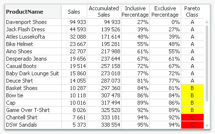
In this table, there are five different expressions that you can use for Pareto analysis. The graph in the beginning of this post uses Sales and Inclusive Percentage for the bars and the line, respectively; and Pareto Class for the coloring of the bars.


Further, you may want to combine the Pareto Class and the Exclusive Percentage into one expression:


     Pareto Class =
         If(RangeSum(Above(Sum(Sales),1,RowNo())) / Sum(total Sales) <= 0.8, 'A',
         If(RangeSum(Above(Sum(Sales),1,RowNo())) / Sum(total Sales) <= 0.9, 'B', 'C'))


Good luck in creating your Pareto chart.


HIC


Further reading related to this topic:

Recipe for an ABC Analysis

Recipe for a Pareto Analysis – Revisited

128 Comments
rameen
Partner - Contributor

Hi Henric,

Very useful post. I want to display the count of products and their names in a text box that have contributed to first 25% of the turnover. Is it possible to do it outside of a chart? The pre-requisite is to sort the sum(Sales) in descending order. How does one do that in a single expression and then do a cumulative sum?

Would look forward to your response.

Thanks and Regards

0 Likes
596 Views
hic
Former Employee
Former Employee

No, unfortunately this is today not possible. But we are looking at possibilities to do this in future versions. Basically, you would need an Aggr() function with a sorted output vector. And today Aggr() cannot be sorted.

What you could do, is to use an ABC-categorization based on rank rather than Pareto.

See Re: Pareto analysis with classification. How filter a single customer (whit correct classification)?

HIC

0 Likes
596 Views
Not applicable

Very useful and easy to make.

Thanks a lot

0 Likes
596 Views
kkkumar82
Specialist III
Specialist III

Hi Henric,

I have a similar requirement where I have input box which holds some dimensions and a straight table with out dimension but with some expressions, like

1. Total spend

2. 80% spend(Top Spend)

3. 20% spend (Tail Spend)

4. Top count(80% spend, count of a selected dimension in the input box which are involved in 80% spend)

5. Tail count(20% spend ,count of a selected dimension in the input box which are involved in 20% spend)

for the fourth column the customer want to see count of selected dimension(i.e. product) involved in 80% spend like wise, similarly fifth count of 20% spend dimensions.

I used expression for 4 as

-Sum(aggr(rangesum(top(sum(Spend),1,rowno()-1))/rangesum(top(sum(Spend),1,noofrows())),

$(SpendDriverDimension))<0.8)

but this expression is not working fine with some of the input box values(dimensions), the variable which I am using in the input box is $(SpendDriverDimension).


I think that top() functions cannot be used with out dimensions, please suggest any alternatives.

Thanks

Kiran Kumar

0 Likes
596 Views
JonasValleskog
Partner - Creator
Partner - Creator

Hi Kiran,

Just took a glance at your expression, here are some tangential pointers that may (or may not) help - no solution, just a bit of background information on what is going on in your current expression :

The Top function is evaluating the expression Sum(Spend) as per the first record in your aggregate dimension listing. It is dependent on the sort order of your aggregate. The Aggr() function does not contain a 'SORT BY' clause as per HIC's comment above and it is definitely not affected by the outer sort order set in your chart. So what exactly does the Top() function evaluate across in your instance? It's actually dependent on the LOAD ORDER of each of your dynamically referenced dimensions. I.e. if at time of refresh, you load your $(SpendDriverDimension) with attributes orders sorted A-Z, then Top() would evaluate the record relating to your first alphabetically sorted dimension value. This is unlikely going to meet your requirement.

The lack of dynamic sort order in the Aggr() function is a significant restriction in achieving these type of result sets. HIC - can we get some form of explicit commitment on sort order in Aggr() statement being on the road map for a future version? I first raised an ideas submission for this back in 2010. Anyone wishing to up the visibility of this feature, follow this link and vote it up

This is one of my most commonly encountered restrictions when building analytical client solutions...

My two pennies for what it's worth.

Regards

Jonas

0 Likes
596 Views
kkkumar82
Specialist III
Specialist III

Hi Jonas/HIC,

Is there a way that we can achieve it or it depends on the sort capability of aggr().

Thanks

Kiran Kumar

0 Likes
596 Views
hic
Former Employee
Former Employee

@ kiran

No, I don't know of any way to achieve this if you want to base your classification on a sorted, accumulated number. But you can do it if you base it on the ranking.

See Recipe for an ABC Analysis

or Re: Pareto analysis with classification. How filter a single customer (whit correct classification)?

@ Jonas

No, you cannot gen an explicit commitment from Qlik. Qlik is a public company, and as such we are not allowed to spread information about our plans that way. But I can promise you that I, personally, will work for this.

Concerning the technical solution: A sorted Aggr() would do the job. But a better alternative would perhaps be to introduce a function ParetoRank() that returns the number you want. Compare with Rank() that returns an integer 1..N, depending on where this Customer/Product is ranked: ParetoRank() would be similar, but the number would be a float between 0 and 1; like a percentage. In both cases, the best Customer/Product would have the lowest value and the worst would have the highest.

HIC

0 Likes
557 Views
gautik92
Specialist III
Specialist III

very helpful.

0 Likes
557 Views
Not applicable

How do I use more than one Dimension? I need to add Code Product and Segment Product in the table.

What do I need change in these expressions?

Tks.

0 Likes
557 Views
Not applicable

Thx! Great explanation!

0 Likes
557 Views