Unlock a world of possibilities! Login now and discover the exclusive benefits awaiting you.
- Subscribe to RSS Feed
- Mark as New
- Mark as Read
- Bookmark
- Subscribe
- Printer Friendly Page
- Report Inappropriate Content
An ABC analysis is a dynamic bucket classification of e.g. products, based on some property, usually the sales number. The best products are your "A" products and the worst are your "C" products.
It is used in all types of business intelligence applications and can appear in many different forms: It can concern any dimension, e.g. customer, supplier, sales person, etc. and be based on any measure. The sales number is one example, but it can just as well be e.g. number of support cases, or number of defect deliveries, etc.
One way to make an ABC analysis is to use a Pareto analysis where the classification is based on the accumulated number after the entities have been sorted according to their numbers. The products contributing to the first 80% are usually the A products.
However, the Pareto analysis, as described in the above blog post, is sometimes limiting: It is for instance not easy to use several dimensions, and it is not possible to define the ABC classes as a dimension. Hence, it is sometimes better to use an alternative classification function:
The Rank.
QlikView has a Rank() function that is well suited for this purpose. With it, you can rank any dimension according to any expression. You can use several dimensions and you can define your ABC classes as dimensions. The logic is that you calculate a relative rank, i.e. you divide the rank of the product with the total number of products:
(Rank(Sum(Sales),1)-1) / Count(distinct total Product)
If this number is lower than 0.5 the product belongs to the better 50% and thus to the “A” products. Similarly you can use 0.75 as a limit for belonging to group “B”. The result will be very similar to a Pareto analysis.
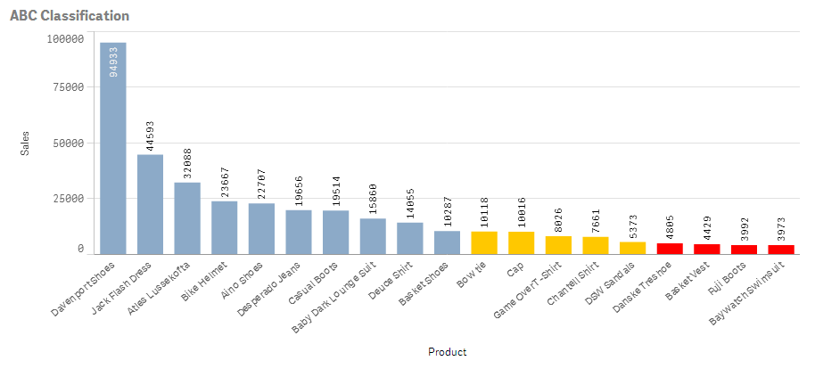
One possibility is to use colors to display the classification:
- Create a bar chart and choose your dimension and your basic measure. In the example below, I use Product and Sum(Sales) labeled as “Sales”.
- Set the color of the bars to
If((Rank(Sum(Sales),1)-1) / Count(distinct total Product) < 0.50, RGB(140,170,200),
If((Rank(Sum(Sales),1)-1) / Count(distinct total Product) < 0.75, RGB(255,200,0), LightRed()))
In QlikView you do this under the expression “Background color” and in Qlik Sense you do it under “Appearance” – “Colors and Legend” for the object.
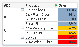
But you can also use this method to create a field or a calculated dimension, which means that you can make the ABC classes selectable:
Aggr( If((Rank(Sum(Sales),1)-1) / Count(distinct total Product)< 0.50, 'A',
If((Rank(Sum(Sales),1)-1) / Count(distinct total Product)< 0.75, 'B', 'C')),
Product)
Finally, if you want to use ranking in a two-dimensional chart, you can use the same logic. However, you must first decide how the rank should be calculated. Normally you would want the ranking to be done within each group defined by the second dimension, i.e. per column in a pivot table:
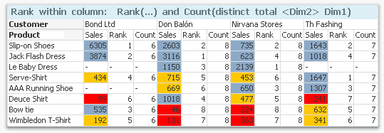
The above chart shows sales per product and customer. The colors define the classes and the rank and the count is done within each column, i.e. the products are classified within each customer. The following expression was used:
If((Rank(Sum(Sales),1)-1) / Count(distinct total <Customer> Product)< 0.50, RGB(140,170,200),
If((Rank(Sum(Sales),1)-1) / Count(distinct total <Customer> Product)< 0.75, RGB(255,200,0), LightRed()))
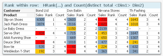
But you may also want to do the ranking within each group defined by the first dimension, i.e. classify the customers within each product. Then you need to swap place of Customer and Product in the formula, and you need to use HRank() instead:
If((HRank(Sum(Sales),1)-1) / Count(distinct total <Product> Customer)< 0.50, RGB(140,170,200),
If((HRank(Sum(Sales),1)-1) / Count(distinct total <Product> Customer)< 0.75, RGB(255,200,0), LightRed()))
Good luck in creating your ABC analysis!
Further reading related to this topic:
You must be a registered user to add a comment. If you've already registered, sign in. Otherwise, register and sign in.