Unlock a world of possibilities! Login now and discover the exclusive benefits awaiting you.
- Subscribe to RSS Feed
- Mark as New
- Mark as Read
- Bookmark
- Subscribe
- Printer Friendly Page
- Report Inappropriate Content
In the Qlik Sense September 2020 release, many improvements were made to reference lines. Now, a dimensional reference line can be added to a bar chart or a line chart and there are additional formatting options as well. In this blog, I will show 2 examples of dimensional reference lines. In the first example, I will show how text can be used to add a dimensional reference line to a discrete axis bar chart. In the second example, I will show how dimensional reference lines can be added to a continuous axis line chart.
Example 1
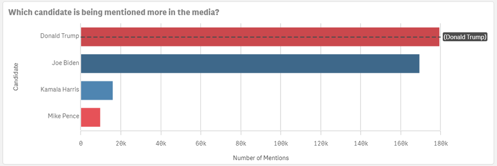
In the chart below, a dimensional reference line is used to highlight the bar for Donald Trump.
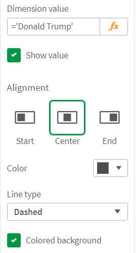
This reference line is created by setting the Dimension value to ='Donald Trump' which is simply text. In this example, the line type is set to dashed and the colored background checkbox is checked. The alignment of the chart is set to center so that the line goes through the bar versus above (start) or below (end) the bar. Some of the properties set can be seen in the image below.
Example 2
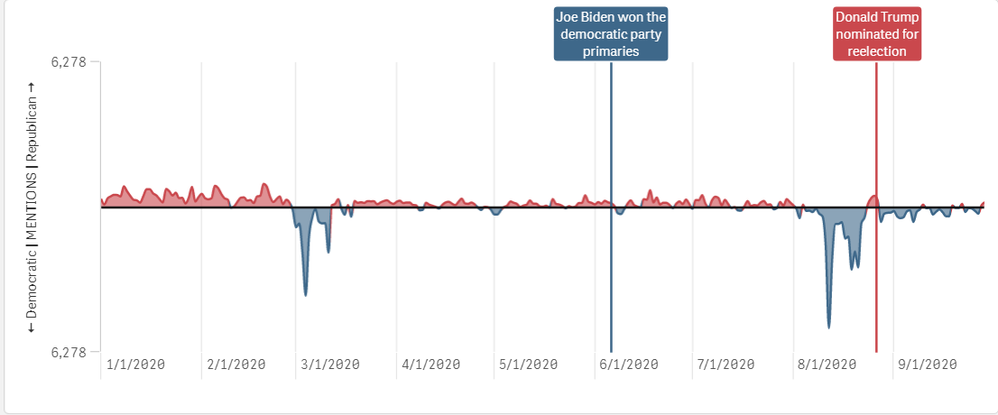
The second example of dimensional reference lines can be seen in the continuous line chart below. This line chart shows the net difference in media mentions each party receives. The red line is for Donald Trump and Mike Pence mentions and the blue line is for Joe Biden and Kamala Harris mentions. The reference lines point out key moments leading up to the 2020 presidential election so you can see if the media talk was based on a specific event. Check out the 2020 Presidential Election app to see this chart in action.
In this example, the reference lines are based on the date of the event and the labels and lines are styled to match the candidate party color. The new formatting features available in the Qlik Sense September 2020 release makes it easy to identity events for a specific party. There are other options available for dimensional reference lines. You can also set a show condition to determine when the reference line is displayed. This is what was done in the 2020 Presidential Election app – the selected key campaign event is displayed in the line chart. There is also the option to show the label and the value. The label can be hard-coded, or it can be an expression. The same is true for the reference line expression. The color of the label can be set to any color and the line type can be solid or dashed.
Learn more about reference line improvements and other new Qlik Sense enhancements in the What's New - September 2020 app and video.
Thanks,
Jennell
You must be a registered user to add a comment. If you've already registered, sign in. Otherwise, register and sign in.


