Unlock a world of possibilities! Login now and discover the exclusive benefits awaiting you.
- Qlik Community
- :
- Discover
- :
- Blogs
- :
- Product
- :
- Design
- :
- Replacing images with Geometric Shapes as visual c...
- Subscribe to RSS Feed
- Mark as New
- Mark as Read
- Bookmark
- Subscribe
- Printer Friendly Page
- Report Inappropriate Content
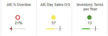
The use of icons and other visual cues has been proved as a great value asset in data visualization.
Icons let people to better understand complex information. Another good thing about icons is that they let us communicate globally. An up-pointing triangle is universally understood as a representation of growth.
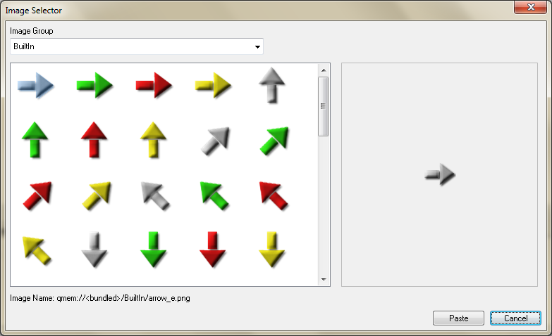
QlikView brings you the possibility to choose from a predesigned set of visual indicators.
A good alternative to the standard icons is the Unicode Geometric Shapes set.
“Unicode is a computing industry standard for the consistent encoding, representation and handling of text expressed in most of the world's writing systems.” (Source Wikipedia).
 Geometric Shapes is a set of visual indicators that effectively work as a text character. This means, you could use it everywhere you can write text in QlikView. Text objects, captions, cells, sheet titles, etc.
The main advantage of using Unicode Geometric shapes over images is the fact that you can control their properties, like size and color as any other text character. You could, for example, set up an expression to change the color based on an expression.
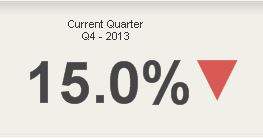
Another good example of how to take advantage of Unicode Shapes is including them as a part of number format pattern. You can predetermine how the shape will look for positive and negative values.
▲ #,##0.0%; ▼ #,##0.0%
Using this pattern will let you integrate an icon inside a cell like as in Change column in the table below.
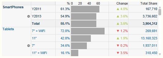
Color is, in some situations, not enough to differentiate from one state to another. Using different fills or patterns will help color blind people to identify differences.
To include any of these shapes into your next QlikView project you just need to copy the shape from here and paste it where needed.
0 | 1 | 2 | 3 | 4 | 5 | 6 | 7 | 8 | 9 | A | B | C | D | E | F | |
U+25Ax | ||||||||||||||||
U+25Bx | ||||||||||||||||
U+25Cx | ||||||||||||||||
U+25Dx | ||||||||||||||||
U+25Ex |
Note: Remember to test your app to make sure it renders properly on every possible browser.
Enjoy Qliking!
AMZ
Update: Here you can get a working app with some examples on how to use these shapes.
You must be a registered user to add a comment. If you've already registered, sign in. Otherwise, register and sign in.