Unlock a world of possibilities! Login now and discover the exclusive benefits awaiting you.
- Subscribe to RSS Feed
- Mark as New
- Mark as Read
- Bookmark
- Subscribe
- Printer Friendly Page
- Report Inappropriate Content
When creating a chart in QlikView that has multiple expressions, a legend is created for each expression. Sometimes, I find that the legend takes up too much space and I spend time trying to move it or adjust the wording in my expression labels so that they are not too long just so I can show my chart and gain as much real estate on my sheet as possible. Now I have the option to turn the expression legends off but without them you will have no idea what the chart is showing. So I explored other ways to show a legend without cluttering my sheet. In the Social Media Data Analysis demo, I had several visualizations that compared six companies. If I used the expression legend in the line chart and the bar chart (Tweets over time section), it would have taken up a lot of space and been a little redundant as seen in the image below.
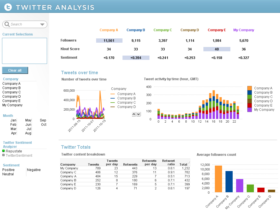
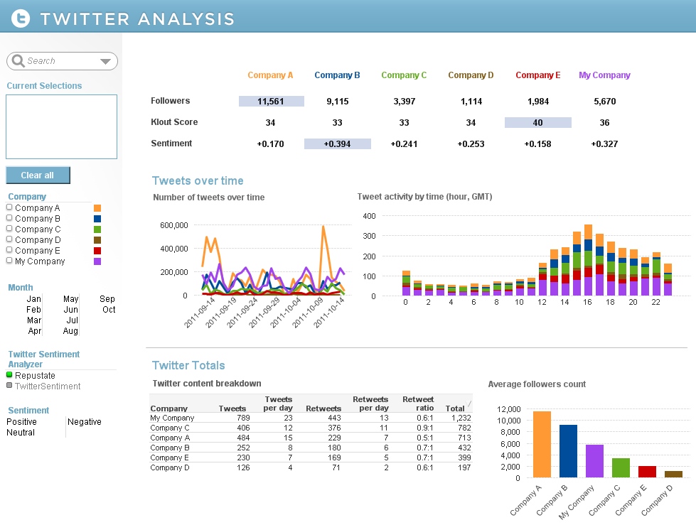
So instead, I added a silent legend to the Company List Box by adding Text Objects that corresponded to each company. I set the style of the List Box to LED so that the companies were always listed in the same order and I added actions to the Text Objects so that users could make selections using either the company name or color. This allowed me to remove the expression legends in my line and bar chart enabling me to show more of the data and it gave the charts a cleaner appearance.
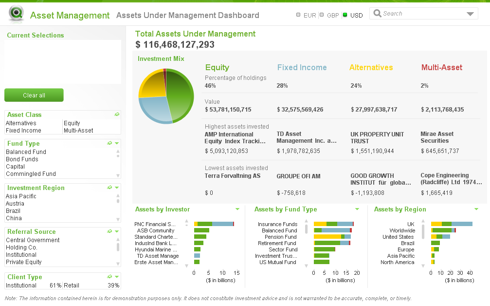
There are other examples of silent legends in the Asset Management and Help Desk Management demos. In the Asset Management demo, the legend is defined in the asset class headings and coloring is reflected in the pie and bar charts.
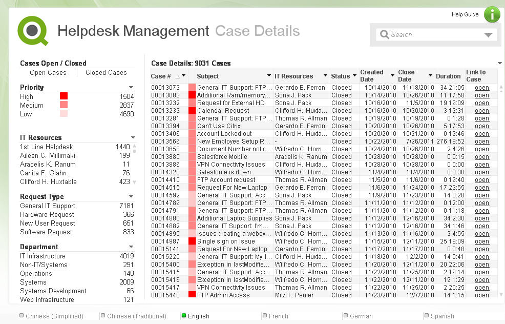
The Help Desk Management demo uses the List Box as the legend and the respective colors in a straight table versus using the text. This makes the various priorities easier to identify in the list.
I have written a technical brief on how a silent legend was created in these three demos. Check it out.
- « Previous
-
- 1
- 2
- Next »
You must be a registered user to add a comment. If you've already registered, sign in. Otherwise, register and sign in.