Alexander_Thor
Employee
Employee

Have you ever been asked to create a table that has several independent calculations over different metrics?

Mixing aggregation formulas and counts in the same table?

Did you end up creating different tables for every view point on the same information?

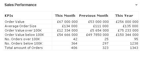
Or did you create a table like the one below?

table.PNG

If not, let me introduce you to ValueList() and its number oriented big brother ValueLoop().

ValueList
ValueList (value {, value })

ValueList allows us to specify a set of arbitrary values within the function, when used as a calculated dimension in a chart this will act as a synthetic dimension.

We can later restate the same function, with the same parameters, in our expression to reference the corresponding value in our newly created synthetic dimension.

And it is as simple as creating a straight table with following dimension and expression

Calculated Dimension:

=ValueList('My First KPI','My Second KPI')

Expression:

=IF( ValueList('My First KPI','My Second KPI')='My First KPI',

     Sum([My First KPI Field],

     Count([My Second KPI Field])

)

And voila we have created a table/chart with a dimension that does not exist in our data model and with an expression that has the possibility to mix and match aggregation functions over each dimension.

Matthew Crowther has also created an excellent Explosion Chart that also leverages ValueList, you can read more on his blog

ValueLoop
ValueLoop(from [, to [, step = 1 ]])

ValueLoop shares the same characteristics as it’s little brother ValueList with the exception that it will create a series of numbers as the synthetic dimension.

To create a dimension with values that spans between 1-100 we would create a calculated dimension with

=ValueLoop(1,100,1)

which we can reference from our expression with the expression

IF( ValueLoop(1,100,1)=3,

     'Almost Pi',

     'Not Pi'

)

ValueLoop also allows us to create the, not so useful but fun to make, square pie chart which you can read more on in this technical brief.

26 Comments
paulyeo11
Master
Master

Great arthicle, this is what i saw a a sample doc name CFO.

but the PDF file showin on square pie chart. it is wrong link ?

0 Likes
23,077 Views
IAMDV
Luminary Alumni
Luminary Alumni

Great article mate. I'm big fan of ValueLoop Function and check this link.. you will see another example on how it can be used. I have tightly linked the Dimension & Expression using ValueLoop.

http://community.qlik.com/message/222872#222872

Thanks again.

Cheers,

DV

www.QlikShare.com

23,077 Views
mikecrengland
Creator III
Creator III

I love the valuelist() function. My favorite tweak with it is to put it into a variable so that the If statement in the expression is a little less messy...

Mike

www.fortunecookiebi.com

0 Likes
23,077 Views
tanelry
Partner - Creator II

The ValueList and nested if() expression can become quite overwhelming.

With straight tables I have found better manageable to use ValueLoop as dimension, then hide that column and define both dimension labels and measures in expressions.

Dimension (hidden):

=ValueLoop(1,3)

Dimension labels (expression):

=Pick(ValueLoop(1,3),

'Net Sales',

'Margin',

'COGS'

)

Measures (expression):

=Pick(ValueLoop(1,3),

sum(Sales),

sum(Margin),

sum(Cost)

)

23,077 Views
Alexander_Thor
Employee
Employee

Absolutly agree. I also tend to favor the Pick( Match() ) approach over nested IF's.

It gets really interesting when you start utilizing nested dynamic concatenated variables in your ValueList/Loop

If there is further interest we could look into posting more advanced samples of ValueList/Loop.

0 Likes
23,077 Views
Alexander_Thor
Employee
Employee

Very smart Tanel! I had not thought of that approach before.

0 Likes
23,077 Views
IAMDV
Luminary Alumni
Luminary Alumni

Hi Tanel - I did similar thing on this thread.

http://community.qlik.com/message/222872#222872

ValueLoop is amazing!

Cheers,

DV

www.QlikShare.com

0 Likes
18,862 Views
skokenes
Luminary Alumni
Luminary Alumni

I agree that the valuelist and valueloop functions are very useful; however, I recently found that you can improve performance greatly by using a different approach; That approach is using an isolated dimension created in your data model rather than using valuelists with calculated dimensions.

Details, including performance testing results, here: http://blog.axc.net/?p=1360

Thanks,

Speros

18,862 Views
qlikpahadi07
Specialist
Specialist

great article

cheers!!!

0 Likes
18,862 Views
Anonymous
Not applicable

I have been doing a number of these KPI reports based upon the isolated dimension pattern. Although we used excel as both a template for the KPI layout and also to determine which measure to calculate. Using this approach you can quickly change the presentation of the KPI report.

E.g. the following is an extract from excel where the columns are used in the straight table to control formatting.

template.png

The expression is then calculated with this function:

(

if(Len(Trim(rbITReportLineDescription))=0,' ',

  Pick(Match(rbITMeasure,1,2,3)

  ,Num($(mRevenuePeriod(>=$(vMTDStart)<=$(vYTDEnd))) -$(mRevenuePeriod2(>=$(vMTDStart)<=$(vYTDEnd),rbpSuperGroup={"Establishment Fee"})),rbITNumFormat)

  ,Num($(mRevenuePeriod2(>=$(vMTDStart)<=$(vYTDEnd),rbpSuperGroup={"Establishment Fee"})),rbITNumFormat)

  ,Num($(mRevenuePeriod(>=$(vMTDStart)<=$(vYTDEnd))),rbITNumFormat)

  )

  )

)

18,862 Views