Unlock a world of possibilities! Login now and discover the exclusive benefits awaiting you.
- Subscribe to RSS Feed
- Mark as New
- Mark as Read
- Bookmark
- Subscribe
- Printer Friendly Page
- Report Inappropriate Content
When you start getting into the Data Visualization field you quickly learn that there are good visualizations and there are bad visualizations. Most scorned are probably the horrible pie chart and its cousin the donut chart. Should we follow Stephen Fews advice and save the pies for dessert or is there a time and place for sub-optimal visualizations?
With data visualization celebrities such as Edward Tufte and Stephen Few being very vocal in their crusade against bad visualizations the rest of the industry has started to follow suit. BI vendors have slowly adopted and almost everyone is promoting data visualization best practices now a days.
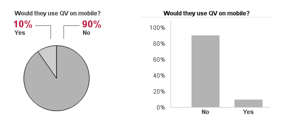
I'm not saying they are wrong, a bar chart or line chart for time series are always a better option than one or several pie charts when the core objective is to compare data points.
But is that always the core objective?
Sometimes we build QlikView apps for very large audiences, apps they might only use once in a while, apps that aren't critical for them to perform their job and sometimes we build apps that contain downright “boring” data. It’s still an important app; the users would more than likely gain additional insight from the data or the app would help them perform their job more efficiently.
Looking at myself I know there are probably several applications that Qlik has deployed internally that could help me in my job. They aren’t critical for me, I would probably only look at them once a quarter or less but still I don’t open them at all.
These would be apps with “boring” data, apps built according to every best practice in the book. Absolutely no pie/donut charts, muted downplayed color series from http://colorbrewer2.org/ and consisting to 99% of bar charts and data tables. They are in no shape or form bad apps, they are built around solid best practices, every data point is correct and every visualization carefully selected to achieve the maximum efficiency but still I can’t get myself to spend more than 15 seconds in them.
What they are lacking is attention.
Attention vs Accuracy
I want to make the case that sometimes it’s appropriate to sacrifice a certain degree of accuracy for attention. Sometimes you need some sex and sizzle to get your users to care at all.
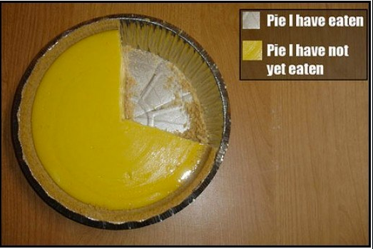
For example, humans are naturally drawn to rounded objects versus squared yet our brains are not wired to quickly grasp the sizes of a pie chart. Despite the logical part of my brain telling me that the bar chart would be a more optimum medium to display the information my eyes are still drawn to the pie chart.
The Bar Chart makes it easier to compare the individual values against each other but for me the pie chart is more inviting.
This holds true for pie charts and it also is true for maps. In this day and age as soon as we have an address or a location in our data we are compelled to put it on a map. Why? Most of the time the geospatial dimension is totally irrelevant to our analysis but we still squeeze a map in every application that we can. Because maps engage the users - you can put almost any boring data set on a map and I would still explore it, I will most likely not gain the most knowledge out of the map BUT my interest has been sparked and I might explore the data and the app further.
So should we go wild and crazy, sprinkle every app with pie charts, donut charts, bubble charts or maps?
Absolutely not, while at the same time we need a certain degree of attention to get our users to take interest in the data; we also have a responsibility to represent the data in the most accurate way possible. But what good is the data if people won’t take any interest in it at all?
I say it’s okay to stray from the path of best practice as long as you are aware why you are doing it.
Michael Anthony has previously blogged about Progressive Disclosure which can be used to overcome the initial attention hurdle while the rest of the application can focus on delivering as accurate representation of the data as possible.
TL;DR Pie charts - bad. But sometimes good.
- « Previous
-
- 1
- 2
- Next »
You must be a registered user to add a comment. If you've already registered, sign in. Otherwise, register and sign in.