Unlock a world of possibilities! Login now and discover the exclusive benefits awaiting you.
- Qlik Community
- :
- Discover
- :
- Blogs
- :
- Product
- :
- Design
- :
- When the going gets Flat, the Flat gets going…
- Subscribe to RSS Feed
- Mark as New
- Mark as Read
- Bookmark
- Subscribe
- Printer Friendly Page
- Report Inappropriate Content
When Microsoft unveiled its Windows 8 UI, which they called the ‘Metro’ style, there were whispers of a new underlying design concoction which was happening in an effort to set a trend. The whispers quickly turned into a buzz when Google switched their visual design and UI for all its platforms to bold and contemporary. Then came Apple with its iOS 7 designed flat as paper which turned the big buzz into what was being called a design revolution which was the antithesis of faux bevels, shadows and the real world lookalikes.
“There is a profound and enduring beauty in simplicity, in clarity, in efficiency, true simplicity is derived from so much more than just the absence of clutter and ornamentation. It’s about bringing order to complexity” these are words from Sir Jony Ive, the chief designer of all the beautiful Apple products we own. It was just déjà vu for some of us who thought it was like the return of the BAUHAUS.
So what exactly are we talking about?
It is about a Design style, an approach to UI that has become a mainstream and what everyone seems to be following these days. It can be seen in websites, mobile apps, print, branding, logos, icons and even in dashboards. It is called Flat design.
So what exactly is a Flat design and what is not a Flat design?
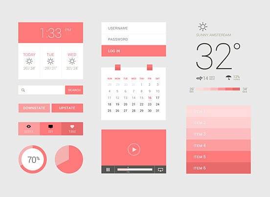
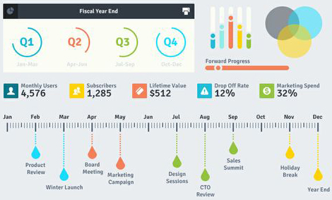
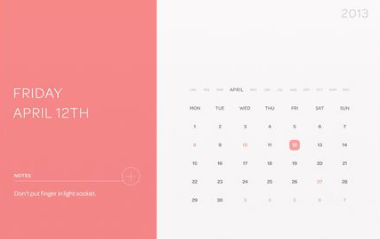
Flat design is essential visual elements that are literally flat, they are without any shadows, bevels and gradients. Apart from its elements Flat is minimalistic in its style and places greater emphasis on colors, typography and imagery as core design principles. Basically it is striping off the ornamentation which doesn’t support the UI and doesn’t mimic real-life objects. Something like this...
And this..
What is not flat design is obviously completely the opposite, and the word for it is “Skeuomorphism”. Skeuomorphism is something that mimics a real-life object, just like the previous Apple UIs before iOS7. Something like this

…As opposed to this.
It is obviously a design language of the present times but there are certain pitfalls that come along with it that are hard to ignore. They tend to blur the line between navigational elements and aesthetic elements within a design. This means certain UI elements like buttons and toggles merge into the background and cannot be recognized quickly as action items. But again, it depends on how they are designed.
Design is a combination of science and aesthetics; however, visual design is also a lot of personal aesthetic choices we make to support the user interface in becoming seamless. My style choice may not be someone else’s. As a designer, I like following the trends to avoid looking like a pair of bell bottom pants in the age of skinny jeans.
Another argument for moving away from the age old Skeuomorphism is that we have come such a long way in the digital world that the need to relate to real-life objects in the digital sense seems redundant.
So, what should one follow? You can follow your own style of design as long as it justifies the purpose. And if you are the fashionable type then just remember to do a contextual based design, which means do it where necessary and strip off where unnecessary. Just like how Google gets it right, a little shadow where needed but mostly flat.
- « Previous
-
- 1
- 2
- 3
- Next »
You must be a registered user to add a comment. If you've already registered, sign in. Otherwise, register and sign in.