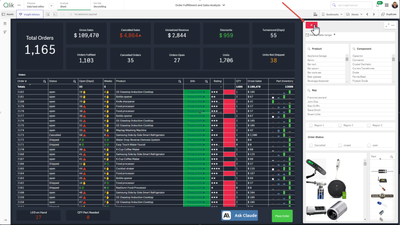
In this detailed demonstration video, you will see how Qlik Sense SaaS, offers a true Active Intelligence solution to contact tracing. (Active Intelligence is a new paradigm, creating in-the-moment awareness about every aspect of your business. It delivers a state of continuous intelligence from real-time, up-to-date information designed to trigger immediate actions.)
Let's face it - it usually takes a bit longer for features and capabilities of any product to gain traction in an organization. We released On Demand App Generation in 2018 with our Qlik Sense client-managed edition. Frankly I don't have much insight into whom has or has not implemented it. BUT, I can tell you from those that I have spoken with over the years, many were surprised to even see this awesome feature in the product when I brought it up.However, in older versions, in order to enable it - there were a number of requirements which involved copying data load script along with inserting bindings and variables - which at first glance could be perceived as cumbersome. Even the first time I worked with it, I was a bit overwhelmed. This was true for others as well, so much so, that some Qlik enthusiast even developed web app add-ons and extensions to simplify the process and generate the template for you.BUT....... since the release of ODAG, just like anything else, it has evolved and is now extremely simple to enable and implement. I show you this process in my latest Do More with Qlik(archive link below) session and summarize the ODAG concept in the latest Qlik Sense in 60 video embedded in this post - so please be sure to check them out. Let me know what you think in the comments below. Stay tuned to my next post where I build on what we learned about ODAG to introduce you to Dynamic Views!On Demand App Generation - (ODAG - concept)In summary, ODAG was originally developed to meet the need of analysis of very large data sets. The concept is quite simple:One Qlik Sense app displays summarized data with filters from the big data source.You select the filter values and reduce your answer set to meet a defined row count constraint.You click the app navigation link along the bottom to open the ODAG panelYou click a button and a new more detailed app, dynamically built from a template, is generated directly from the source data with applied filters and defined metrics at a much more detailed level. That's it!ODAG Requirements SummarizedQlik Sense base app (contains summarized measures as KPIS and desired dimension values as filters)Summarized dataApp Navigation link - linked to 2nd Qlik Sense template appDefined row count constraintApp retention settingQlik Sense template app (contains detail KPIs and detailed analysis metrics)Activation script with binding syntaxWHERE conditions with odag_ binding variables added to queryQlik Sense in 60 - On Demand App Generation (video)(Video transcript attached)Help Topicshttps://help.qlik.com/en-US/sense/February2021/Subsystems/Hub/Content/Sense_Hub/LoadData/using-OnDemand-apps.htmSource data:https://www1.nyc.gov/site/tlc/about/tlc-trip-record-data.pageSample Apps attached -ODAG - Apps - Taxi Trips.zip - (Note you need to add your data connection and access SQL etc to your data sources)Do More Archive - On Demand App Generation session:https://go.qlik.com/Do_More_with_Qlik_Webinar_Series_Target_Registration-LP.html?sourceID1=mtoComm224Sign up for the next Do More with Qlik session:https://go.qlik.com/Do-More-with-Qlik-Webinar-Series.html?sourceID1=mtoComm0224Can't see the video? YouTube blocked by your region or organization? Download the .mp4 attached in this post to view this on your computer or mobile device.
...View More
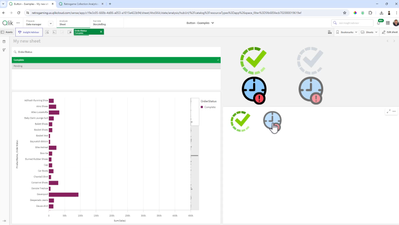
How do you edit a public sheet in a shared app? In the Qlik Sense cloud hub, users can use a shared space to develop apps collaboratively. Depending on your license and space permission, users in a shared space can create and edit content in an app. According to Qlik Help, there are 4 permissions in a share space.Owner: You are the first administrator that can manage the space and its members as well as create content in the space.Is admin: You can manage the space and its members as well as create content in the space.Can edit: You can add and edit content in apps. You cannot manage the space and its membership.Can view: You can view apps in the space, but cannot create content or manage the space.In this blog, I will share some ways to edit the public sheets in an app. I assume the app is in a shared space and you have create/edit permissions.An app in a shared space can have sheets that are private or public. Private sheets are sheets in the My sheets section of the App overview and are visible only to you as the owner. Public sheets are in the Public sheets area and are visible to everyone who has permissions to the shared space. See the highlighted areas in the image below.Sometimes, there may be the need to edit or delete a sheet that is already public or add a new sheet. Let’s cover how to do this.Update an existing public sheet – there are two options:The first option is to right-click on the sheet and select Duplicate. The duplicate sheet will appear in the My sheets section in the App overview. You are now the owner of the sheet and can edit as needed. Once edits are complete, right-click on the sheet and select Make public. Once the sheet is public, you are no longer the owner. Note that it does not overwrite the original sheet that was duplicated. Move the sheet to the appropriate location, if necessary. Now, you need to remove/delete the original sheet that was duplicated. To do this, right-click on the sheet and select Make private. This will move the sheet to the My sheets section of the App overview. From there, you can opt to leave the sheet since only you can see it, or you can right-click on it and select Delete to remove it from the app.The second option is to make the sheet you would like to edit private by right-clicking on it and selecting Make private. This will move the sheet to the My sheet section of the App overview. From there, you own the sheet and can edit it. Once the edits are complete, right-click on the sheet and select Make public. This will add the sheet back to the Public sheets section of the App overview. If necessary, move the sheet to the appropriate location.The main difference between these two options is that in the first option, the sheet that is being edited is still visible to users while the edits are being done in a private copy of the sheet. Whereas in the second option, the sheet being edited is not visible to users until it is made public again.Delete a public sheet – To delete a public sheet from an app, right-click on it to Make private, then right-click on the now private sheet and select Delete.Add a new sheet to an existing app - Click on Create new sheet and open the sheet to add content. Once the sheet is ready to share, go to the App overview, right-click on the new sheet and select Make public.Hopefully, you now know how you can update a public sheet in a shared space. It is easy and the key thing to remember is to make the sheet public once you are ready to share the sheet with others who have access to the shared space.🙂Thanks,Jennell
...View More
Don't forget a new Do More with @qlik Tomorrow!Register Now! <-HEREWhat is On Demand App Generation ( ODAG ) , its concepts and use cases – summarized:Provides everyone simple, guided-access to valuable, large data assets and relevant contextual information in a rapidly evolving big data landscapeUses a selection app of summarized large data – where user selects criteria (dimensional values) to reduce desired slice of data - and generates a new detail analysis app directly from the source (based off a template app) – for unrestricted search and exploration – this process can be managed and repeated as many times as neededExamples include – Analysis of telemetry data (think of IoT devices and large collections of anything mechanical), customer buying patterns (POS), telecommunications (Call Detail Records), hospital patient performance, anything with high volumes of large dataHelp topic:https://help.qlik.com/en-US/sense/November2020/Subsystems/Hub/Content/Sense_Hub/DataSource/Manage-big-data.htmSee an example in action of ODAG:What is a Dynamic View, what does It do, its concepts and use cases:Enables data refreshes in individual visualizations DIRECTLY FROM THE SOURCE TEMPLATE APP – WITHOUT a need to reload the main Qlik Sense APPTHE DV is an object in the MAIN Qlik Sense app - configured from a template app that contains master visualizations. The main Qlik Sense app can be considered a Hybrid app as it works with data from the Qlik Engine and also has DVs which can be refreshed from the source app.The template DV app is based on the same ODAG technology and can be a simple template just to refresh the latest data – or can contain parameters from the main app to be passed to the Dynamic view.The template app for a Dynamic View is created in the exact same manner as an ODAG-based app.Help Topic:https://help.qlik.com/en-US/sense/November2020/Subsystems/Hub/Content/Sense_Hub/DynamicViews/creating-dynamic-views.htmSee an example of Dynamic Views in action:
...View More
In my previous articles I talked about Nebula.js and the use with the existing extensions on major frameworks like React, Svelte and Angular.Since the last one, a new extension was added, sn-table. Here is how to use it.First install itnpm install @nebula.js/sn-tableThen import it and add it into your configurationimport table from '@nebula.js/sn-table';...
{
name: 'table',
load: () => Promise.resolve(table),
},
...If you have issues, you can view the entire configuration athttps://observablehq.com/@yianni-ververis/nebula-jsThen, start adding dimensions and measures.n.render({
element: chartElement,
type: 'table',
properties: {
qHyperCubeDef: {
qDimensions: [
{ qDef: { qFieldDefs: ['Case Owner Group'] }, qNullSuppression: true, qLabel: 'Department' },
{ qDef: { qFieldDefs: ['Priority'] }, qNullSuppression: true },
],
qMeasures: [
{ qDef: { qDef: 'Avg([Case Duration Time])', autoSort: false }, qSortBy: { qSortByNumeric: -1 }, qLabel: 'Avg Duration' },
],
qInterColumnSortOrder: [2, 0, 1],
qInitialDataFetch: [{
qWidth: 3,
qHeight: 3000,
}],
},
showTitles: true,
title: 'Table',
subtitle: 'Sample supernova table',
footnote: '',
totals: {
show: true,
},
},
});You should have something like thisView the entire example herehttps://observablehq.com/@yianni-ververis/nebula-jshttps://observablehq.com/@yianni-ververis/nebula-js-tableHappy coding!/Yianni
...View More
My friend,Øystein Kolsrud - Software Architect at Qlik, is back with part 4 of the Qlik Engine API fundamentals: HypercubesPrevious articles:Part 1:Let's Dissect the Qlik Engine API - Part 1: RPC BasicsPart 2:Let's Dissect the Qlik Engine API - Part 2: HandlesPart 3:Let's Dissect the Qlik Engine API - Part 3: Generic ObjectsIntroductionThe topic of this post is the concept of "hypercubes", which can sound rather intimidating at first, but which is simply a very flexible and convenient way of extracting data from Qlik Sense.BackgroundWe have in previous posts seen some basic examples of how to perform evaluations in Qlik Sense. It is theoretically possible to use the approach described in Part 3 (where a generic object is used to group evaluations) to extract any information we want from the system. In fact, it would be possible to rely solely on the "Evaluate" method described in Part 2 along with selections to produce any imaginable set of data. But the obvious downside to this approach is performance. A visualizations would typically have to call that method an enormous amount of times, maybe even millions, in order to fully display a chart. Doing so is of course not feasible, and this is where the hypercube comes into play.The term "hypercube" is a concept taken from mathematics and is a geometric concept denoting a cube of a generic number of dimensions. The good old cube as we know it is a hypercube of 3 dimensions. The square is a hypercube of 2 dimensions. But in mathematical terms, there is no reason why it would not be possible to express higher order cubes, using any number of dimensions. For more reading on this (and some fancy animations), Wikipedia provides a good starting point:https://en.wikipedia.org/wiki/HypercubeBut that's all I'll say about mathematics for now. In Qlik Sense, a hypercube is simply an interface for defining a set of data to extract. And as far as this post goes, it is sufficient to simply think of a hypercube as a table.Defining a hypercubeI will start with an extension of the example used in the previous post where we used the "StringExpression" construct to evaluate the sum of sales. In that example we created a generic object with the following set of properties:{
"qInfo": {
"qId": "81bac84a-cb6a-48ac-8139-298b6e4913c5",
"qType": "myKpi"
},
"myProp0": { "qStringExpression": "=Sum(Sales)" }
"myProp1": { "qStringExpression": "=Sum(Sales)/Count(Month)" },
}The resulting object gave us an interface for performing computations, and we could use selections together with "GetLayout" to evaluate the sum of sales for a particular employee. This approach would be fine for a simple KPI, but for a more complex visualization we would typically like to do something more interesting like for instance listing the sales for all employees at once. In that case, what we need is to be able to construct a table with the employee as one column and the expressions to evaluate as the other columns. That way we could tell the engine to fill in the cells of the table and extract all the information in one go. This is exactly the purpose of a hypercube.To use a hypercube, we need to add a definition of our hypercube to the properties of a generic object. And just like an evaluation can be added by using the reserved "qStringExpression" property, a hypercube can be added using the reserved property "qHyperCubeDef". The hypercube is, as I have already mentioned, a very flexible tool which means that there is a huge amount of settings available for it. I will only cover a very small portion of what you can do with hypercubes in this blog series, but you will find the full definition of the structure for defining them here:https://help.qlik.com/en-US/sense-developer/November2020/APIs/EngineAPI/definitions-HyperCubeDef.htmlThe two most important settings for a hypercube are "qDimensions" and "qMeasures". These are the properties that define the dimensions that the hypercube should consider, along with the measures that should be computed based on the values of those dimensions. In our case we will have one dimension (the field "SalesRep") and two measures (the sum of sales, and sum of sales per month) which means our call to "CreateSessionObject" will like like this:{
"jsonrpc": "2.0",
"id": 17,
"method": "CreateSessionObject",
"handle": 1,
"params": [
{
"qInfo": { "qType": "myCube" },
"qHyperCubeDef": {
"qDimensions":
[ { "qDef": { "qFieldDefs": [ "SalesRep" ] } } ],
"qMeasures":
[ { "qDef": { "qDef": "Sum(Sales)" } },
{ "qDef": { "qDef": "Sum(Sales)/Count(Month)" } }
]
}
}
]
}The engine replies with the following message giving us a handle for interacting with the new object:{
"jsonrpc": "2.0",
"id": 17,
"result": {
"qReturn": {
"qType": "GenericObject",
"qHandle": 4,
"qGenericType": "myCube",
"qGenericId": "3cb898dc-b7dc-44ed-ba83-c27fae5d0658"
}
},
"change": [ 4 ]
}Getting dataNow that we have an object containing a valid hypercube definition, we can extract data from it using the method "GetHyperCubeData":https://help.qlik.com/en-US/sense-developer/November2020/APIs/EngineAPI/services-GenericObject-GetHyperCubeData.htmlThis method takes two arguments, of which the first is a path to where in the properties structure of the object the hypercube is defined. In our case the definition is found at the root level, so our path will be "/qHyperCubeDef" just like the example in the reference documentation. The second argument contains a definition for what data to retrieve from the cube. This is defined as a set of pages each defining a rectangle of the data of the table defined by the hypercube. The definition of the "NxPage" structure can be found here:https://help.qlik.com/en-US/sense-developer/November2020/APIs/EngineAPI/definitions-NxPage.htmlIn my very simple example, the table contains three columns (one for the dimension and two for the expressions) and only two rows as my data contains only two sales reps. So to get all data for this hypercube, I will use a page starting at the top left corner, with width set to 3 and height set to at least 2 (I somewhat arbitrarily choose 20 in this case):{
{
"jsonrpc": "2.0",
"id": 21,
"method": "GetHyperCubeData",
"handle": 4,
"params": [
"/qHyperCubeDef",
[ { "qLeft": 0,
"qTop": 0,
"qWidth": 3,
"qHeight": 20
}
]
]
}The response I get is, as the reference documentation states, an array of instances of the structure "NxDataPage":https://help.qlik.com/en-US/sense-developer/November2020/APIs/EngineAPI/definitions-NxDataPage.htmlThe full response to the call to "GetHyperCubeData" does in our case look like this:{
"jsonrpc": "2.0",
"id": 20,
"result": {
"qDataPages": [
{
"qMatrix": [
[ { "qText": "Amalia Craig", "qNum": "NaN",
"qElemNumber": 0, "qState": "O"
},
{ "qText": "261142", "qNum": 261142,
"qElemNumber": 0, "qState": "L"
},
{ "qText": "2720.2291666667", "qNum": 2720.2291666666665,
"qElemNumber": 0, "qState": "L"
}
],
[ { "qText": "Amanda Honda", "qNum": "NaN",
"qElemNumber": 1, "qState": "O"
},
{ "qText": "253689", "qNum": 253689,
"qElemNumber": 0, "qState": "L"
},
{
"qText": "2698.8191489362", "qNum": 2698.81914893617,
"qElemNumber": 0, "qState": "L"
}
]
],
"qTails": [ { "qUp": 0, "qDown": 0 } ],
"qArea": { "qLeft": 0, "qTop": 0, "qWidth": 3, "qHeight": 2 }
}
]
}
}The most important part of the returned data is what we find in the property "qMatrix". That is where all the data is found. The matrix consists of an array of rows (two in this case), and each row contains an array of cells. The cells contain values in the same order as the dimensions and measures are defined for the hypercube, so cell position number 0 contains the dimension value and position 1 and 2 contain the measures computed for that dimension.More to learnI will stop here for now, but I'll come back to hypercubes in later posts as this is a very important concept in Qlik Sense. Pretty much every visualization will be based on an object containing a hypercube definition of some form. In fact, some visualizations will contain multiple hypercubes. An example of this is the map visualization which contains one hypercube for each map layer. Another example is the box plot visualization which contains one main hypercube which is based on the dimensions and measures the user defines, and a set of auxiliary hypercubes constructed under the hood that are derived from the main hypercube but used to compute the whiskers and outliers.
...View More
Our guest blogger Christophe Brault@christophebrault, will show you how to build a very different type of chart with Qlik Sense. A really smart addition to Qlik's wide chart library that illustrates how standard charts have more to offer when we look at them with the right eyes. Check out Christophe's website for more interesting examples with Qlikhttps://www.qreatic.fr/How to build a Quadrant Dot chart, step by stepHave you ever felt restrained with Qlik Sense graphic objects before? Personally, if I'm not careful, I feel like I'm doing the same Dashboard over and over again. Sometimes you want something different, surprising or striking. Those are the days when thinking out of the box gets especially important.I found the Dot Quadrant chart online and I was curious about how could we achieve something like that in Qlik, so I tried.In this article I will not discuss when or why to use this visualization, but I'll focus on a detailed guide on how to built it, and more generally, how to hijack basic graphics in Qlik.Building our gridFirst, we need to create a grid that contains all the dots that will make the chart. We will use a Scatter Plot Chart to create a 21 x 21 grid. Notice how we are generating a 21 X 21 grid instead of a 20 by 20, since we need to delimit each sector.Generate every point in the scriptTMP:LOAD RECNO() AS X AUTOGENERATE 21;JOIN LOAD RECNO() AS Y AUTOGENERATE 21;Prepare your dataDATA :LOAD X &'|'& Y AS POINT,X+Y AS TOTAL,X,YRESIDENT TMP;DROP TABLE TMP;Create the Dot Quadrant chart using a scatter chart and filling dimension with the field called Point, and X Y as measures. Set the Range for both to Max with 22 and there is your grid.Create trianglesThe first thing is to remove the points that separate our four sections. It’s easily done with X and Y. Use color "by Expression" in your chart to set the color to white so they disappear from view.IF(X=Y OR X+Y=22, RGB(255,255,255))To know what "triangle" each points belongs to you could use the conditions belowif(Total=22 or X=Y,'NONE',if(Total>=23 and Y>X,'TOP',if(Total<23 and Y>X,'LEFT',if(Total>=23 and Y<X,'RIGHT', if(Total<23 and Y<X,'BOTTOM')))))Using those conditions you can generate a new field in your script called "POSITION" that will help you later on to target the right quarter of your Dot Quadrant ChartYour loading script by now should look like the code belowTMP:LOAD RECNO() AS X AUTOGENERATE 21;JOINLOAD RECNO() AS Y AUTOGENERATE 21;DATA:// // DEFINE TRIANGLE POSITIONLOAD X,Y,TOTAL,POINT,IF(TOTAL=22 OR X=Y,'NONE',IF(TOTAL>=23 AND Y>X,'TOP',IF(TOTAL<23 AND Y>X,'LEFT',IF(TOTAL>=23 AND Y<X,'RIGHT',IF(TOTAL<23 AND Y<X,'BOTTOM'))))) AS Position;LOAD X&'|'&Y AS POINT,X+Y AS TOTAL,X,YRESIDENT TMP;DROP TABLE TMP;Once you know where each dot belongs to, is time to color each one of the quadrants. You can reuse the field "Position" in Color by Expression :if(Position='NONE',rgb(255,255,255), if(Position='TOP',rgb(231, 76, 60), if(Position='RIGHT',rgb(41, 128, 185), if(Position='BOTTOM',rgb(230, 126, 34), if(Position='LEFT',rgb(22, 160, 133))))))Displaying KPI in the gridIn my example, I have four metrics and one dimension, year, containing two values. Since each quarter is made up of 100 points, it is time to asing them a value from 1 to 100 starting from the center dot. This way you will be able to control how the sections will fill up. You want them to fill up starting from the center outwards.In the load script, is time to create a new field called "NoPoint" as shown belowTop:load Position,X,Y,RowNo() as NoPointT Resident DataWhere Position ='TOP'Order by Y asc;Right:load Position,X,Y,rowno() as NoPointR Resident DataWhere Position ='RIGHT'Order by X asc;Bottom:load Position,X,Y,RowNo() as NoPointB Resident DataWhere Position ='BOTTOM'Order by Y desc;Left:load Position,X,Y,rowno() as NoPointL Resident DataWhere Position ='LEFT'Order by X desc;All:LOAD Position,X,Y,NoPointT as NoPoint Resident Top;Concatenate(All)LOAD Position,X,Y,NoPointR as NoPoint Resident Right;Concatenate(All)LOAD Position,X,Y,NoPointB as NoPoint Resident Bottom;Concatenate(All)LOAD Position,X,Y,NoPointL as NoPoint Resident Left;join(Data)LOAD * resident All;Drop tables All,Top,Right,Bottom,Left;Finally, go back to the chart coloring properties panel and add each KPI likePosition='TOP' and Sum({$<Metric={'Sales'}>}Percentage)*100>=NoPointBy know, your color expression should be something like thisif(X+Y=22 or X=Y,'#ffffff', if(Position='TOP' and Sum({$<Metric={'Sales'}>}Percentage)*100>=NoPoint,'#e74c3c', if(Position='RIGHT' and Sum({$<Metric={'Profit'}>}Percentage)*100>=NoPoint,'#2980b9', if(Position='BOTTOM', if(Sum({$<Metric={'Headcount'}>}Percentage)*100>=NoPoint,'#e67e22','#bdc3c7'), if(Position='LEFT', if(Sum({$<Metric={'Cost'}>}Percentage)*100>=NoPoint,'#16a085','#bdc3c7'),'#bdc3c7') ) ) ) )To complete your chart remember to hide what you don't need in there, the Labels and Titles for X and Y and Voila !Thanks for reading and find more chart hijacking at https://www.qreatic.fr/dailyqlikchallenge/category/Charts+HijackingChristophe BraultPS: Check Christophe's Dot Quadrant app attached
...View More
ThisThursday at 2PM ET- I'll be hosting our first Do More with Qlik Session of the year, introducing you to Qlik Replicate.Take a brief look at what Qlik Replicate can do and join me LIVE where I will demonstrated real-time automated data ingestion and update. Hope to see you there!Registration and resources links below.Sign Up for Do More with Qlik - Qlik ReplicateTake Replicate for a Test DriveQlik Data Integration Product Page
...View More
As Qlik developers, we are always looking for ways to maximize the development real estate in our apps. And sometimes, we (well me), tend to overcomplicate things in order to accomplish the task at hand.
The holidays are approaching, and Santa is almost ready to deliver toys to children around the world again! But just how does Santa run such an enormous enterprise and continue to scale to meet global demand each and every year? With the help of Qlik Sense, of course! From supply chain to operations to distribution, Santa uses Qlik Sense to enable all aspects of his organization to make data-driven decisions.Since it’s that time of year, let’s look at how Qlik Sense is used on the shop floor in Santa’s Workshop to monitor and improve production. Qlik Sense is available to shop managers and teams on mobile devices throughout the shop floor, and real-time data and alerting enables timely action to any changes. Below are four real-world examples from Santa’s workshop this year.Click to open the "Santa's Workshop" Qlik Sense appAll Wrapped UpOn September 26 the Jingle, Twinkle, Merry, and Peppermint Teams were trending on average 5% below target. Qlik Sense alerted management that the teams were not meeting production targets and that downstream bottleneck time for the three teams was more than 3x higher than average, so a manager went to investigate the packaging department. What they discovered was quite a scene! One of the newer elves, in the midst of trying to prove himself and working as fast as he possibly could, had gotten himself so tangled up in gift wrap and tape that the other packaging elves were having a frightfully difficult time getting him free of the mess. The manager quickly went and got Grandma Elf, who is particularly apt at solving such crises, and packaging was then resumed, relieving the downstream bottleneck for the Jingle, Twinkle, Merry, and Peppermint Teams, and bringing production back in line with targets.Industrious ElvesOn October 11, Jingle Team’s production dropped to more than 16% below target. When the manager received an alert from Qlik Sense and checked to identify a cause she discovered that personal break time for the team was 8x more than average for the day. She immediately went to talk to the team to discuss the finding, but they were not at their workstations or the candy bar break room. She eventually discovered the entire team outside engaged in an intense and prolonged snowball fight. While elves are generally an industrious bunch, they love a good snowball fight, and the Jingle Team had lost track of time amidst the fierce battle. After the manager jumped in to toss a few snowballs herself and show the elves who’s boss she got the team back to work and production back on track.North Pole BluesThen on November 19, Qlik Sense alerted that the production of both the Jingle Team and the Holly Team was more than 11% under target. Downtime caused by an upstream bottleneck was more than 5x average for both teams. Turns out that having your workshop in the North Pole presents some unique logistical challenges, and essential materials due to arrive that morning were held up in transit after Jack Frost decided it would be a good day for an impromptu artic blizzard. Luckily, the real-time alerting of Qlik Sense enabled the problem to be identified quickly, and production on the two lines was shifted to use available resources and quickly get production levels back up to capacity.A Sticky SituationOn December 16, less than ten days out from Christmas Eve during the final push to reach production goals for the year, Qlik Sense alerted that the Marshmallow Team was operating at almost 12% under their daily target. Analyzing the data revealed that repair downtime was 5.5x longer than average, so a specialist repair team was sent to investigate. The repair team discovered cotton candy in the machine gears, causing increasingly frequent shutdowns, a sticky situation to say the least. The repair team got to work right away, licking the machine clean despite the health department protest, and the Marshmallow Team was back to full production just two days later.
...View More