Unlock a world of possibilities! Login now and discover the exclusive benefits awaiting you.
- Qlik Community
- :
- All Forums
- :
- GeoAnalytics
- :
- Which chart to use to compare row data qlikview
- Subscribe to RSS Feed
- Mark Topic as New
- Mark Topic as Read
- Float this Topic for Current User
- Bookmark
- Subscribe
- Mute
- Printer Friendly Page
- Mark as New
- Bookmark
- Subscribe
- Mute
- Subscribe to RSS Feed
- Permalink
- Report Inappropriate Content
Which chart to use to compare row data qlikview
Hi,
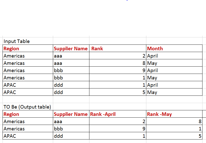
I have data as below . Showing region wise supplier ranking per month . Is there a chart where i can show the comparison of the particular region suppliers.
| Region | Supplier name | Supplier Rank | Month |
| APAC | aaa | 1 | April |
| APAC | aaa | 2 | March |
| Americas | ccc | 1 | April |
| Americas | ccc | 2 | March |
Output as below (may be in charts) with up/down arrow
| Region | Supplier name | Supplier Rank_April | Supplier Rank_March |
| APAC | aaa | 1 | 2 |
| Americas | ccc | 1 | 2 |
- Mark as New
- Bookmark
- Subscribe
- Mute
- Subscribe to RSS Feed
- Permalink
- Report Inappropriate Content
this can be helpful to identify which Chart you want to use.
Third Pillar Of Mapping Data To Visualizations: Usage | Qlik
- Mark as New
- Bookmark
- Subscribe
- Mute
- Subscribe to RSS Feed
- Permalink
- Report Inappropriate Content
Hi Prashant,
Kindly refer the below link for select perfect chart:
http://extremepresentation.typepad.com/files/choosing-a-good-chart-09.pdf
- Mark as New
- Bookmark
- Subscribe
- Mute
- Subscribe to RSS Feed
- Permalink
- Report Inappropriate Content
Hi .. I read the blogs but not able to figure out.
I am attaching the image of what is needed. My month data would increase per month , so every time i have to add a column of that month rank.