Unlock a world of possibilities! Login now and discover the exclusive benefits awaiting you.
- Qlik Community
- :
- Forums
- :
- Groups
- :
- Industry and Topics
- :
- Healthcare
- :
- Visualizing End User Adoption
- Subscribe to RSS Feed
- Mark Topic as New
- Mark Topic as Read
- Float this Topic for Current User
- Bookmark
- Subscribe
- Mute
- Printer Friendly Page
- Feature this Topic
- Mark as New
- Bookmark
- Subscribe
- Mute
- Subscribe to RSS Feed
- Permalink
- Report Inappropriate Content
Visualizing End User Adoption
This past week I had my annual review. This time of year always makes me envious of those that produce widgets. I would love to be able to show my boss a list of all of the widget producers and say “See boss I’m in the top 2% of all of the widget producers in the company and the top 5% of widget producers around the world please compensate me accordingly.”
Since you are reading this post the odds are high that like me you produce Business Intelligence Applications and aren’t producing widgets either. So how do we evaluate our work? How should management evaluate us?
One way to evaluate our work might be to simply count the number of applications that we build. Of course I could barely contain a laugh just writing that. Obviously that is wrought with problems so let’s not even consider this option.
In a strictly financial sense many types of business can measure the return on investment (ROI.) But perhaps the application we spent 9 months building is intended to help resolve bottlenecks in the company that will lead to improved patient satisfaction. The resolutions that surface may cost the company more money. Does that mean we failed? Certainly not. So we can’t measure ourselves by dollars spent and dollars saved either.
If you follow industry pundits, tweets and other social media you might be familiar with the focus of many in the industry to focus on “user adoption.” Evaluating to what degree users actually utilize our applications is probably a good way to measure ourselves. It could be argued that it isn’t a perfect measure of our efforts, however, it does seem to be a pretty good measure of our effectiveness. Because whether we like it or not, our jobs involve more than just slapping an application together. End user adoption, or the lack there off, measures our ability to brand, market and support our application. It is also a pretty good representation of how trustworthy the data in our application is. One of the most important things that end user adoption will measure is our ability to effectively visualize the data in ways that encourage usage.
Taking advantage of Qlikview logfiles
One of the nice features of Qlikview is that it retains a log file in the background on the server that retains information about every single end user session that is invoked. Since the introduction for this post was so long I will spare you the pain of reading the raw data of a session log file and skip right to ways to effectively visualize end user adoption using the data that those logfiles contain. Please refer to other posts and discussions directly in the Qlik Community about where to find and how to access these log files.
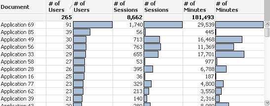
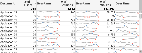
The session log files contain information that would let us look at things like “how many users used the application” “how many times were sessions invoked” and “how many minutes were used.” Thus the first chart I present contains all 3 of those measures.
The first point I want to make is that I’ve masked the real document names. I did this for two reasons. First you don’t need to know what my real document names are. The more important reason is that I don’t want know what the real document names are. At least for the duration of the time I’m trying to figure out how to effectively measure “end user adoption.” That seems rather odd so let me explain.
Overcoming bias when choosing how to measure
I believe that we all have biases. I haven’t developed all of my companies applications and frankly I have some favorites of those that I have developed and some that I was forced against my will to develop. If I knew what the application names were I could be inclined to choose and recommend the metrics that make “my” applications look the best.
If you refer back to the chart you will see that Application 69 has the greatest number of users by a large margin. If I knew that Application 69 was written by me I could immediately come to the conclusion that our end user adoption should be based on the number of users that use the application. If I also wrote Application 85 I would probably really push for that policy. “Show me the money.”
But wait someone else on my team seems to have an objection because it appears that Application 85 has a lot of distinct users but only has a tiny amount of Sessions and very tiny amount of minutes. Hard for me to argue with that, and I put my outstretched hand back into my pocket.
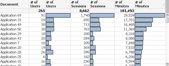
A discussion ensues for several minutes and perhaps we re-sort the chart by number of sessions. Then by Number of Minutes.
The author of Applications 33, 49 and 56 now suggests that we evaluate end user adoption by the number of minutes used. I’d like to vote for that since I was the author of Application 69 but I also authored applications at the bottom of the chart for number of minutes. I’m kind of in a no win situation on this.
Can you understand my point for masking the document names so that we don’t really know which application was developed by whom? If we are choosing a method of evaluation we need to hide the real document names so that nobody pushes for a choice just because it is better for them.
Perhaps of equal importance can you appreciate the beauty of having all 3 columns displayed with numbers as well as bar charts? Obvious patterns jump off the page that help you avoid jumping to quick conclusions just based on 1 value or the other. If we are going to devise the method of coming up with an evaluation method we need the visualization to be really crisp, and this method provides that.
You might be screaming “You rotten Qlik Dork … just tell me which of the measures is the right one to use!” To which my reply is a resounding “None of them and yet all of them.”
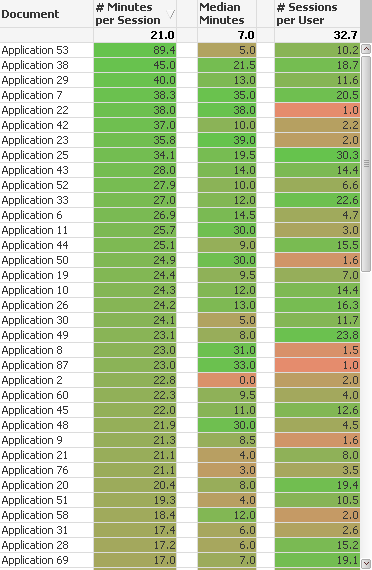
You see nobody said we had to use a single value to do the evaluation of end user adoption and there is so much more that we can do with Qlikview to present a more complete picture. The chart below slices and dices the data a few other ways that presents a different picture.
The first column interprets the average number of minutes per session. I might argue that value really represents user adoption of data analytics applications. Regardless if the application was built for a team of 5 or 50 to consume it reflects how long users stay engaged with the application. If we believe that is the goal then perhaps this is the perfect measure. Woo hoo. I think I wrote application 53.
Oh wait a second the other developer raises their hand to complain yet again, and points out that average is a really poor statistical indicator and that Median is a better measurement because it isn’t so swayed by outliers. In theory I agree, but as the author of application 53 it appears this statistics mumbo jumbo is costing me a big fat raise because while the average number of minutes per session is the highest, the median number of minutes per session is a measly 5. Phooey on heat maps I say, because if it weren’t color coded nobody would have spotted the 5.
Whether we used average number of minutes, or median number of minutes both point out something very interesting. If you look at the very bottom and see the numbers for Application 69 it appears that any of the single measurements like # of Users/Sessions/Minutes alone didn't show a complete picture. Lots of total users and minutes, just not many minutes per session. Quantity for sure but not necessarily much analytical quality.
The third column illustrates a completely different measurement, the number of sessions per user. In other words how frequently are users engaging with our application. Like the raw data displayed in chart 1, displaying all 3 of these combined measurements helps paint a broader picture: Is our application engaging users for a very long time? Are they engaging once every 6 months, or are they coming back every other day and working?
Box plots to the rescue?
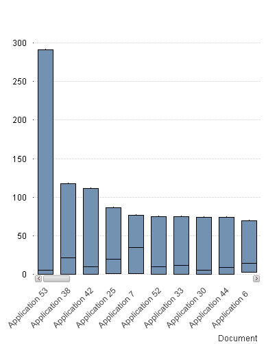
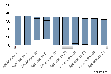
If we produce a box plot and make a few minor tweeks we can see that in fact Application 53 does in fact have a very high max value but the very low median of 5.
But the beauty of what a box plot visualizes for us can best be seen as I scroll to the right a bit. Notice for applications 87 and 8 both have pretty high medians, which we would see in the heat map chart, but more importantly you can see that even their lowest values are near 10 minutes per session. Meaning when these applications are used they are used for a good amount of time and the time is pretty consistent in a predictable range. Perhaps we could measure the end user adoption based on the predictability and consistency with which users engage?
Of course any kind of visualization of end user adoption would be incomplete if we didn’t look at the values over time so that we could see if things were getting better, stabilizing or getting worse.
The wonderful thing is that while I focused on each method individually the great thing about visualizing data in Qlikview is that we can keep the entire picture together so that we get a true overview. A scorecard of sorts for each application.
The truth about visualizing end user adoption
Click here to read the conclusion of this post on my blog QlikDork.com
Please note: The attachment provides you the sample visualizations above in case you want to see how they are accomplished. The load script is loading data from a QVD that has already read in all of the Qlikview log files and applied some logic to them. If you refer to other posts and discussion items you will be able to easily read in your server's log files and actually utilize what I've given you in production.
Please respond
I would love to read how you measure end user adoption at your facility, or how in general you measure the effectiveness of the Qlikview/Qlike Sense applications that you have developed.
