Unlock a world of possibilities! Login now and discover the exclusive benefits awaiting you.
- Qlik Community
- :
- Forums
- :
- Groups
- :
- Industry and Topics
- :
- Healthcare
- :
- Visualizing Knowledge
- Subscribe to RSS Feed
- Mark Topic as New
- Mark Topic as Read
- Float this Topic for Current User
- Bookmark
- Subscribe
- Mute
- Printer Friendly Page
- Feature this Topic
- Mark as New
- Bookmark
- Subscribe
- Mute
- Subscribe to RSS Feed
- Permalink
- Report Inappropriate Content
Visualizing Knowledge
 I love it when a plan comes together.
For the past several weeks I’ve been reading furiously and working like a dog doing my day job, while also trying to come up to speed on Qlik Sense as quickly as I can. Today everything seemed to come together so well I felt like I just had to share. My first project in Qlik Sense involved trying to replicate as much of the functionality of our Emergency Department Dashboard as I could. If you’ve ever been to an Emergency Department you probably dread going not just because you are in a crisis but there is often a fear that you’ll “be waiting forever to be seen.”
So one of the major metrics used to evaluate Emergency Departments is the time it takes to get the patient into a bed. An arrival to bed time of 15 minutes means it took 15 minutes from the time the patient arrived in the ED until they were taken to a bed. That 15 minutes would include the time to register you when you walked in the door, find out what you believe is wrong with you, determine the severity of your condition and find a location to put you. Naturally it only made sense for me to begin visualizing this “Door to Bed” metric with Qlik Sense and then work up from there.
On the dashboard for this new Qlik Sense application I already displayed the simple “Median Minutes from Door to Bed.” While a critical piece of the puzzle it’s only a very small part of the bigger picture and would be considered “information.” Like David I wanted to go deeper. I chose to begin my exploration with a scatter plot that would show the Median Minutes to Bed across the Number of Arrivals and the Day of the Week and this is what I came up with.
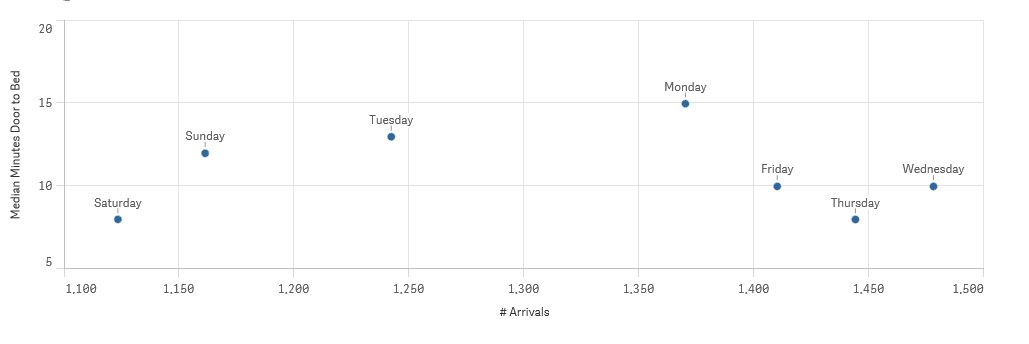
Looked really neat but as I began selecting various Months I realized what I was displaying was very misleading. The information was totally correct but I happen to know that our busiest day of the week by far is Monday. Yet because I had chosen a month that happened to have more Wednesday’s, Thursday’s and Friday’s the total number of arrivals for those days was greater. It’s only logical that if the ED is really busy the time to get you into a bed would be greater right? But total number of arrivals over the course of a month doesn’t really equate to busy when the number of those days of the week can vary. Rats!
Here is one of the beauties that I’ve already discovered with Qlik Sense … it’s so easy to drag and drop or choose a different metric that it was nothing for me to choose “Average # of Arrivals” instead of “Total # of Arrivals” so that the chart could depict the “busy” aspect of the knowledge I was trying to visualize and as I was hoping a clear pattern emerged. Something that wouldn’t necessarily jump off the page if I had chosen a pivot table to show the raw data. There is a clear correlation between how busy the ED is and how long it takes to bed patients. 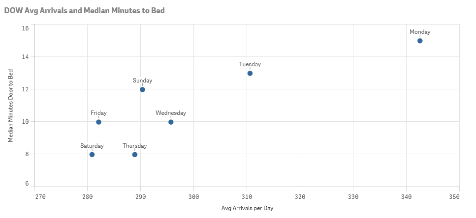
When I removed the date filter another interesting thing jumped out at me. Or I suppose in this case it would be more fitting to say something disappeared … Friday.
Click this link to read the rest of my post on Visualizing Knolwedge at QlikDork.com
- Mark as New
- Bookmark
- Subscribe
- Mute
- Subscribe to RSS Feed
- Permalink
- Report Inappropriate Content
Hi Dalton,
You describe a very interesting situation regarding the place you worked.
Until now I did't do any Qliksense project.
You convinced me to start as soon as possible to work with Qliksense.
Thanks!
- Mark as New
- Bookmark
- Subscribe
- Mute
- Subscribe to RSS Feed
- Permalink
- Report Inappropriate Content
Glad you enjoyed it and are inspired to check into Qlik Sense more. Once I have a little firmer grasp of all it can do and how I see it fitting in to our organization I will certainly post more.