Unlock a world of possibilities! Login now and discover the exclusive benefits awaiting you.
- Qlik Community
- :
- All Forums
- :
- Qlik NPrinting
- :
- Crear gráficos de dos dimensiones y una metrica
- Subscribe to RSS Feed
- Mark Topic as New
- Mark Topic as Read
- Float this Topic for Current User
- Bookmark
- Subscribe
- Mute
- Printer Friendly Page
- Mark as New
- Bookmark
- Subscribe
- Mute
- Subscribe to RSS Feed
- Permalink
- Report Inappropriate Content
Crear gráficos de dos dimensiones y una metrica
Hola
Quiero crear en el informe de power point un gráfico que me diga el volumen de ventas que se han generado en los últimos tres años por cada equipo comercial, o por cada zona del país, o por producto.
No encuentro ninguna documentación que me diga como crear estos gráficos.
- Tags:
- gráficos
Accepted Solutions
- Mark as New
- Bookmark
- Subscribe
- Mute
- Subscribe to RSS Feed
- Permalink
- Report Inappropriate Content
Hi,
You can follow the step by step tutorial at https://community.qlik.com/t5/Qlik-NPrinting-Documents/How-to-Create-a-PowerPoint-Chart-using-Native.... The tutorial was made for QlikView NPrinting 16 so there are UI differences but the process to develop the template is the same.
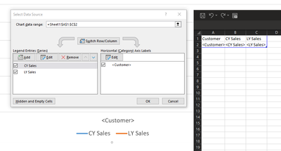
In your case you have to add 3 series instead of one. The following is an example I made with two series:
Best Regards,
Ruggero
Best Regards,
Ruggero
---------------------------------------------
When applicable please mark the appropriate replies as CORRECT. This will help community members and Qlik Employees know which discussions have already been addressed and have a possible known solution. Please mark threads with a LIKE if the provided solution is helpful to the problem, but does not necessarily solve the indicated problem. You can mark multiple threads with LIKEs if you feel additional info is useful to others.
- Mark as New
- Bookmark
- Subscribe
- Mute
- Subscribe to RSS Feed
- Permalink
- Report Inappropriate Content
Hi,
Please post your questions in English, it will increase the opportunities to get an answer. Thanks.
Qlik NPrinting PowerPoint templates support native charts. Refer to https://help.qlik.com/en-US/nprinting/February2021/Content/NPrinting/PowerPointReports/Chart-Native-....
You could also create the chart you need in the source Qlik Sense app and add it into the report as an image.
What type of chart to create depends on your needs.
Best Regards,
Ruggero
Best Regards,
Ruggero
---------------------------------------------
When applicable please mark the appropriate replies as CORRECT. This will help community members and Qlik Employees know which discussions have already been addressed and have a possible known solution. Please mark threads with a LIKE if the provided solution is helpful to the problem, but does not necessarily solve the indicated problem. You can mark multiple threads with LIKEs if you feel additional info is useful to others.
- Mark as New
- Bookmark
- Subscribe
- Mute
- Subscribe to RSS Feed
- Permalink
- Report Inappropriate Content
Thanks for your answer.
I already changed it to English. The link you send me I can't find what I'm looking for.
- Mark as New
- Bookmark
- Subscribe
- Mute
- Subscribe to RSS Feed
- Permalink
- Report Inappropriate Content
Hi,
The help site explains the generic case, than you have to apply it to your specific one.
To keep only last 3 years you can set a filter. Qlik NPrinting supports also advanced search.
Thank you can use Levels, Pages or Cycles to split the report on specific dimension.
Best Regards,
Ruggero
Best Regards,
Ruggero
---------------------------------------------
When applicable please mark the appropriate replies as CORRECT. This will help community members and Qlik Employees know which discussions have already been addressed and have a possible known solution. Please mark threads with a LIKE if the provided solution is helpful to the problem, but does not necessarily solve the indicated problem. You can mark multiple threads with LIKEs if you feel additional info is useful to others.
- Mark as New
- Bookmark
- Subscribe
- Mute
- Subscribe to RSS Feed
- Permalink
- Report Inappropriate Content
Hi Ruggero
I understand what you are saying, thank you.
I specifically want to (create o generate) graphs in a report where I can see the volume of sales in a given period and classified by product, by country, or by another criteria.
I send you an example.
- Mark as New
- Bookmark
- Subscribe
- Mute
- Subscribe to RSS Feed
- Permalink
- Report Inappropriate Content
Hi,
You can follow the step by step tutorial at https://community.qlik.com/t5/Qlik-NPrinting-Documents/How-to-Create-a-PowerPoint-Chart-using-Native.... The tutorial was made for QlikView NPrinting 16 so there are UI differences but the process to develop the template is the same.
In your case you have to add 3 series instead of one. The following is an example I made with two series:
Best Regards,
Ruggero
Best Regards,
Ruggero
---------------------------------------------
When applicable please mark the appropriate replies as CORRECT. This will help community members and Qlik Employees know which discussions have already been addressed and have a possible known solution. Please mark threads with a LIKE if the provided solution is helpful to the problem, but does not necessarily solve the indicated problem. You can mark multiple threads with LIKEs if you feel additional info is useful to others.
