Unlock a world of possibilities! Login now and discover the exclusive benefits awaiting you.
- Qlik Community
- :
- All Forums
- :
- Qlik NPrinting
- :
- #NPrinting ,#QlikView Template design
- Subscribe to RSS Feed
- Mark Topic as New
- Mark Topic as Read
- Float this Topic for Current User
- Bookmark
- Subscribe
- Mute
- Printer Friendly Page
- Mark as New
- Bookmark
- Subscribe
- Mute
- Subscribe to RSS Feed
- Permalink
- Report Inappropriate Content
#NPrinting ,#QlikView Template design
Qlik NPrinting How to design the style in the picture in NPrinting, where the stores field will change with the change of filter condition
QlikView At present, you can only use qlikview to develop and then use NPrinting to call the entire page, but how to implement the look in the picture in qv is also difficult, I hope to get help, thanks
Accepted Solutions
- Mark as New
- Bookmark
- Subscribe
- Mute
- Subscribe to RSS Feed
- Permalink
- Report Inappropriate Content
Well - it is not that hard in NPrinting at all..I actually think it is easier to build this in NPrinting excel template than would be to build it in QlikView directly. And yes - all data would be sitting in single table so there wouldn't be an issue regarding number of stores or alignment
I just did quick test by creating data for 1 KPI.
This a table in Qlik Sense (same applies to QlikView):
So I have:
- Store
- M1 - this is KPI 1
- text(num... etc) - this i column I would use to show data as text under bar in your chart
- Inverted - this is to handle drawing of the bar in chart
- %Growth - converted to text so it can be used as % and indicator under bar in chart
- Red Or Green - column I will use in excel to conditionally colour bar in chart
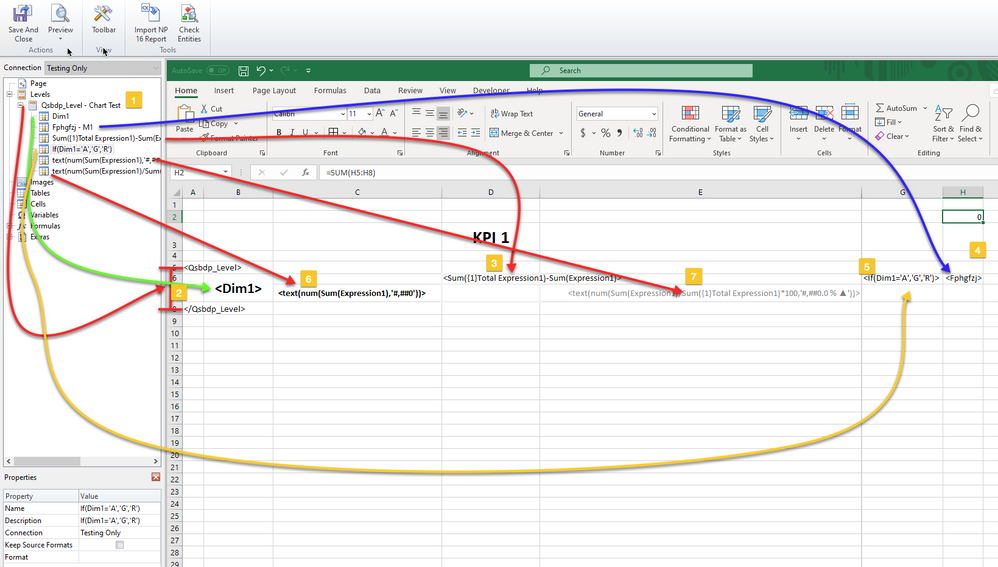
This is how it looks in NPrinting template (maybe open image in new window so you can clearly see):
- Level made of the table
- Store dimension Tag
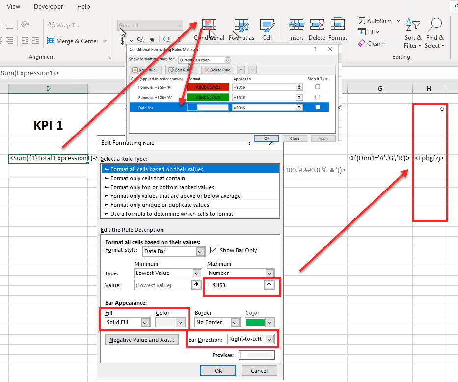
- Inverted measure for the bar (Inverted because I use cover background of the cell with white bar - note that bars are having Right-to-Left drawing direction with white background. that allows me to have dynamic bar colour for red and green bars). This is simply achieved by setting conditional formats of cell background based of column G values being G or R as you can also see on screenshot below. I also calculate in Cell H3 total for my measure so I can control max value for the bar..
- Column H supports total for KPI - to be able to control max value on bar - that column will be hidden later
- In column G i have values G or R which I use to conditionally format background of the cell with the bar
- In Column C I have value shown below the bar. It needs to be converted to text left aligned so then it can overlap column D
- In Column E I have % growth value shown below the bar. CIt needs to be converted to text right aligned so then it can overlap column D
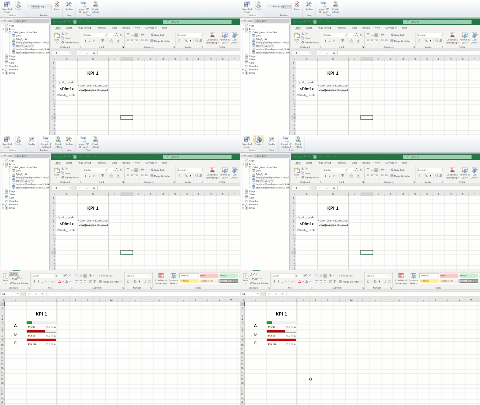
Note that for all cells i have disabled "Keep Source format"
Columns A, C,E,G & H have in final version width 0.1 so they are practically invisible as shown below:
adding additional KPIs to the same table should be straight forward process and on NPrinting side you would just repeat the same steps in further columns to the right.
I guess it is just up to you to build it, should be straight forward though.
cheers
- Mark as New
- Bookmark
- Subscribe
- Mute
- Subscribe to RSS Feed
- Permalink
- Report Inappropriate Content
hi,
There is no single right answer to your question.
To start we need to understand that NPrinting uses Qlik as a data source. So whatever data/visualisations you need to achieve in this view, first that data needs to exist in Qlik View. Second thing to consider is the way you want to build it and yes one way of doing this is to print a sheet or a container directly from QlikView as an image. The benefit of this is that what you have in QlikView you will get in NPrinting.
On the other hand if you wish to develop such report in NPrinting template first you will need to decide about the type of template which will be suitable. I can Imagine this to be quite hard if you wish to replicate exactly the same look and feel.
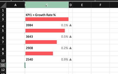
With little bit of thinking, tinkering and planning I can see this being built in Excel template as an excel table. There may be some small differences, but general look can be retained (see sample below).
At the end all components apart from the one lines highlighted in screenshot below can be done as a simple table in Excel with heaps of conditional formats.
By the way - what are those lines? do they represent anything meaningful? They seem to be in the same position all the time.
Sample of excel built result you can see below. However preparations to achieve this would involve great planning and few workarounds. You would have to build a table in QlikView with:
- row for each store,
- on each row you would have information for each measure including
- measure value
- value for the bar
- bar colour
- this may be tricky as I did not find conditional data bar colours in excel, so workaround would be to have "excel data bars" white with inverted values aligned from right and conditional colour set on actual cell background
- % and direction indicator
Once you have all that you can then use level in NPrinting to go through each store within your filter selection and produce charts as shown below.
Designing this is not easy and requires knowledge on how to work with NPrinting. I am suggesting going through the tutorials about excel tables and excel templates in general.
https://help.qlik.com/en-US/nprinting/May2021/Content/NPrinting/ExcelReports/Intro-Excel.htm
Make sure you go through all that info from help page as it will help you understand how data needs to be structured for it to work properly.
cheers
- Mark as New
- Bookmark
- Subscribe
- Mute
- Subscribe to RSS Feed
- Permalink
- Report Inappropriate Content
Hi,
When posting new questions on the community please invest the time to help us to help you. Please remember to always add the exact version of Qlik NPrinting you are using as label and the type of template you are developing. Also the type of output you want to get.
If you are new to Qlik NPrinting please start by studying the official help site page at https://help.qlik.com/en-US/nprinting/May2021/Content/NPrinting/Introduction/Introduction.htm because we are speaking about a enterprise class software and you must be trained before starting to use it.
Best Regards,
Ruggero
Best Regards,
Ruggero
---------------------------------------------
When applicable please mark the appropriate replies as CORRECT. This will help community members and Qlik Employees know which discussions have already been addressed and have a possible known solution. Please mark threads with a LIKE if the provided solution is helpful to the problem, but does not necessarily solve the indicated problem. You can mark multiple threads with LIKEs if you feel additional info is useful to others.
- Mark as New
- Bookmark
- Subscribe
- Mute
- Subscribe to RSS Feed
- Permalink
- Report Inappropriate Content
Hello,
thank you for your reply!
I am quite familiar with the use of NPrinting. It is really difficult to implement the things in the picture I gave in NPrinting, so I wonder if I can make this example in qv first, and use NPrinting to directly call qv. Good page
The problem now is that I cannot fully implement the graphic development of this page in qv. First of all, there are many values in the stores field, which means that there is a store corresponding to one row, and the store will be affected by other field filtering, so I I think the display must be in the form of a table, not an independent bar chart. If it is an independent bar chart, it will be combined in NPrinting. Once the data is filtered, the entire interface will be messed up.
The vertical bar in the middle is the national value of the corresponding indicator, this can be ignored
- Mark as New
- Bookmark
- Subscribe
- Mute
- Subscribe to RSS Feed
- Permalink
- Report Inappropriate Content
Well - it is not that hard in NPrinting at all..I actually think it is easier to build this in NPrinting excel template than would be to build it in QlikView directly. And yes - all data would be sitting in single table so there wouldn't be an issue regarding number of stores or alignment
I just did quick test by creating data for 1 KPI.
This a table in Qlik Sense (same applies to QlikView):
So I have:
- Store
- M1 - this is KPI 1
- text(num... etc) - this i column I would use to show data as text under bar in your chart
- Inverted - this is to handle drawing of the bar in chart
- %Growth - converted to text so it can be used as % and indicator under bar in chart
- Red Or Green - column I will use in excel to conditionally colour bar in chart
This is how it looks in NPrinting template (maybe open image in new window so you can clearly see):
- Level made of the table
- Store dimension Tag
- Inverted measure for the bar (Inverted because I use cover background of the cell with white bar - note that bars are having Right-to-Left drawing direction with white background. that allows me to have dynamic bar colour for red and green bars). This is simply achieved by setting conditional formats of cell background based of column G values being G or R as you can also see on screenshot below. I also calculate in Cell H3 total for my measure so I can control max value for the bar..
- Column H supports total for KPI - to be able to control max value on bar - that column will be hidden later
- In column G i have values G or R which I use to conditionally format background of the cell with the bar
- In Column C I have value shown below the bar. It needs to be converted to text left aligned so then it can overlap column D
- In Column E I have % growth value shown below the bar. CIt needs to be converted to text right aligned so then it can overlap column D
Note that for all cells i have disabled "Keep Source format"
Columns A, C,E,G & H have in final version width 0.1 so they are practically invisible as shown below:
adding additional KPIs to the same table should be straight forward process and on NPrinting side you would just repeat the same steps in further columns to the right.
I guess it is just up to you to build it, should be straight forward though.
cheers
- Mark as New
- Bookmark
- Subscribe
- Mute
- Subscribe to RSS Feed
- Permalink
- Report Inappropriate Content
Thank you very much for your proposal.
This is an effective method for a fixed line dimension. I have taken a detour to avoid the limitations of the existing design templates. First, I implemented the entire page in qlikview, and finally used NPrinting called the entire page, thank you again for your hard work
cheers!


