Unlock a world of possibilities! Login now and discover the exclusive benefits awaiting you.
- Qlik Community
- :
- All Forums
- :
- Qlik NPrinting
- :
- Nprinting powerpoint native bar chart strange out...
- Subscribe to RSS Feed
- Mark Topic as New
- Mark Topic as Read
- Float this Topic for Current User
- Bookmark
- Subscribe
- Mute
- Printer Friendly Page
- Mark as New
- Bookmark
- Subscribe
- Mute
- Subscribe to RSS Feed
- Permalink
- Report Inappropriate Content
Nprinting powerpoint native bar chart strange output
Hi i am trying to create a simple Bar chart Via Nprinting with the Native Powerpoint charts in the designer
in Qlik Sense i have created a simple table 2 columns
| Actual | Target |
| 27,80 | 27,80 |
i have then imported this table to NPrinting designer .
in the Powerpoint i use the insert Chart and add the columns as below, im showing the column headers and rows in the example
| A | B | C | |
| 1 | Data | Target | Actual |
| 2 | Current Cycle | <$(vLiz_Form_RepCountryCnt_Planned_TOTAL)> | <$(vLiz_Form_RepCountryCnt)> |
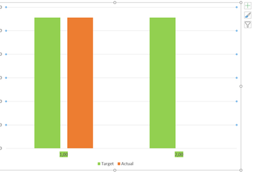
but for some reason im getting the below chart showing an additional Target on the axis ,
there should only be one target and one actual
does anyone know why this is occuring ?
Accepted Solutions
- Mark as New
- Bookmark
- Subscribe
- Mute
- Subscribe to RSS Feed
- Permalink
- Report Inappropriate Content
I have fixed this thank to a post by @nvrphanikumar
it seems like a serious bug in Nprinting powerpoint.
in qlik sense i created an additional blank column called total
| Actual | Target | Total |
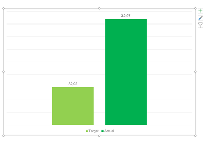
| 32,97 | 32,92 | Total |
then in the powerpoint when you select your data source
a places the Total column on column A placement
| Total | Target | Actual |
| Total | 32,92 | 32,97 |
this fixed the Issue

