Unlock a world of possibilities! Login now and discover the exclusive benefits awaiting you.
- Qlik Community
- :
- All Forums
- :
- Qlik NPrinting
- :
- PixelPerfect - Rolling Wave Data Positioning,
- Subscribe to RSS Feed
- Mark Topic as New
- Mark Topic as Read
- Float this Topic for Current User
- Bookmark
- Subscribe
- Mute
- Printer Friendly Page
- Mark as New
- Bookmark
- Subscribe
- Mute
- Subscribe to RSS Feed
- Permalink
- Report Inappropriate Content
PixelPerfect - Rolling Wave Data Positioning,
Hi everyone,
i have an issue to present the data correctly aligned (s. attachment) in NP PixelPerfect.
The report takes the date (i.e. "Stand: 11.12.19") and calculates a period of a year back (12.12.18 - 11.12.19 => 2019). This range is saved in QS in vPeriod and fills automatically another variable (vPeriodVJ) with the range a year before (12.12.17-11.12.18 => 2018). All the fields in the attachment are calculated with set analysis on these variables in formulas in the NP Designer. I've created an advanced filter for the whole range on the year field, but I want to have the calculation-columns of 2018 behind the ones of 2019 placed.
Does anybody have an idea to merge my "two tables"? Thanks in advance
Accepted Solutions
- Mark as New
- Bookmark
- Subscribe
- Mute
- Subscribe to RSS Feed
- Permalink
- Report Inappropriate Content
Hi @Gerdinho22
If I understand your question correctly perhaps you can use set analysis in conjunction with an new straight table chart.
Of course you would need to apply your advanced filters to enable the ranges as needed.
- I previously had two charts 1 for each years data in my QS app
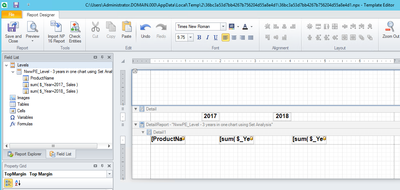
- In the new single QS chart, I added one dimension and one measure for each year of data. See attached output.
- I used set analysis for the columns ie; = sum( {$<Year={2017}>} Sales ) and = sum( {$<Year={2018}>} Sales )
- I used a text box to enable the years 2017 and 2018 in the NP template editor
- Inserted the chart as a level and insert the chart into the band in the detailed report area on the right in the template editor window.
- dragged the individual data fields to the detail report from the expand level/chart upper right corner
How it works in the template editor
Report output attached
Hopefully this is something that you might be able to leverage to achieve the result you need.
Kind regards...
- Mark as New
- Bookmark
- Subscribe
- Mute
- Subscribe to RSS Feed
- Permalink
- Report Inappropriate Content
Hi,
thanks for the response. In the meantime, I worked on a similar solution like yours and it was solved with set analysis, i.e. sum({<Datum={'>=01.01.2018<=31.01.2018'}>}[$(vQuelle)]). Now I have over 100 formulas and more than 200 labels.
However, I`m not happy with it, because I´ll have to adjust every formular year by year. Maybe it is possible to create a variable, which takes the current date from my selection and calculates the needed range?!
I will work on it and would post my success into this thread, but so far it is done 🙂
Thanks everyone
- Mark as New
- Bookmark
- Subscribe
- Mute
- Subscribe to RSS Feed
- Permalink
- Report Inappropriate Content
Hi @Gerdinho22
If I understand your question correctly perhaps you can use set analysis in conjunction with an new straight table chart.
Of course you would need to apply your advanced filters to enable the ranges as needed.
- I previously had two charts 1 for each years data in my QS app
- In the new single QS chart, I added one dimension and one measure for each year of data. See attached output.
- I used set analysis for the columns ie; = sum( {$<Year={2017}>} Sales ) and = sum( {$<Year={2018}>} Sales )
- I used a text box to enable the years 2017 and 2018 in the NP template editor
- Inserted the chart as a level and insert the chart into the band in the detailed report area on the right in the template editor window.
- dragged the individual data fields to the detail report from the expand level/chart upper right corner
How it works in the template editor
Report output attached
Hopefully this is something that you might be able to leverage to achieve the result you need.
Kind regards...
- Mark as New
- Bookmark
- Subscribe
- Mute
- Subscribe to RSS Feed
- Permalink
- Report Inappropriate Content
Hi,
If you mean that you would like to place two tables side-by-side I suggest to give a check at the post https://community.qlik.com/t5/Qlik-NPrinting-Discussions/Side-by-Side-Tables-in-One-Band-in-PixelPer...
Best Regards,
Ruggero
Best Regards,
Ruggero
---------------------------------------------
When applicable please mark the appropriate replies as CORRECT. This will help community members and Qlik Employees know which discussions have already been addressed and have a possible known solution. Please mark threads with a LIKE if the provided solution is helpful to the problem, but does not necessarily solve the indicated problem. You can mark multiple threads with LIKEs if you feel additional info is useful to others.
- Mark as New
- Bookmark
- Subscribe
- Mute
- Subscribe to RSS Feed
- Permalink
- Report Inappropriate Content
Hi,
thanks for the response. In the meantime, I worked on a similar solution like yours and it was solved with set analysis, i.e. sum({<Datum={'>=01.01.2018<=31.01.2018'}>}[$(vQuelle)]). Now I have over 100 formulas and more than 200 labels.
However, I`m not happy with it, because I´ll have to adjust every formular year by year. Maybe it is possible to create a variable, which takes the current date from my selection and calculates the needed range?!
I will work on it and would post my success into this thread, but so far it is done 🙂
Thanks everyone

