Unlock a world of possibilities! Login now and discover the exclusive benefits awaiting you.
- Qlik Community
- :
- All Forums
- :
- Qlik NPrinting
- :
- Qlik Nprinting - Nested Doughnut Chart fill option...
- Subscribe to RSS Feed
- Mark Topic as New
- Mark Topic as Read
- Float this Topic for Current User
- Bookmark
- Subscribe
- Mute
- Printer Friendly Page
- Mark as New
- Bookmark
- Subscribe
- Mute
- Subscribe to RSS Feed
- Permalink
- Report Inappropriate Content
Qlik Nprinting - Nested Doughnut Chart fill option not working
Hello, I'm using Qlik Nprinting November 2020.
I'm having a lot of troubles creating a Pixel Perfect report due to the sheer lack of informative threads and vague documentation.
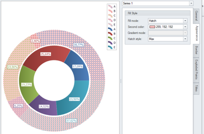
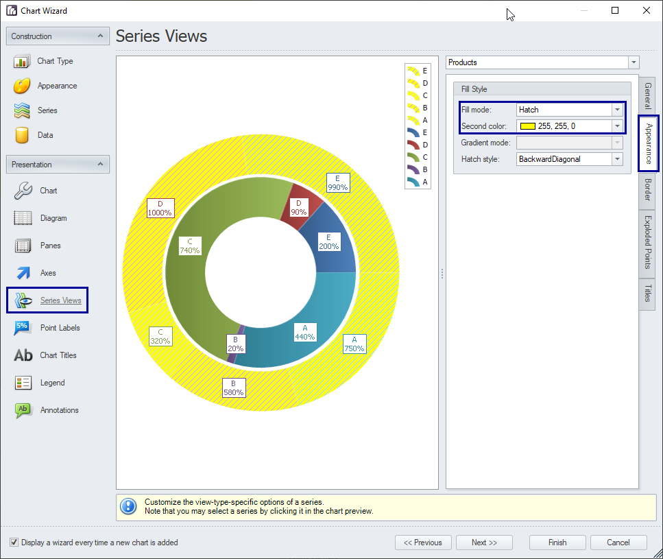
I'm trying to create a Nested Doughnut with two different series of data based on two different tables. I can't use two different color palettes, so in order to distinguish the two series I tried relying on the Series Views section: I attempted changing the filling style of one of the series to a hatch pattern, this is what I see on the designer
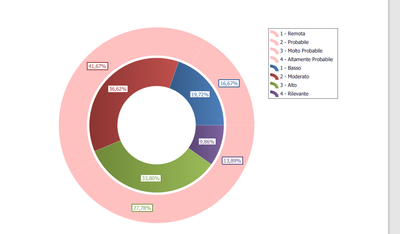
This looks reasonable on the designer, but doesn't work at all on the final report, since this is what I see when previewing it:
The hatch pattern is gone and only the "second color" is visible. The same happens when leaving the second color blank, the outer ring of the chart is blank with only the point labels visible.
I need to distinguish the two different series of data using something like a pattern, since they must have the same set of colors. Any way to fix/avoid this?
Also, is there any way to split the legend in two, one for each series?
- Tags:
- pixel perfect
- Mark as New
- Bookmark
- Subscribe
- Mute
- Subscribe to RSS Feed
- Permalink
- Report Inappropriate Content
Hi,
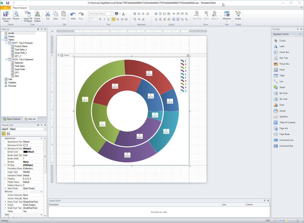
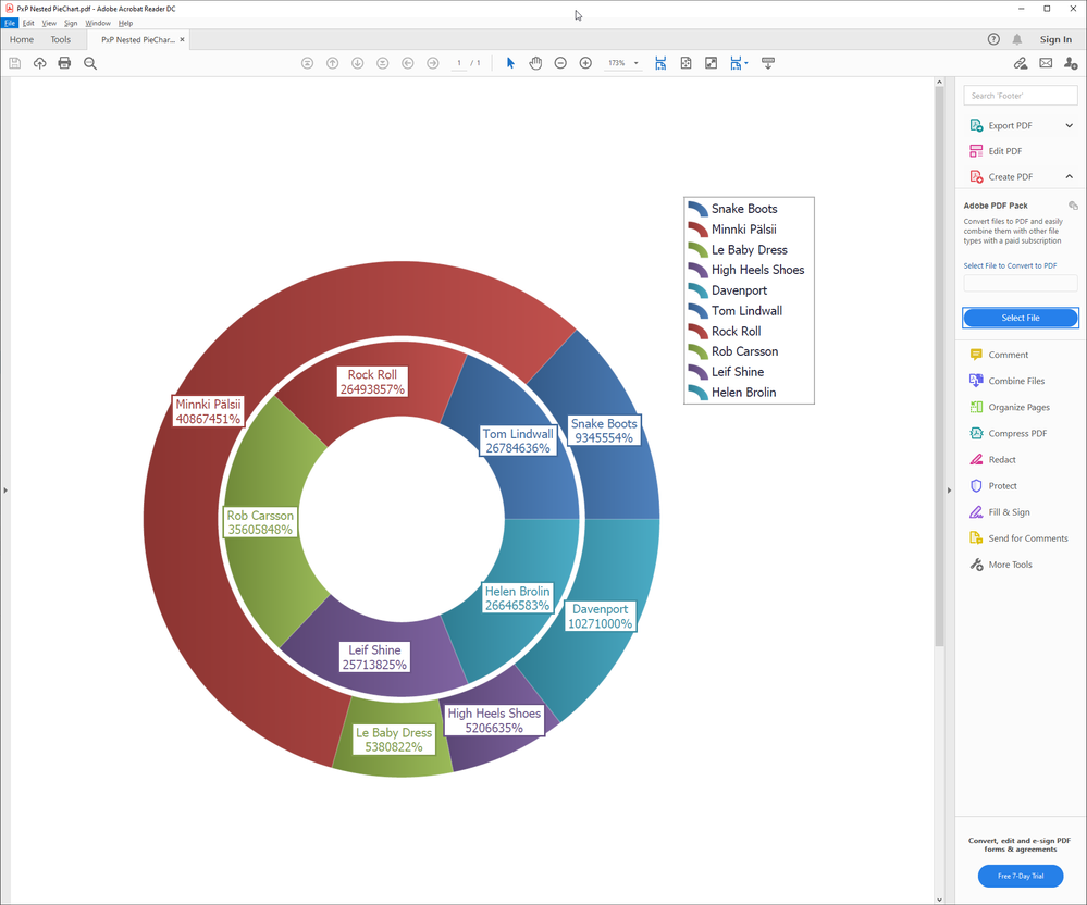
I did some tests and yes it is not possible to use two different palettes one for the inner and another for the outer.
I'm not able to reproduce your issue with the color, my chart is correct.
So I suppose you setted and option that create the single color outer circle. For example check the option:
By using it I was able to create a outer circle in a single color.
Best Regards,
Ruggero
Best Regards,
Ruggero
---------------------------------------------
When applicable please mark the appropriate replies as CORRECT. This will help community members and Qlik Employees know which discussions have already been addressed and have a possible known solution. Please mark threads with a LIKE if the provided solution is helpful to the problem, but does not necessarily solve the indicated problem. You can mark multiple threads with LIKEs if you feel additional info is useful to others.
- Mark as New
- Bookmark
- Subscribe
- Mute
- Subscribe to RSS Feed
- Permalink
- Report Inappropriate Content
Hi @Ruggero_Piccoli ,
Thanks for your answer. I updated the answer to highlight that the problem is not the palette, but actually the hatch pattern.
The issue is that, when selecting an hatch pattern, the pattern doesn't show up in the report and the "second color" kind of overwrites the color palette. This ends up showing an outer ring with just one color, as shown in my screenshots.
