Unlock a world of possibilities! Login now and discover the exclusive benefits awaiting you.
- Qlik Community
- :
- All Forums
- :
- Qlik NPrinting
- :
- value field in Pivot table not work
- Subscribe to RSS Feed
- Mark Topic as New
- Mark Topic as Read
- Float this Topic for Current User
- Bookmark
- Subscribe
- Mute
- Printer Friendly Page
- Mark as New
- Bookmark
- Subscribe
- Mute
- Subscribe to RSS Feed
- Permalink
- Report Inappropriate Content
value field in Pivot table not work
Hi Guys,
I have a straight table with three columns:
event day, data_source, eventcount
and would like to make a stacked bar chat with event day as x axis and eventcount grouped by data_source as stacked bar.
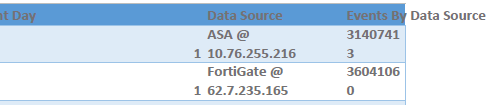
Hence, concert it into a pivot chart as below, however I find the eventcount field is always 0 although I put "Sum" there.
I was thinking there are no data for eventcount, which makes it 0, but we do have values for eventcount.
Not sure why it sum (events_by_datasource) all become 0 once the table is converted into pivot.
- Mark as New
- Bookmark
- Subscribe
- Mute
- Subscribe to RSS Feed
- Permalink
- Report Inappropriate Content
Hi @cimxfang
It's not clear what you are trying to accomplish.
Are you trying to make a pivot table as shown in the images or as you also mentioned you are trying to create a stacked bar chart.
Are you trying to do this in an NPrinting report with QlikView or Qlik Sense data or some other data source?
Note that if you are trying to make a pivot table chart with QV or QS data exclusively, please check the following article. It has to be followed accurately or it will not work.
If you are trying to do another requirement, there are many existing tutorials that can be found here:
There are also several videos that 'might' have what you need. Please explore the Qlik NPrinting videos here: https://help.qlik.com/en-US/videos. Choose 'Qlik NPrinting' to access the videos.
If you need advance assistance with your requirement, you may wish to reach out to consulting services here. https://www.qlik.com/us/services/qlik-consulting
Kind regards...
- Mark as New
- Bookmark
- Subscribe
- Mute
- Subscribe to RSS Feed
- Permalink
- Report Inappropriate Content
this looks to me like your data comes out to your excel template as text not as numbers hence it is not additive.