Unlock a world of possibilities! Login now and discover the exclusive benefits awaiting you.
- Qlik Community
- :
- Support
- :
- Support
- :
- Knowledge
- :
- Support Articles
- :
- Qlik NPrinting: Create a sorted stacked bar chart ...
Options
- Subscribe to RSS Feed
- Mark as New
- Mark as Read
- Bookmark
- Subscribe
- Printer Friendly Page
- Report Inappropriate Content
Qlik NPrinting: Create a sorted stacked bar chart in PixelPerfect
No ratings
Turn on suggestions
Auto-suggest helps you quickly narrow down your search results by suggesting possible matches as you type.
Showing results for
Support
- Mark as New
- Bookmark
- Subscribe
- Mute
- Subscribe to RSS Feed
- Permalink
- Report Inappropriate Content
Qlik NPrinting: Create a sorted stacked bar chart in PixelPerfect
Last Update:
Apr 19, 2022 4:53:06 AM
Updated By:
Created date:
Sep 14, 2018 6:53:34 AM
The goal of this document is to create a sorted and stacked bar chart by using PixelPerfect. See Fig 1.

Environment:
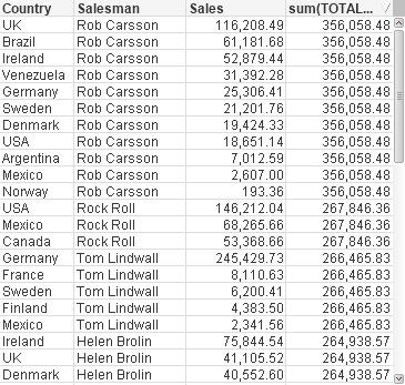
The original source QlikView object contains two dimentsions (Country and Salesman) and one measure (sales):
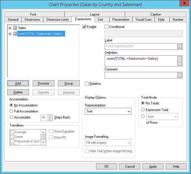
- First, add a measure with the sum of the sales for each salesman. We will use it to sort the chart. Create a new expression with the formula sum(TOTAL <Salesman> Sales)
- The final source chart will looks like the following:
- Save the .qvw and create a Qlik NPrinting connection to it or refresh the cache if you already created the connection. Create a new PixelPerfect template add the cource QlikView table in the Tables node and add a native chart.
- Select Side by side bar stacked chart type and press Next two times.
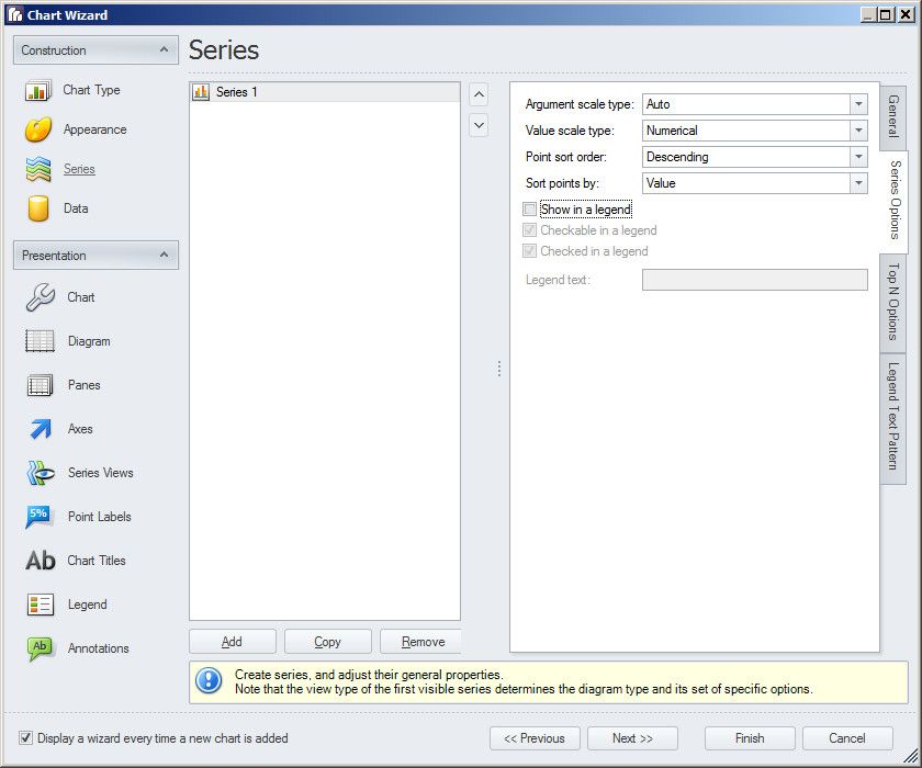
- Remove all the data series a part Series 1, then click on Series Options tab
- To order the bars in descending order based on the total sales of each salesman set Point sort order to Descending and Sort points by Values by using the related drop down menus. Unflag the Show in legend check box. We will use the Series 1 only to order the bars in the final chart, but the series itself will be hide so we don't want to show it in the legend.Click on Next.
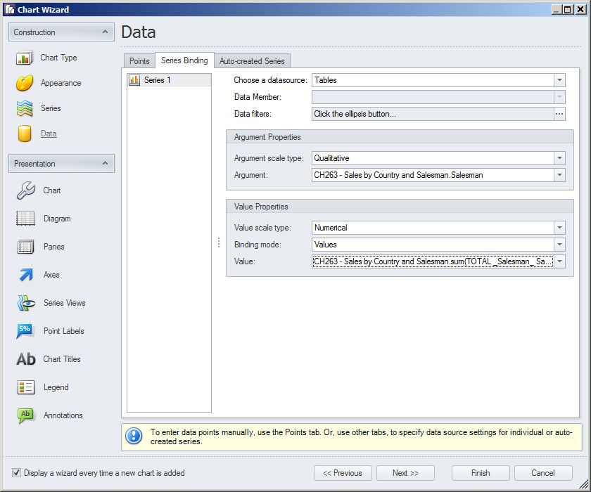
- Select the Series Binding tab. Select Salesman in the Argument drop down menu and the new sum total field in the Value drop down menu.
- Open the Auto created Series tab ad set:
- The source chart in the Data Member drop down menu
- Country as Series. This will divide each bar by country
- Salesman as Argument. This will create a bar for each salesman
- Sales as value so the portion for each country in each bar will be calculated based on the sales value
- Click on Next until you reach the Series View section.
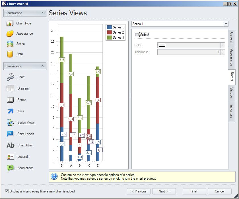
- Set 0,1 in the Width option to have the narrowest possible bars.
- In the Appearance tab set Transparency to 255. This will made the bar 100% transparent.
- In the Border tab remove the flag in the Visible check box to hide the bar borders. Click Next.
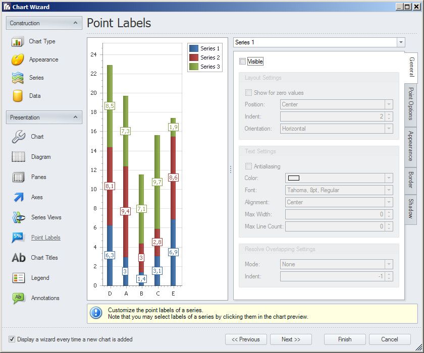
- In the Point Labels section remove the flag to the Visible check box for the Series 1. We hiddin the series bars, we need also to avoid to show related numbers.
It is your choiche to remove the point labels also for the auto generated series. - Click on Finish. Resize the chart and run a report preview.
If the bars in the report are not in the correct order go back to Data - Series Binding and be sure that Series 1 is correctly configured.
Qlik NPrinting

Qlik NPrinting
1,716 Views
Comments
Contributor
2019-06-13
11:02 AM
- Mark as Read
- Mark as New
- Bookmark
- Permalink
- Report Inappropriate Content
Great job.
Do you know how to keep the colors? For example, if one of the countries has no data, the others countries keep their colors?
In my case, I have a chart, in QlikView, with one dimension and one measure (the colors are calculated in the background color). I want to keep the same behavior in a pixel perfect chart.

