Unlock a world of possibilities! Login now and discover the exclusive benefits awaiting you.
- Qlik Community
- :
- Support
- :
- Support
- :
- Knowledge
- :
- Member Articles
- :
- How to Create MS Excel Charts from Qlikview Data
- Edit Document
- Move Document
- Delete Document
- Subscribe to RSS Feed
- Mark as New
- Mark as Read
- Bookmark
- Subscribe
- Printer Friendly Page
- Report Inappropriate Content
How to Create MS Excel Charts from Qlikview Data
- Move Document
- Delete Document
- Mark as New
- Bookmark
- Subscribe
- Mute
- Subscribe to RSS Feed
- Permalink
- Report Inappropriate Content
How to Create MS Excel Charts from Qlikview Data
Nov 10, 2015 4:21:02 AM
Nov 10, 2015 4:21:02 AM
This tutorial illustrates how to create a native Excel graph in your NPrinting reports. A table will be added to the template as a level. Fields will be embedded in the template and an Excel chart will be created with the data exported from QlikView.
Start New Excel Report Template and Open Select Levels Window
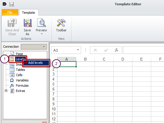
- Right click on the Levels node
- Click on Add level
Select Level
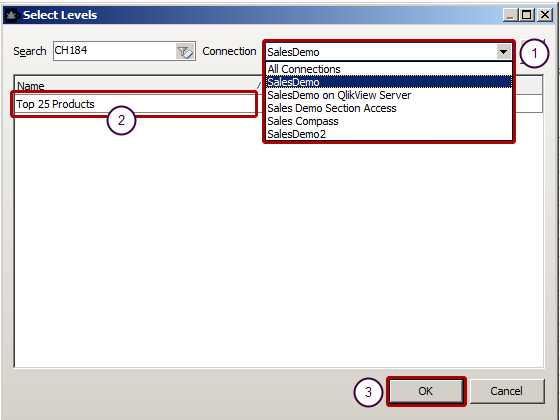
Add the Top 25 Products - CH184 as a level by:
- Select the Connection SalesDemo to the QlikView document that contains the object you want
- Type CH184 in the search box and select the Top 25 Products
- Click on OK
Embed Level in Template
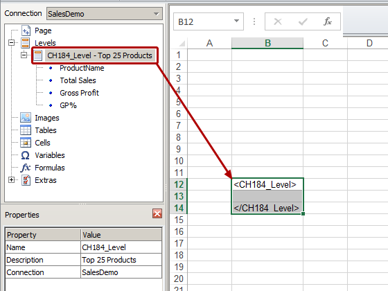
Drag the CH184_Level - Top 25 Products node into the template and drop it onto three vertically consecutive cells. I have dropped them into the 12th-14th rows to make room for the graph that I intend to place above.
Embed Fields for Columns
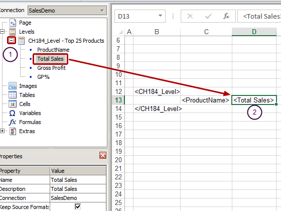
- Expand the CH184_Level - Top 25 Products node by clicking on the '+' to its left
- Drag the field nodes to be used into the template one at a time and drop them onto empty cells in a row between the level tags
Add Column Headings
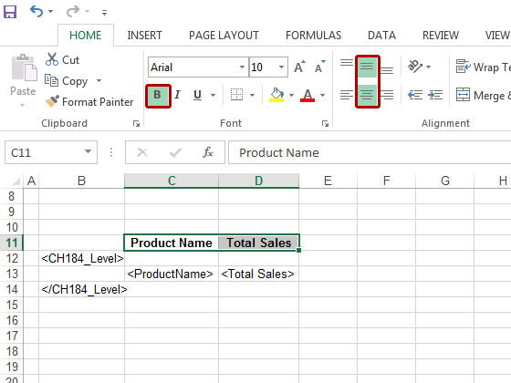
Add headings in a row that is above the row containing the level opening tag and format them with the Excel formatting tools that are made visible by clicking on the Toolbar icon. The rows containing the level opening and closing tags will be eliminated during the table generation process.
Add Chart
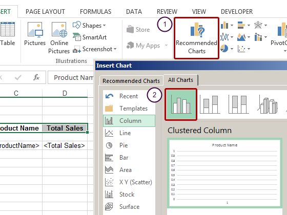
- Click on the Recommended Charts icon
- Select a column chart
- Confirm with OK
Begin to Define Chart
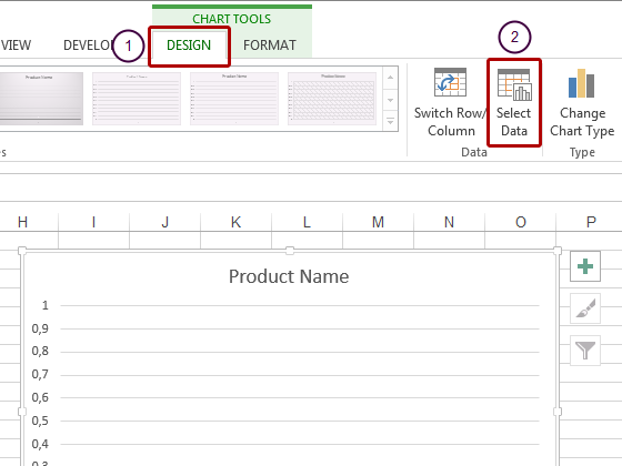
- Select the Design tab
- Click on the Select Data icon
Begin to Define Vertical Axis
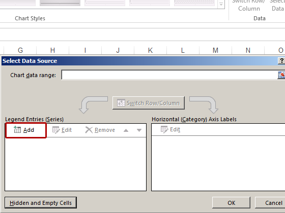
Click on the Add button in the Legend Entries (Series) pane
Continue to Define Vertical Axis
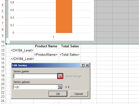
Click on the icon at the right of the Series name.
Select Series Name = Vertical Axis Legend
- Select the cell with the Total Sales heading
- Confirm by clicking on the icon at the right end of the Edit Series field
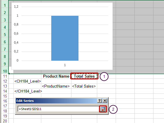
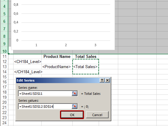
Proceed to define Series values
Select the icon at the right end of the Series values.
Select Vertical Axis Range
- Select the Total Sales range by including the cells in the rows containing the level opening and closing tags along with the cell containing the <Total Sales_1> tag
- Confirm the selection by clicking on the icon at the extreme right end of the Edit Series field
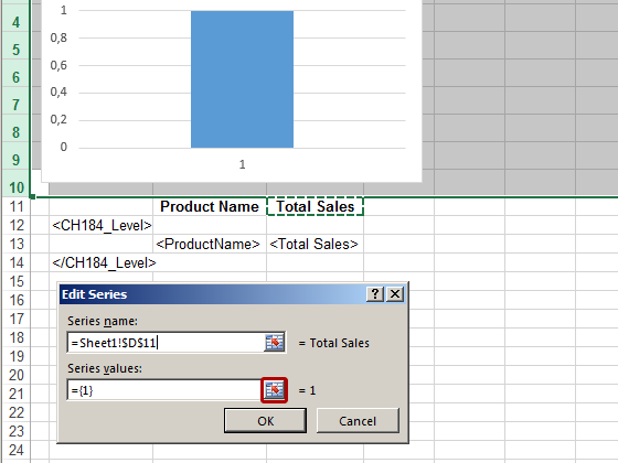
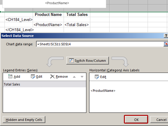
Finish Editing Legend Entries (Series)
Select OK
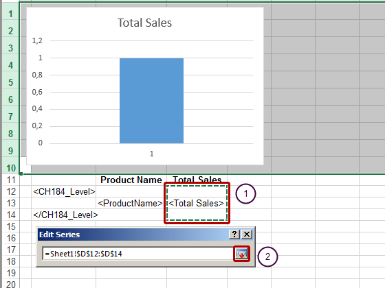
Begin Defining Horizontal (Category) Axis Labels
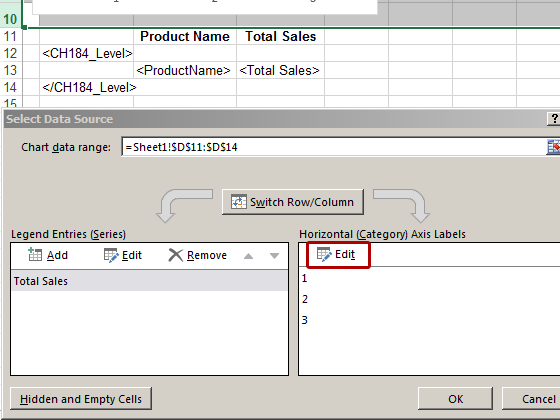
Click on Edit in the Horizontal (Category) Axis Labels pane
Select Horizontal Axis Range
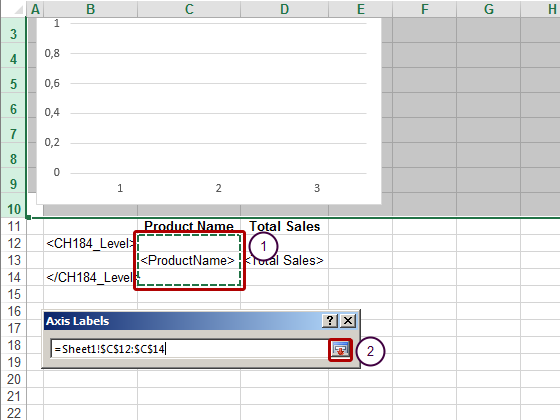
- Select the Product Name range by including the cells in the rows containing the level opening and closing tags along with the cell containing the <ProductName> tag
- Confirm the selection by clicking on the icon at the right end of the Axis Labels field
Confirm Horizontal Axis Range
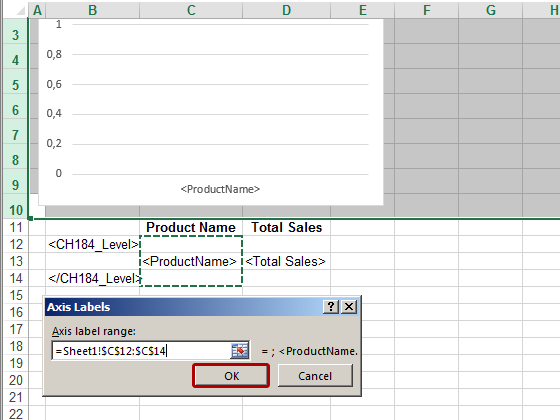
Click on OK
Conclude Chart Creation
Click on OK
Generate Preview
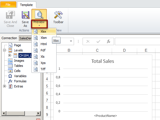
Select preferred Preview output format (eg .xlsx).
View Preview
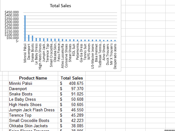
The Excel chart is visible on the upper left corner.
Call up Save Dialog
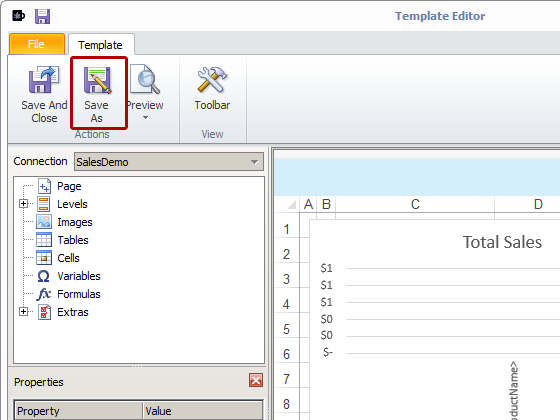
Select the Save As icon
Save Template
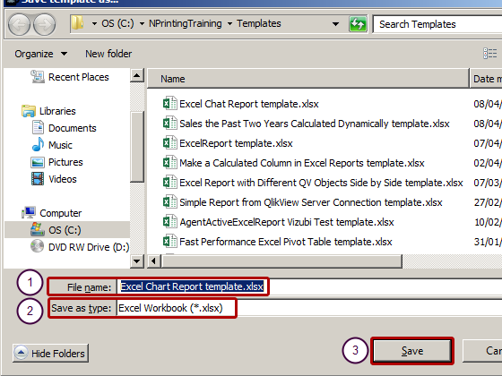
- Insert "Excel Chart Report template.xlsx" as File name
- Select .xlsx as type of Excel Workbook
- Click on Save