Unlock a world of possibilities! Login now and discover the exclusive benefits awaiting you.
- Qlik Community
- :
- Support
- :
- Support
- :
- Knowledge
- :
- Support Articles
- :
- Qlik NPrinting PixelPerfect Charts with a Date and...
- Subscribe to RSS Feed
- Mark as New
- Mark as Read
- Bookmark
- Subscribe
- Printer Friendly Page
- Report Inappropriate Content
Qlik NPrinting PixelPerfect Charts with a Date and Time field on X axes
- Mark as New
- Bookmark
- Subscribe
- Mute
- Subscribe to RSS Feed
- Permalink
- Report Inappropriate Content
Qlik NPrinting PixelPerfect Charts with a Date and Time field on X axes
Apr 19, 2022 5:19:27 AM
Mar 7, 2019 8:51:16 AM
PixelPerfect native charts have some useful features in case you are using a Date and Time dimension for example in X-axes.
Environment:
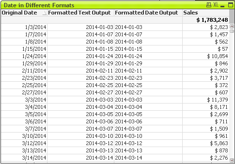
We will use a QlikView Straight Table object with sales by day.
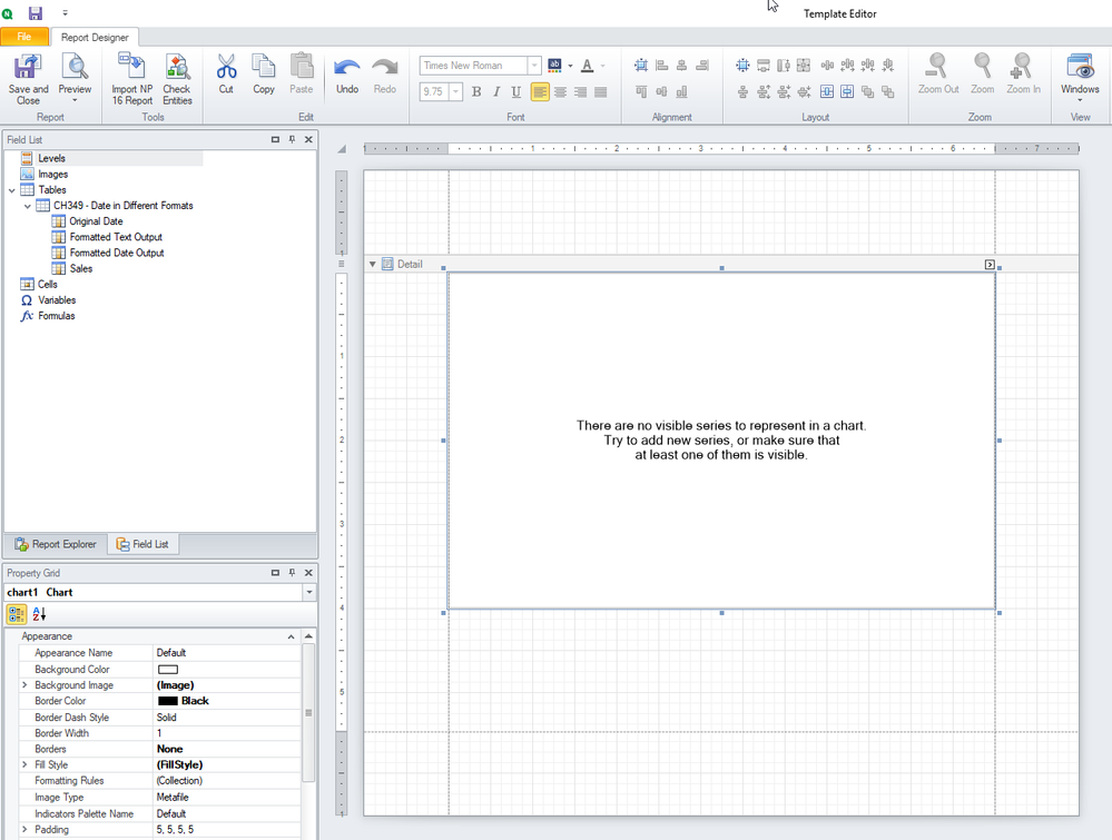
- Create a new PixelPerfect report, add the straight table object in the Tables node and a new native chart as usual.
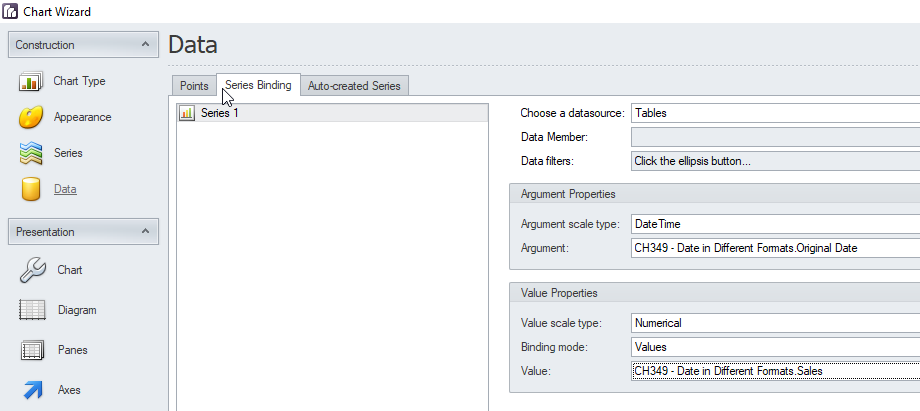
- Select a Line Chart, keep only a series of data and go to Data -> Series Binding tab. In the Argument scale type select Date Time and in the Argument select the field of the straight table that contains the date. Using DateTime data scale means that data provided for the series points will be treated as DateTime values and will be shown on the Axis as DateTime values (e.g., January, 2019).
- In the Value select the Sales field.
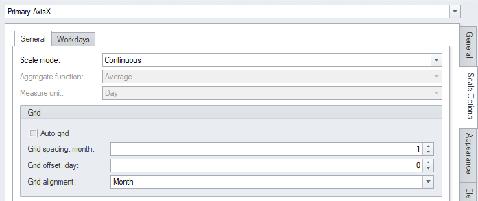
- Go to the Axes tab and open the Scale Options on the right side tabs. Select Sale mode Continuous, it means that data aggregation is disabled. The original table has sales by day so we will get a chart with a value for each day.
Automatic date-time scale mode, meaning that data is automatically aggregated according to the chosen aggregate function. Manual date-time scale mode, meaning that you can manually choose the aggregate function using the aggregate function and measure unit properties. I suggest to test also these options to familiarize with them. - Hide the Point Labels, the Legend and the Marker in the Series View. Run a report preview.
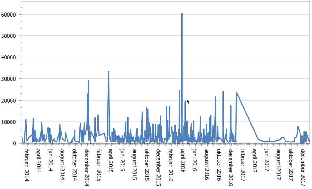
- If you want to see the x axes grid by month, remove the auto grid option and set grid alignment to month.
- Run a preview.
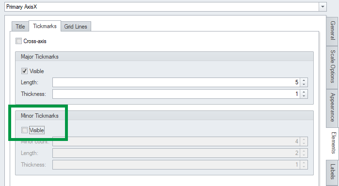
- To remove the secondary tickmarks, open Axes -> Elements -> Tickmarks and uncheck the Visible flag in the Minor tickmarks area.
- Run a preview.
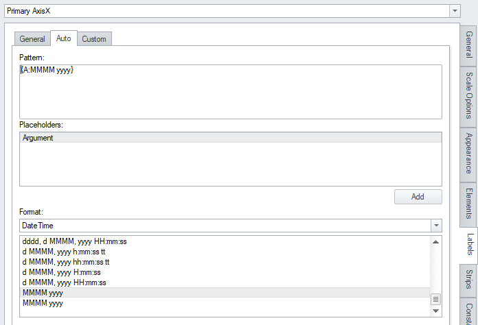
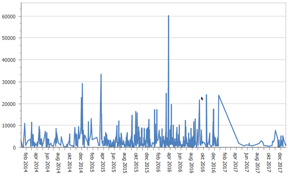
- Then to change how date are displayed open Axes -> Labels -> Auto than manually insert in the pattern the string {A:MMMM yyyy}. It means argument in the format of first letters of the month followed by the year with four letters. You can also use the format list.
- Run a preview.
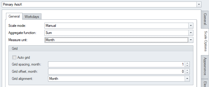
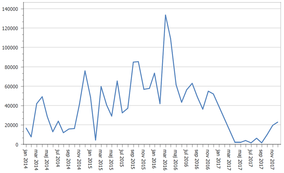
- To test the aggregation function go back to the scale options tab and set scale mode to manual, aggregate function to sum and measure unit on month.
- Run a preview.
- Mark as Read
- Mark as New
- Bookmark
- Permalink
- Report Inappropriate Content
Thank you so much Ruggero !
This post looks its gonna save me 🙂
I am on my way to try the ways you suggested and glad that it had the option not only of 'Continuous' but many.
Will update once resolved.
Great post !! Its really helpful.
Thanks,
Gargi
- Mark as Read
- Mark as New
- Bookmark
- Permalink
- Report Inappropriate Content
Hi Ruggero,
I have one more doubt.
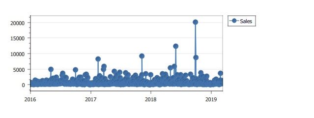
The pdf preview of pixelperfect chart not coming as expected.

Thanks,
Gargi
- Mark as Read
- Mark as New
- Bookmark
- Permalink
- Report Inappropriate Content
Hi,
You can remove the markers from the Series View tab and select Markers on the right.
I suggest you to follow all the chart wizard steps and explore the options to have an overview of what you can do.
Best Regards,
Ruggero
- Mark as Read
- Mark as New
- Bookmark
- Permalink
- Report Inappropriate Content
Got it, Need to use Swift Plot chart type, I was using Line chart type.
Thanks,
Gargi
- Mark as Read
- Mark as New
- Bookmark
- Permalink
- Report Inappropriate Content
that's what i am talking about - well done 🙂
- Mark as Read
- Mark as New
- Bookmark
- Permalink
- Report Inappropriate Content
Hi Ruggero,
really helpful post, thank you!
But I have one question: What is the condition that I can use the argument scale type "date time"?
I have a calculated dimension in QV straight table which returns date format: =Date(if(Year(Cal.Date)=Year(Today()),AddYears(Cal.Date,-1),Cal.Date))
With this, it is only possible to use "Qualitative", but why?
Best regards,
Diana
- Mark as Read
- Mark as New
- Bookmark
- Permalink
- Report Inappropriate Content
Hi,
I did some tests on my installation and the only solution I found is to add a new calculated field in the reload script created with the formula =Date(if(Year(Cal.Date)=Year(Today()),AddYears(Cal.Date,-1),Cal.Date)). Then add it into the chart, save the QVW and refresh the connection cache.
Best Regards,
Ruggero
- Mark as Read
- Mark as New
- Bookmark
- Permalink
- Report Inappropriate Content
Your suggestion did the job an now my line chart looks exactly as I wished.
Thank you very much!
