Unlock a world of possibilities! Login now and discover the exclusive benefits awaiting you.
- Qlik Community
- :
- All Forums
- :
- Qlik NPrinting
- :
- Create a stacked chart in Nprinting with one dimen...
- Subscribe to RSS Feed
- Mark Topic as New
- Mark Topic as Read
- Float this Topic for Current User
- Bookmark
- Subscribe
- Mute
- Printer Friendly Page
- Mark as New
- Bookmark
- Subscribe
- Mute
- Subscribe to RSS Feed
- Permalink
- Report Inappropriate Content
Create a stacked chart in Nprinting with one dimension and two measures
Hello everyone, i work on Nprinting and i need help. I would like to know how create a stacked chart PPT in NPRINTING with one dimension and two measures ?
I show you the data of my table.
- Mark as New
- Bookmark
- Subscribe
- Mute
- Subscribe to RSS Feed
- Permalink
- Report Inappropriate Content
Hi @Wil18
You can convert the table into a stacked chart and directly call it an Image in NPrinting
else
After selecting insert chart options, you can take this table to a NPrinting PPT or Excel template.
- Mark as New
- Bookmark
- Subscribe
- Mute
- Subscribe to RSS Feed
- Permalink
- Report Inappropriate Content
can you mockup example of output you are trying to achieve?
I would say you may need to convert your dataset to create 2 columns (1 for each measure using set analysis).
- Mark as New
- Bookmark
- Subscribe
- Mute
- Subscribe to RSS Feed
- Permalink
- Report Inappropriate Content
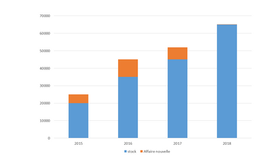
Thanks for your help @Lech_Miszkiewicz , here is an overview of the graph I would like to obtain. How can i convert my dataset on QLIKSENSE to create 2 columns ?
- Mark as New
- Bookmark
- Subscribe
- Mute
- Subscribe to RSS Feed
- Permalink
- Report Inappropriate Content
Thanks @Dharanidharan_DD concerning your first solution, i did the reverse process, i convert the stacked chart into table in order to use the ppt native chart in Nprinting. Concerning your second solution, it's difficult for me to obtain the same stacked chart of qlik sense on Nprinting. How could i set up the data set to obtain this graph.
- Mark as New
- Bookmark
- Subscribe
- Mute
- Subscribe to RSS Feed
- Permalink
- Report Inappropriate Content
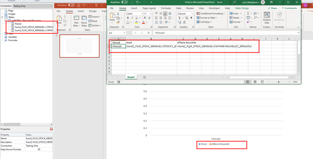
There is no need to convert dataset - you just need to create Qlik Sense straight table using set analysis to create "Stock" measure and "Affaire Nouvelle" measure just like in my screenshot below:
Once you do this then you import that object as table to PPT NPrinting template, insert stacked bar chart and add data tags as shown on screenshot below
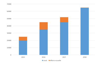
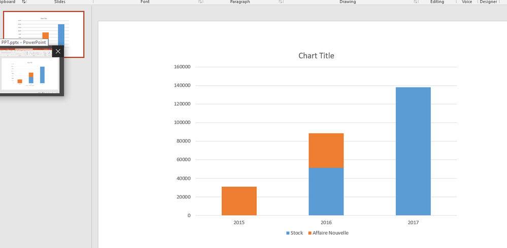
Result is exactly what you wanted
- Mark as New
- Bookmark
- Subscribe
- Mute
- Subscribe to RSS Feed
- Permalink
- Report Inappropriate Content
just as a side note - It seems you are doing some data prep in some ETL tool (or maybe database) which normally we would do in Qlik Sense to achieve this. I am not sure what your Qlik Sense experience is but purely judging by the question you have asked I take you are new to Qlik and Qlik community. If my judgment is right I would suggest you take some time learning how to build Qlik Sense apps - and I would actually suggest using help of a Qlik Partner or experienced developer so you can learn good practices. If you still want to do this by yourself please invest time to learn best practices in writing Qlik Sense scripts and expressions.
On top of that there is NPrinting bit which also should be done by experienced Qlik Sense and NPrinting person.
The reason I am saying all this is not to discourage you, but to make sure you get best out of the product and you will learn much quicker.
cheers and good luck


