Unlock a world of possibilities! Login now and discover the exclusive benefits awaiting you.
- Qlik Community
- :
- Discover
- :
- Blogs
- :
- Product
- :
- Product Innovation
- :
- Highlights of Recent Qlik Sense SaaS Data Visualiz...
- Subscribe to RSS Feed
- Mark as New
- Mark as Read
- Bookmark
- Subscribe
- Printer Friendly Page
- Report Inappropriate Content
Add Help to your Qlik Sense Application
When you need to provide more details to a chart, such as a definition, tip, or note, you can add a container tab with text and image object. This not only gives users context, but also reduces clutter when you need to add more information that is not specified within the chart.
Add Reference Lines in Charts
It’s often necessary to add context to metrics presented in charts and dashboards. This helps data consumers and decision makers easily see key points within your chart. By adding reference lines for 50% and top 5 as dynamic indicators, additional perspective is displayed.
Grid Chart with Pie Charts
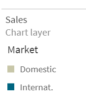
Using a grid chart with pies can help users visualize KPIs over time or with different variables like regions. To do this, you can re-use the map chart with the chart layer.
Table Indicators
By adding table indicators, you can enrich your tables with context, allowing users to immediately identify outliers and understand key metrics. Table indicators can include rank, trend, and status markers to simplify the interpretation of values. Below you will see how to add table indicators in Qlik Sense.
Icicle Chart
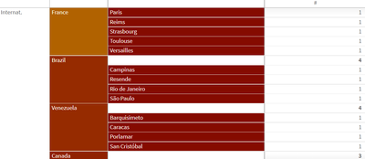
Helpful in showing hierarchies, you can create an icicle chart by modifying the pivot chart. To determine the space you need, sort by the first measure and count the leafs. Make sure “totals” are turned “on,” so you can sort by the first measure. To color by number of leafs, use the colormix function. You can reduce clutter utilizing pivot buttons and condensing the header with CSS multi-KPI.
Icicle Chart with Deviation
Finally, the deviation icicle chart provides users with a simple way to see the differences between metrics over time. For example, you can quickly show a number increase or decrease in units sold or bookings month over month using the deviation icicle. This type of chart is created using the combo with stacked bars for the deviation and white bar as the offset. First, add lines with actual and forecast, turn on labels, and set forecast to transparent =argb(0,0,0,0). Next, add bars for offset=min(Actual,Forecast) and deviation. Then, color the offset bar transparent =argb(0,0,0,0) and deviation red for – and green for +. Finally, add a marker layer for lollipops.
As you use Qlik Sense SaaS more and more, you will clearly see how Qlik’s world-class visualization capabilities stand ahead of other analytics companies when it comes to supporting your innovation today and in the future. For more information on these and other data visualization capabilities, check out Qlik’s Visualization Showcase. See this eBook for tips on avoiding common data visualization pitfalls.
You must be a registered user to add a comment. If you've already registered, sign in. Otherwise, register and sign in.


