Unlock a world of possibilities! Login now and discover the exclusive benefits awaiting you.
- Qlik Community
- :
- Forums
- :
- Analytics
- :
- App Development
- :
- A small UI suggestion
- Subscribe to RSS Feed
- Mark Topic as New
- Mark Topic as Read
- Float this Topic for Current User
- Bookmark
- Subscribe
- Mute
- Printer Friendly Page
- Mark as New
- Bookmark
- Subscribe
- Mute
- Subscribe to RSS Feed
- Permalink
- Report Inappropriate Content
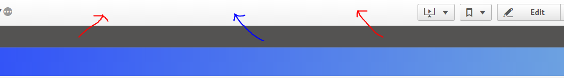
A small UI suggestion
Patrik,
Thanks for doing a great job in designing the Qlik UI layer. However, there's a minor suggestion that you may be interested in.
Currently, the selection bar occupies a full inch of width on the UI layer. Is there a way to push the selection bar to the white ribbon above it?
Please see attached image.
I was accessing my apps in QlikSense cloud and my Ipad. In both cases there wasn't enough real estate for me to look at. I felt the visualizations were scrunched up. The desktop version seems fine.
Please see if you can squeeze some more room to allow developers to use more real estate to present their visualizations (That's where the value is for the end users  ) .
) .
Thanks for taking the time to read this long message.